
###Contenido del Curso
- Introducción
- Layout y componentes
- Maquetación responsiva: pantallas de autenticación
- Maquetación responsiva: vistas principales
###Introducción
###Buenas prácticas de CSS: reflexión y advertencias


###Layout y componentes
###Sistema de diseño, assets y variables de CSS
Enlace para descargar la carpeta de iconos y logos
Código para nuestras variables:
:root{
--white: #FFFFFF;
--black: #000000;
--dark: #232830;
--very-light-pink: #C7C7C7;
--text-input-field: #F7F7F7;
--hospital-green: #ACD9B2;
}
body{
font-family: 'Quicksand', sans-serif;
}```
###Maquetación responsiva: pantallas de autenticación
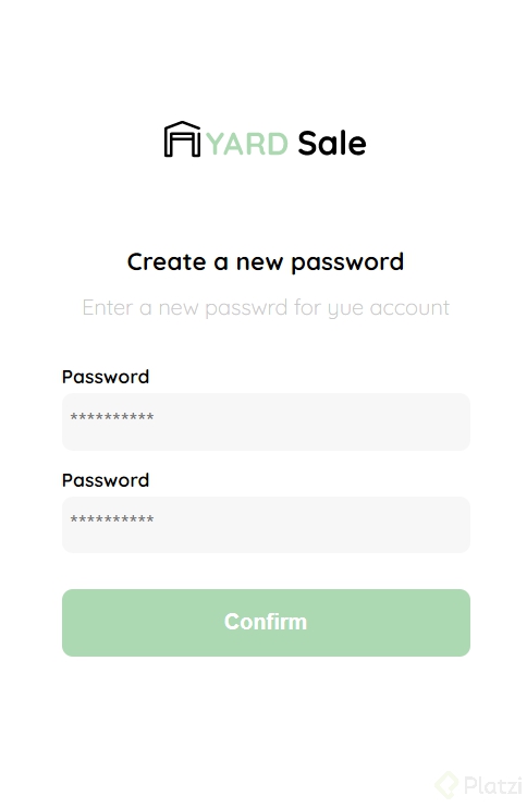
### Crear nueva contraseña: HTML
En este curso decidimos NO crear archivos con extensión `.css` para guardar nuestros estilos, sino guardarlos en los mismos archivos `.html` (dentro de la etiqueta `<style>`).
Si lo prefieres, puedes hacer esta división con tus propios archivos `.css`. De hecho, es la forma más recomendada de trabajar profesionalmente con HTML y CSS.
Pero con nuestra profesora Estefanny Aguilar lo haremos sin esta separación para facilitar la migración a componentes en el [Curso Práctico de React.js](https://platzi.com/react) (que muy pronto tomarás si continúas con la [Escuela de JavaScript](https://platzi.com/escuela-javascript/)).
¡Mucha suerte durante tu maquetación!
**Archivos de la clase**
[clase1.html](https://static.platzi.com/media/public/uploads/clase1_fd5d33b2-2a7e-44a7-8d81-df7c889e8076.html)
**Codigo**
<title>Document</title>
  <style>

  </style>
</head>

<body>
  <div class="login">
    <div class="form-container">
      <img src="" alt="logo" class="logo">

      <h1 class="title">Create a new password</h1>
      <p class="subtitle">Enter a new passwrd for yue account</p>

      <form action="/" class="form">
        <label for="password" class="label">Password</label>
        <input type="password" id="password" placeholder="**********" class="input input-password">

        <label for="new-password" class="label">Password</label>
        <input type="password" id="new-password" placeholder="**********" class="input input-password">

        <input type="submit" value="confirm" class="primary-button login-botton">
      </form>
    </div>
  </div>
</body>

</html>
###Crear nueva contraseña: CSS
** Archivos de la clase**
Codigo
<style>
:root {
--white: #FFFFFF;
--black: #000000;
--dark: #232830;
--very-ligth-pink: #C7C7C7;
--text-input-field: #F7F7F7;
--hospital-green: #ACD9B2;
--sm: 14px;
--md: 16px;
--lg: 18px;
}
body {
margin: 0;
font-family: 'Quicksand', sans-serif;
}
.login {
width: 100%;
height: 100vh;
display: grid;
place-items: center;
}
.form-container {
display: grid;
grid-template: auto 1fr auto;
width: 300px;
}
.logo {
width: 150px;
margin-bottom: 48px;
justify-self: center;
display: none;
}
.title {
font-size: var(--lg);
margin-bottom: 12px;
text-align: center;
}
.subtitle {
color: var(--very-ligth-pink);
font-size: var(--md);
font-weight: 300;
margin-top: 0;
margin-bottom: 32px;
text-align: center;
}
.form {
display: flex;
flex-direction: column;
}
.label {
font-size: var(--sm);
font-weight: bold;
margin-bottom: 4px;
}
.input {
background-color: var(--text-input-field);
border: none;
border-radius: 8px;
height: 30px;
font-size: var(--md);
padding: 6px;
margin-bottom: 12px;
}
.primary-button {
background-color: var(--hospital-green);
border-radius: 8px;
border: none;
color: var(--white);
width: 100%;
cursor: pointer;
font-size: var(--md);
font-weight: bold;
height: 50px;
}
.login-botton {
margin-top: 14px;
margin-bottom: 30px;
}
@media (max-width: 640px) {
.logo {
display: block;
}
}
</style>```
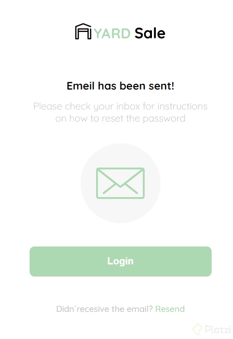
### Email enviado
**Archivos de la clase**
[clase2.html](https://static.platzi.com/media/public/uploads/clase2_c20ebe7b-4050-48e9-93a1-c24f0e34a55a.html)
**Codigo**
_++CSS++_
.login {
  width: 100%;
  height: 100vh;
  display: grid;
  place-items: center;
}

.form-container {
  display: grid;
  grid-template: auto 1fr auto;
  width: 300px;
  justify-items: center;
}

.logo {
  width: 150px;
  margin-bottom: 48px;
  justify-self: center;
  display: none;
}

.title {
  font-size: var(--lg);
  margin-bottom: 12px;
  text-align: center;
}

.subtitle {
  color: var(--very-ligth-pink);
  font-size: var(--md);
  font-weight: 300;
  margin-top: 0;
  margin-bottom: 32px;
  text-align: center;
}

.email-image {
  width: 132px;
  height: 132px;
  border-radius: 50%;
  background-color: var(--text-input-field);
  display: flex;
  justify-content: center;
  align-items: center;
  margin-bottom: 24px;
}

.email-image img {
  width: 80px;
}

.resend {
  font-size: var(--sm);
}

.resend span {
  color: var(--very-ligth-pink);
}

.resend a {
  color: var(--hospital-green);
  text-decoration: none;
}

.primary-button {
  background-color: var(--hospital-green);
  border-radius: 8px;
  border: none;
  color: var(--white);
  width: 100%;
  cursor: pointer;
  font-size: var(--md);
  font-weight: bold;
  height: 50px;
}

.login-botton {
  margin-top: 14px;
  margin-bottom: 30px;
}

@media (max-width: 640px) {
  .logo {
    display: block;
  }
}```
HTML
<body>
<div class="login">
<div class="form-container">
<img src="./logos/logo_yard_sale.svg" alt="logo" class="logo">
<h1 class="title">Emeil has been sent!</h1>
<p class="subtitle">Please check your inbox for instructions on how to reset the password</p>
<div class="email-image">
<img src="./icons/email.svg" alt="email">
</div>
<button class="primary-button login-botton">
Login
</button>
<p class="resend">
<span>Didn´recesive the email?</span>
<a href="/">Resend</a>
</p>
</div>
</div>
</body>```
###Login
**Archivos de la clase**
[clase3.html](https://static.platzi.com/media/public/uploads/clase3_d394e732-908e-46eb-a315-d0b69c32a70b.html)
**Codigo**
++_CSS_++
.login {
  width: 100%;
  height: 100vh;
  display: grid;
  place-items: center;
}

.form-container {
  display: grid;
  grid-template: auto 1fr auto;
  width: 300px;
}

.logo {
  width: 150px;
  margin-bottom: 48px;
  justify-self: center;
  display: none;
}

.form {
  display: flex;
  flex-direction: column;
}

.form a {
  color: var(--hospital-green);
  font-size: var(--sm);
  text-align: center;
  text-decoration: none;
  margin-bottom: 52px;
}

.label {
  font-size: var(--sm);
  font-weight: bold;
  margin-bottom: 4px;
}

.input {
  background-color: var(--text-input-field);
  border: none;
  border-radius: 8px;
  height: 30px;
  font-size: var(--md);
  padding: 6px;
  margin-bottom: 12px;
}

.input-email {
  margin-bottom: 22px;
}

.primary-button {
  background-color: var(--hospital-green);
  border-radius: 8px;
  border: none;
  color: var(--white);
  width: 100%;
  cursor: pointer;
  font-size: var(--md);
  font-weight: bold;
  height: 50px;
}

.secondary-button {
  background-color: var(--white);
  border-radius: 8px;
  border: 1px solid var(--hospital-green);
  color: var(--hospital-green);
  width: 100%;
  cursor: pointer;
  font-size: var(--md);
  font-weight: bold;
  height: 50px;
}

.login-botton {
  margin-top: 14px;
  margin-bottom: 30px;
}

@media (max-width: 640px) {
  .logo {
    display: block;
  }

  .secondary-button {
    width: 300px;
    position: absolute;
    bottom: 0;
    margin-bottom: 24px;
  }
}```
HTML
<body>
<div class="login">
<div class="form-container">
<img src="./logos/logo_yard_sale.svg" alt="logo" class="logo">
<form action="/" class="form">
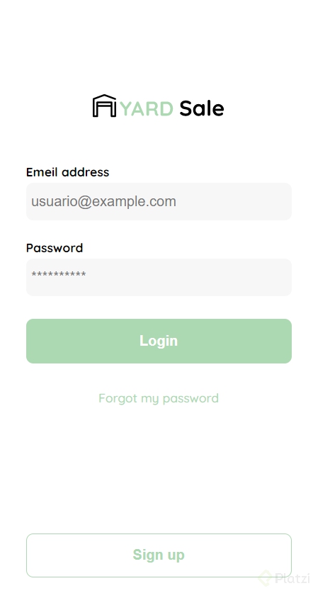
<label for="email" class="label">Emeil address</label>
<input type="text" id="email" placeholder="usuario@example.com" class="input input-email">
<label for="password" class="label">Password</label>
<input type="password" id="password" placeholder="**********" class="input input-password">
<input type="submit" value="Login" class="primary-button login-botton">
<a href="/">Forgot my password</a>
</form>
<button class="secondary-button signup-button">Sign up</button>
</div>
</div>
</body>```
### Crear y editar mi cuenta
** Archivos de la clase**
[clase4.html](https://static.platzi.com/media/public/uploads/clase4_a21ce01b-f548-4200-b75b-e91e7dd890fe.html)
**Codigo**
_++CSS++_
.login {
width: 100%;
height: 100vh;
display: grid;
place-items: center;
}
.form-container {
  display: grid;
  grid-template-rows: auto 1fr auto;
  width: 300px;
}

.logo {
  width: 150px;
  margin-bottom: 48px;
  justify-self: center;
  display: none;
}

.title {
  font-size: var(--lg);
  margin-bottom: 36px;
  text-align: start;
}

.form {
  display: flex;
  flex-direction: column;
}

.form div {
  display: flex;
  flex-direction: column;
}

.label {
  font-size: var(--sm);
  font-weight: bold;
  margin-bottom: 4px;
}

.input {
  background-color: var(--text-input-field);
  border: none;
  border-radius: 8px;
  height: 30px;
  font-size: var(--md);
  padding: 6px;
  margin-bottom: 12px;
}

.input-name,
.input-email,
.input-password {
  margin-bottom: 22px;
}

.primary-button {
  background-color: var(--hospital-green);
  border-radius: 8px;
  border: none;
  color: var(--white);
  width: 100%;
  cursor: pointer;
  font-size: var(--md);
  font-weight: bold;
  height: 50px;
}

.login-botton {
  margin-top: 14px;
  margin-bottom: 30px;
}

@media (max-width: 640px) {

  .form-container {
    height: 100%;
  }

  .form {
    height: 100%;
    justify-content: space-between;
  }
}```
HTML
<body>
<div class="login">
<div class="form-container">
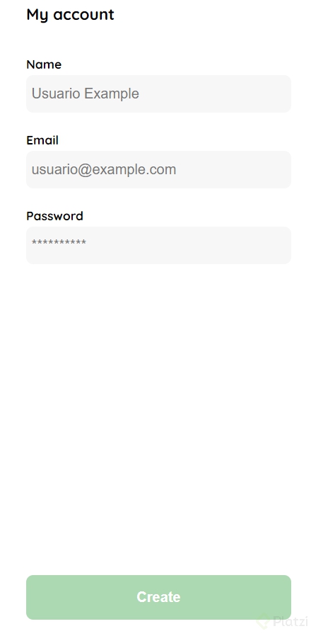
<h1 class="title">My account</h1>
<form action="/" class="form">
<div>
<label for="name" class="label">Name</label>
<input type="text" id="name" placeholder="Usuario Example" class="input input-name">
<label for="email" class="label">Email</label>
<input type="text" id="email" placeholder="usuario@example.com" class="input input-email">
<label for="password" class="label">Password</label>
<input type="password" id="password" placeholder="**********" class="input input-password">
</div>
<input type="submit" value="Create" class="primary-button login-botton">
</form>
</div>
</div>
</body>```
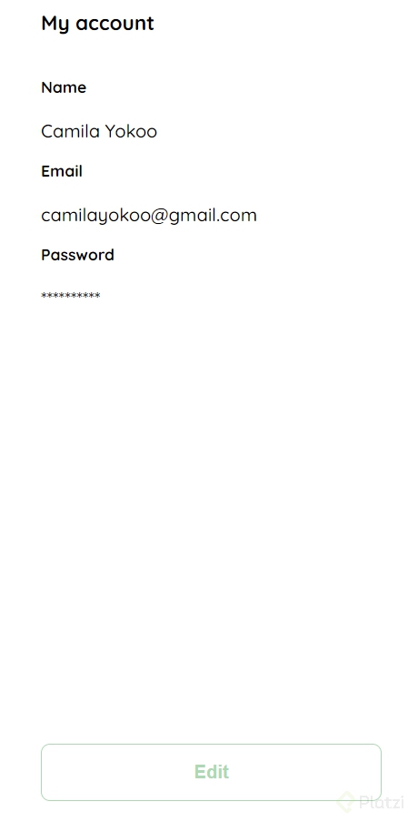
###Mi cuenta
**Archivos de la clase**
[clase5.html](https://static.platzi.com/media/public/uploads/clase5_3e844215-0c65-4452-9344-32a9d62661e6.html)
**Codigo**
_++CSS++_
.login {
width: 100%;
height: 100vh;
display: grid;
place-items: center;
}
.form-container {
  display: grid;
  grid-template-rows: auto 1fr auto;
  width: 300px;
}

.logo {
  width: 150px;
  margin-bottom: 48px;
  justify-self: center;
  display: none;
}

.title {
  font-size: var(--lg);
  margin-bottom: 36px;
  text-align: start;
}

.form {
  display: flex;
  flex-direction: column;
}

.form div {
  display: flex;
  flex-direction: column;
}

.label {
  font-size: var(--sm);
  font-weight: bold;
  margin-bottom: 4px;
}

.values {
  color: var(--very-ligth-pink);
  font-size: var(--md);
  margin: 8px 0 32px 0;
}

.secondary-button {
  background-color: var(--white);
  border-radius: 8px;
  border: 1px solid var(--hospital-green);
  color: var(--hospital-green);
  width: 100%;
  cursor: pointer;
  font-size: var(--md);
  font-weight: bold;
  height: 50px;
}

.login-botton {
  margin-top: 14px;
  margin-bottom: 30px;
}

@media (max-width: 640px) {

  .form-container {
    height: 100%;
  }

  .form {
    height: 100%;
    justify-content: space-between;
  }
}```
HTML
<body>
<div class="login">
<div class="form-container">
<h1 class="title">My account</h1>
<form action="/" class="form">
<div>
<label for="name" class="label">Name</label>
<p class="value">Camila Yokoo</p>
<label for="email" class="label">Email</label>
<p class="value">camilayokoo@gmail.com</p>
<label for="password" class="label">Password</label>
<p class="value">**********</p>
</div>
<input type="submit" value="Edit" class="secondary-button login-botton">
</form>
</div>
</div>
</body>```
###Maquetación responsiva: vistas principales
###Página de inicio: HTML
**Archivos de la clase**
[clase6.html](https://static.platzi.com/media/public/uploads/clase6_d6590f17-864a-42ed-88d9-25197996b404.html)
**Codigo**
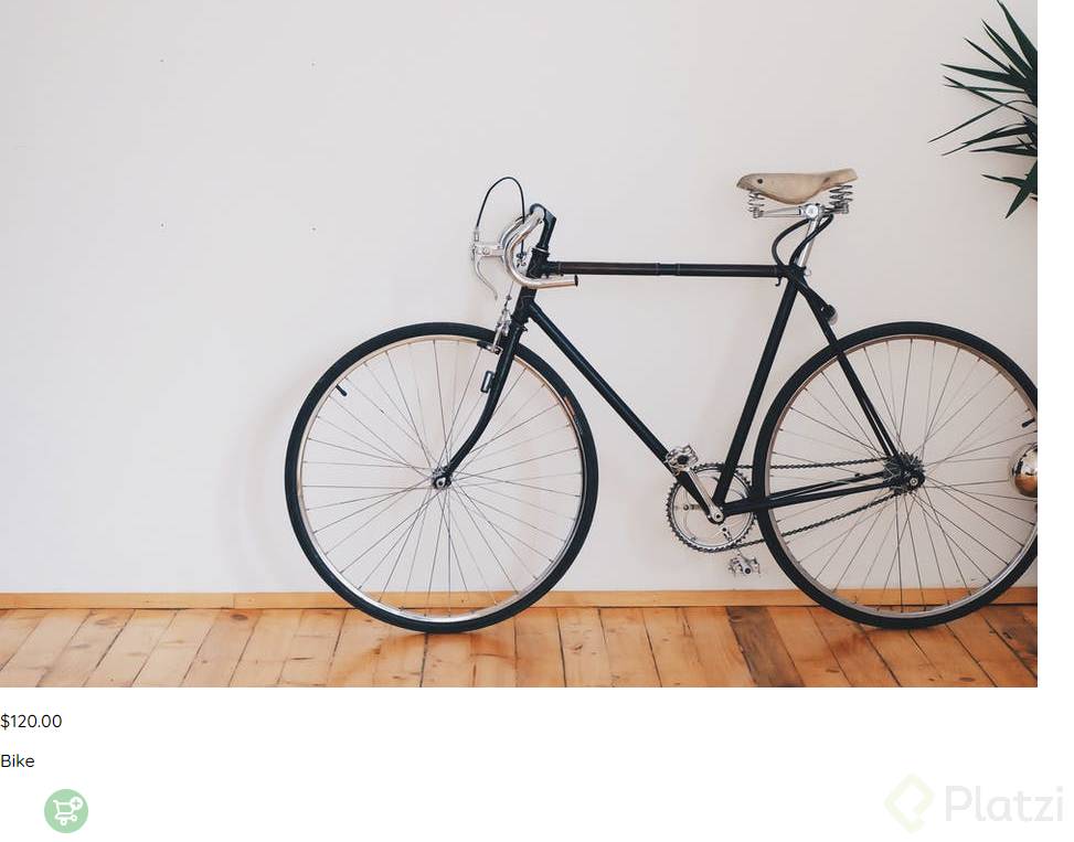
**HTML**
<section class=“main-container”>
<div class=“cards-container”>
  <div class="product-card">
    <img
      src="https://images.pexels.com/photos/276517/pexels-photo-276517.jpeg?auto=compress&cs=tinysrgb&h=650&w=940"
      alt="">
    <div class="product-info">
      <div>
        <p>$120.00</p>
        <p>Bike</p>
      </div>
      <figure>
        <img src="./icons/bt_add_to_cart.svg" alt="">
      </figure>
    </div>
  </div>
</section>```
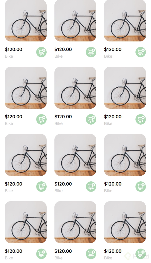
###Página de inicio: CSS
Archivos de la clase
Codigo
CSS
.cards-container {
display: grid;
grid-template-columns: repeat(auto-fill, 240px);
gap: 26px;
place-content: center;
}
.product-card {
width: 240px;
}
.product-card img {
width: 240px;
height: 240px;
border-radius: 20px;
object-fit: cover;
}
.product-info {
display: flex;
justify-content: space-between;
align-items: center;
margin-top: 12px;
}
.product-info figure {
margin: 0;
}
.product-info figure img {
width: 35px;
height: 35px;
}
.product-info div p:nth-child(1) {
font-weight: bold;
font-size: var(--md);
margin-top: 0;
margin-bottom: 4px;
}
.product-info div p:nth-child(2) {
font-size: var(--sm);
margin-top: 0;
margin-bottom: 0;
color: var(--very-ligth-pink);
}
@media (max-width: 640px) {
.cards-container {
grid-template-columns: repeat(auto-fill, 140px);
}
.product-card {
width: 140px;
}
.product-card img {
width: 140px;
height: 140px;
}
}```
###Menú desktop
**Archivos de la clase**
[clase7.html](https://static.platzi.com/media/public/uploads/clase7_85d16102-1f74-4ff9-a564-6ec0aea3c1ec.html)
**Codigo**
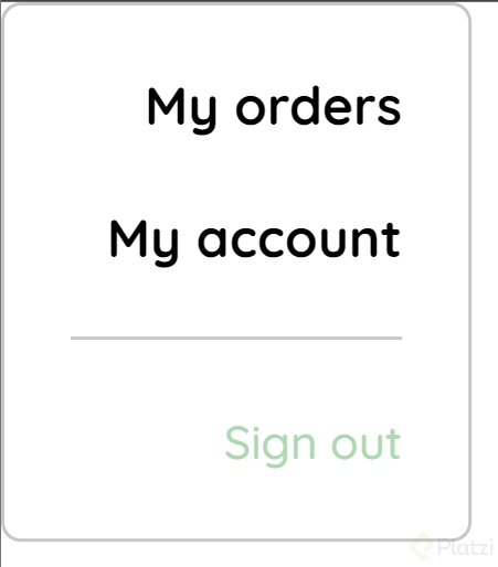
_++CSS++_
.desktop-menu {
  width: 100px;
  height: auto;
  border: 1px solid var(--very-ligth-pink);
  border-radius: 6px;
  padding: 20px 20px 0 20px;
}

.desktop-menu ul {
  list-style: none;
  padding: 0;
  margin: 0;
}

.desktop-menu ul li {
  text-align: end;
}

.desktop-menu ul li:nth-child(1),
.desktop-menu ul li:nth-child(2) {
  font-weight: bold;
}

.desktop-menu ul li:last-child {
  padding-top: 20px;
  border-top: 1px solid var(--very-ligth-pink);
}

.desktop-menu ul li:last-child a {
  color: var(--hospital-green);
  font-size: var(--sm);
}

.desktop-menu ul li a {
  color: var(--black);
  text-decoration: none;
  margin-bottom: 20px;
  display: inline-block;
}```
HTML
<body>
<div class="desktop-menu">
<ul>
<li>
<a href="/" class="title">My orders</a>
</li>
<li>
<a href="/">My account</a>
</li>
<li>
<a href="/">Sign out</a>
</li>
</ul>
</div>
</body>```
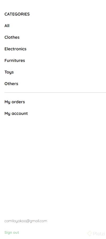
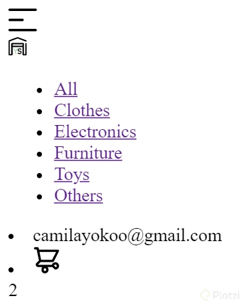
###Menú mobile
**Archivos de la clase**
[clase8.html](https://static.platzi.com/media/public/uploads/clase8_c46c344c-476e-46a7-a709-ac7a2b487c79.html)
**Codigo**
_++CSS++_
.mobile-menu {
padding: 24px;
}
.mobile-menu a {
  text-decoration: none;
  color: var(--black);
  font-weight: bold;
}

.mobile-menu ul {
  padding: 0;
  margin: 24px 0 0;
  list-style: none;
}

.mobile-menu ul:nth-child(1) {
  border-bottom: 1px solid var(--very-ligth-pink);
}

.mobile-menu ul:nth-child(3) {
  position: absolute;
  bottom: 0;
}

.mobile-menu ul li {
  margin-bottom: 24px;
}

.email {
  font-size: var(--sm);
  font-weight: 300 !important;
}

.sign-out {
  font-size: var(--sm);
  color: var(--hospital-green) !important;
}```
HTML
<body>
<div class="mobile-menu">
<ul>
<li>
<a href="/">CATEGORIES</a>
</li>
<li>
<a href="/">All</a>
</li>
<li>
<a href="/">Clothes</a>
</li>
<li>
<a href="/">Electronics</a>
</li>
<li>
<a href="/">Furnitures</a>
</li>
<li>
<a href="/">Toys</a>
</li>
<li>
<a href="/">Others</a>
</li>
</ul>
<ul>
<li>
<a href="/">My orders</a>
</li>
<li>
<a href="/">My account</a>
</li>
</ul>
<ul>
<li>
<a href="/" class="email">camilayokoo@gmail.com</a>
</li>
<li>
<a href="/" class="sign-out">Sign out</a>
</li>
</ul>
</div>
</body>```
###Mi orden: HTML
**Archivos de la clase**
[clase9.html](https://static.platzi.com/media/public/uploads/clase9_649cc00f-46c0-4938-b465-d0570ed04062.html)
**Codigo**
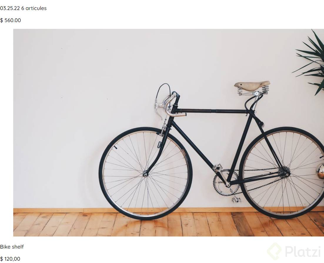
_++HTML++_
<div class=“my-order”>
<div class=“my-order-container”>
  <h1 class="title">My order</h1>

  <div class="my-order-content">
    <div class="order">
      <p>
        <span>03.25.22</span>
        <span>6 articules</span>
      </p>
      <p>$ 560.00</p>
    </div>

    <div class="shopping-cart">
      <figure>
        <img
          src="https://images.pexels.com/photos/276517/pexels-photo-276517.jpeg?auto=compress&cs=tinysrgb&h=650&w=940"
          alt="Bike">
      </figure>
      <p>Bike shelf</p>
      <p>$ 120,00</p>
    </div>
		</div>```

###Mi orden: CSS
Archivos de la clase
Codigo
CSS
.my-order {
width: 100%;
height: 100vh;
display: grid;
place-items: center;
}
.title {
font-size: var(--lg);
margin-bottom: 40px;
}
.my-order-container {
display: grid;
grid-template-rows: auto 1fr auto;
width: 300px;
}
.my-order-content {
display: flex;
flex-direction: column;
}
.order {
display: grid;
grid-template-columns: auto 1fr;
gap: 16px;
margin-bottom: 24px;
align-items: center;
background-color: var(--text-input-field);
border-radius: 8px;
padding: 0 15px;
}
.order p:nth-child(1) {
display: flex;
flex-direction: column;
}
.order p span:nth-child(1) {
font-size: var(--md);
font-weight: bold;
}
.order p span:nth-child(2) {
font-size: var(--sm);
color: var(--very-ligth-pink);
}
.order p:nth-child(2) {
text-align: end;
font-weight: bold;
}
.shopping-cart {
display: grid;
grid-template-columns: auto 1fr auto auto;
gap: 16px;
margin-bottom: 24px;
align-items: center;
}
.shopping-cart figure {
margin: 0;
}
.shopping-cart figure img {
width: 70px;
height: 70px;
border-radius: 20px;
object-fit: cover;
}
.shopping-cart p:nth-child(2) {
color: var(--very-ligth-pink);
}
.shopping-cart p:nth-child(3) {
font-size: var(--md);
font-weight: bold;
}```
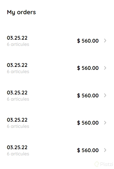
###Mis órdenes
**Archivos de la clase**
[clase10.html](https://static.platzi.com/media/public/uploads/clase10_99aff553-521a-422f-b0df-e8b4bbcf076f.html)
**Codigo**
_++CSS++_
.my-order {
width: 100%;
height: 100vh;
display: grid;
place-items: center;
}
.title {
  font-size: var(--lg);
  margin-bottom: 40px;
}

.my-order-container {
  display: grid;
  grid-template-rows: auto 1fr auto;
  width: 300px;
}

.my-order-content {
  display: flex;
  flex-direction: column;
}

.order {
  display: grid;
  grid-template-columns: auto 1fr auto;
  gap: 16px;
  margin-bottom: 12px;
  align-items: center;
}

.order p:nth-child(1) {
  display: flex;
  flex-direction: column;
}

.order p span:nth-child(1) {
  font-size: var(--md);
  font-weight: bold;
}

.order p span:nth-child(2) {
  font-size: var(--sm);
  color: var(--very-ligth-pink);
}

.order p:nth-child(2) {
  text-align: end;
  font-weight: bold;
}```
HTML
<div class="my-order">
<div class="my-order-container">
<h1 class="title">My orders</h1>
<div class="my-order-content">
<div class="order">
<p>
<span>03.25.22</span>
<span>6 articules</span>
</p>
<p>$ 560.00</p>
<img src="./icons/flechita.svg" alt="arrow">
</div>
<div class="order">
<p>
<span>03.25.22</span>
<span>6 articules</span>
</p>
<p>$ 560.00</p>
<img src="./icons/flechita.svg" alt="arrow">
</div>
<div class="order">
<p>
<span>03.25.22</span>
<span>6 articules</span>
</p>
<p>$ 560.00</p>
<img src="./icons/flechita.svg" alt="arrow">
</div>
<div class="order">
<p>
<span>03.25.22</span>
<span>6 articules</span>
</p>
<p>$ 560.00</p>
<img src="./icons/flechita.svg" alt="arrow">
</div>
<div class="order">
<p>
<span>03.25.22</span>
<span>6 articules</span>
</p>
<p>$ 560.00</p>
<img src="./icons/flechita.svg" alt="arrow">
</div>
</div>
</div>
</div>```
###Navbar: HTML
**Archivos de la clase**
[clase11.html](https://static.platzi.com/media/public/uploads/clase11_6fce3246-6d40-483e-981d-837577f7eca0.html)
**Codigo**
_++HTML++_
<body>
<nav>
<img src="./icons/icon_menu.svg" alt=“menu” class=“menu”>
<div class="navbar-left">
  <img src="./logos/logo_yard_sale.svg" alt="logo" class="logo">

  <ul>
    <li>
      <a href="/">All</a>
    </li>
    <li>
      <a href="/">Clothes</a>
    </li>
    <li>
      <a href="/">Electronics</a>
    </li>
    <li>
      <a href="/">Furniture</a>
    </li>
    <li>
      <a href="/">Toys</a>
    </li>
    <li>
      <a href="/">Others</a>
    </li>
  </ul>
</div>

<div class="navbar-right">
  <ul>
    <li class="navbar-email">camilayokoo@gmail.com</li>
    <li class="navbar-shopping-cart">
      <img src="./icons/icon_shopping_cart.svg" alt="shopping cart">
      <div>2</div>
    </li>
  </ul>
</div>
</nav>
</body>```
###Navbar: CSS
Archivos de la clase
Codigo
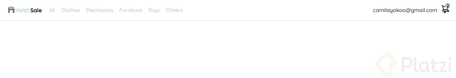
CSS
nav {
display: flex;
justify-content: space-between;
padding: 0 24px;
border-bottom: 1px solid var(--very-ligth-pink);
}
.menu {
display: none;
}
.logo {
width: 100px;
}
.navbar-left ul,
.navbar-right ul {
list-style: none;
padding: 0;
margin: 0;
display: flex;
align-items: center;
height: 60px;
}
.navbar-left {
display: flex;
}
.navbar-left ul {
margin-left: 12px;
}
.navbar-left ul li a,
.navbar-right ul li a {
text-decoration: none;
color: var(--very-ligth-pink);
border: 1px solid var(--white);
padding: 8px;
border-radius: 8px;
}
.navbar-left ul li a:hover,
.navbar-right ul li a:hover {
color: var(--hospital-green);
border: 1px solid var(--hospital-green);
}
.navbar-email {
color: var(--black);
font-family: var(--sm);
margin-right: 12px;
}
.navbar-shopping-cart {
position: relative;
}
.navbar-shopping-cart div {
width: 16px;
height: 16px;
background-color: var(--hospital-green);
border-radius: 50%;
font-size: var(--sm);
font-weight: bold;
position: absolute;
top: -6px;
right: -3px;
display: flex;
justify-content: center;
align-items: center;
}
@media (max-width: 640px) {
.menu {
display: block;
}
.navbar-left ul {
display: none;
}
.navbar-email {
display: none;
}
}```
###Detalle de producto
**Archivos de la clase**
[clase12.html](https://static.platzi.com/media/public/uploads/clase12_07013642-a5c9-4d93-a93c-fce27e2acf14.html)
**Codigo**
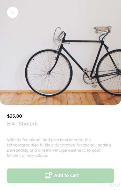
_++CSS++_
.product-detail {
  width: 360px;
  padding-bottom: 24px;
  position: absolute;
  right: 0;
}

.product-detail-close {
  background: var(--white);
  width: 14px;
  height: 14px;
  position: absolute;
  top: 24px;
  left: 24px;
  z-index: 2;
  padding: 12px;
  border-radius: 50%;
}

.product-detail-close:hover {
  cursor: pointer;
}

.product-detail>img:nth-child(2) {
  width: 100%;
  height: 360px;
  object-fit: cover;
  border-radius: 0 0 20px 20px;
}

.product-info {
  margin: 24px 24px 0 24px;
}

.product-info p:nth-child(1) {
  font-weight: bold;
  font-size: var(--md);
  margin-top: 0;
  margin-bottom: 4px;
}

.product-info p:nth-child(2) {
  color: var(--very-ligth-pink);
  font-size: var(--lg);
  margin-top: 0;
  margin-bottom: 36px;
}

.product-info p:nth-child(3) {
  color: var(--very-ligth-pink);
  font-size: var(--sm);
  margin-top: 0;
  margin-bottom: 36px;
}

.primary-button {
  background-color: var(--hospital-green);
  border-radius: 8px;
  border: none;
  color: var(--white);
  width: 100%;
  cursor: pointer;
  font-size: var(--md);
  font-weight: bold;
  height: 50px;
}

.add-to-cart-button {
  display: flex;
  align-items: center;
  justify-content: center;
}

@media (max-width: 640px) {
  .product-detail {
    width: 100%;
  }
}```
HTML
<body>
<aside class="product-detail">
<div class="product-detail-close">
<img src="./icons/icon_close.png" alt="close">
</div>
<img src="https://images.pexels.com/photos/276517/pexels-photo-276517.jpeg?auto=compress&cs=tinysrgb&h=650&w=940"
alt="bike">
<div class="product-info">
<p>$35,00</p>
<p>Bike Shoterk</p>
<p>With its functional and practical interior, this refrigerator also fulfils a decorative functional,
adding personality and a retro-vintage aesthetic to yout kitchen or workplace.
</p>
<button class="primary-button add-to-cart-button">
<img src="./icons/bt_add_to_cart.svg" alt="add to cart">
Add to cart
</button>
</div>
</aside>
</body>```
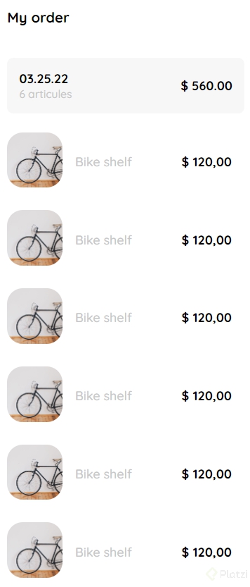
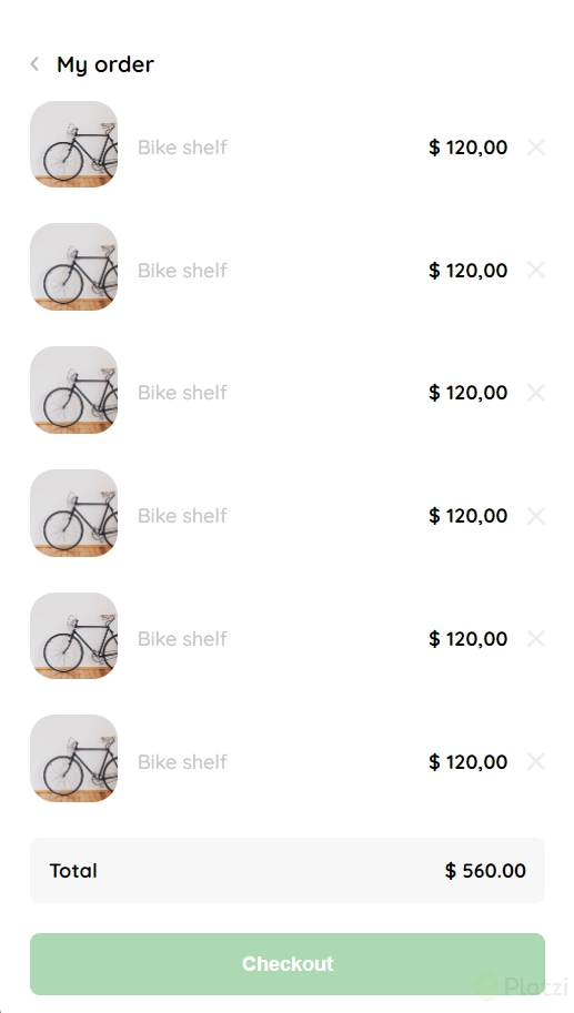
###Carrito de compras: HTML
**Archivos de la clase**
[clase13.html](https://static.platzi.com/media/public/uploads/clase13_1e402601-d206-45a3-a5ca-5e8c9a1bc3fd.html)
**Codigo**
_++CSS++_
.product-detail {
  width: 360px;
  padding: 24px;
  box-sizing: border-box;
  position: absolute;
  right: 0;
}

.title-container {
  display: flex;
}

.title-container img {
  transform: rotate(180deg);
  margin-right: 14px;
}

.title {
  font-size: var(--lg);
  font-weight: bold;
}

.order {
  display: grid;
  grid-template-columns: auto 1fr;
  gap: 16px;
  margin-bottom: 24px;
  align-items: center;
  background-color: var(--text-input-field);
  border-radius: 8px;
  padding: 0 15px;
}

.order p:nth-child(1) {
  display: flex;
  flex-direction: column;
}

.order p span:nth-child(1) {
  font-size: var(--md);
  font-weight: bold;
}

.order p:nth-child(2) {
  text-align: end;
  font-weight: bold;
}

.shopping-cart {
  display: grid;
  grid-template-columns: auto 1fr auto auto;
  gap: 16px;
  margin-bottom: 24px;
  align-items: center;
}

.shopping-cart figure {
  margin: 0;
}

.shopping-cart figure img {
  width: 70px;
  height: 70px;
  border-radius: 20px;
  object-fit: cover;
}

.shopping-cart p:nth-child(2) {
  color: var(--very-ligth-pink);
}

.shopping-cart p:nth-child(3) {
  font-size: var(--md);
  font-weight: bold;
}

.primary-button {
  background-color: var(--hospital-green);
  border-radius: 8px;
  border: none;
  color: var(--white);
  width: 100%;
  cursor: pointer;
  font-size: var(--md);
  font-weight: bold;
  height: 50px;
}

@media (max-width: 640px) {
  .product-detail {
    width: 100%;
  }

  /* .title-container {
    display: none;
  } */
}```
HTML
<aside class="product-detail">

    <div class="title-container">
      <img src="./icons/flechita.svg" alt="arrow">
      <p class="title">My order</p>
    </div>


    <div class="my-order-content">

      <div class="shopping-cart">
        <figure>
          <img
            src="https://images.pexels.com/photos/276517/pexels-photo-276517.jpeg?auto=compress&cs=tinysrgb&h=650&w=940"
            alt="Bike">
        </figure>
        <p>Bike shelf</p>
        <p>$ 120,00</p>
        <img src="./icons/icon_close.png" alt="close">
      </div>

      <div class="order">
        <p>
          <span>Total</span>
        </p>
        <p>$ 560.00</p>
      </div>

      <button class="primary-button">
        Checkout
      </button>

    </div>

  </aside>```

###FINAL
Curso Práctico de Frontend Developer
COMPARTE ESTE ARTÍCULO Y MUESTRA LO QUE APRENDISTE
