Great UI starts with a clear theme. Here you’ll see how to switch between design styles in Lovable, apply them to a dashboard, and refine the result through precise prompting and iteration to create a unique, user‑focused experience.
How do design themes shape your app’s UI and UX?
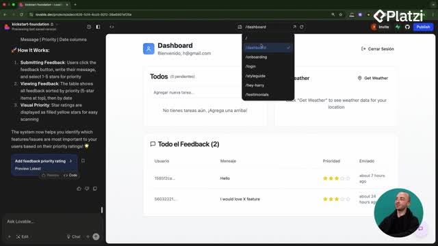
Choosing a theme sets the visual language and the experience users feel. Glassmorphism brings a “glass” look with blurred backgrounds. Neo‑Brutalism goes bold with thick lines and bright colors for a more cartoony feel. Your choice should reflect your target audience and product goals. The workflow shown focuses on applying a theme to a dashboard and refining it step by step in Lovable.
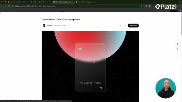
What is glassmorphism and how was it applied?
Glassmorphism makes components look like translucent glass, especially effective when colorful elements sit behind them.
- Convert all components to a glassmorphism style.
- Add a big blurred gradient circle in the background.
- Refactor dashboard components to follow the new theme.
- Remove solid white card backgrounds so the blur shows through.
- Add background elements to make the glass effect pop.
The key is specificity: be explicit about what to change, not just that “it doesn’t work.”
Why do context and iteration matter when prompting Lovable?
Sometimes Lovable edits code but misses the intent. Provide more context to guide the LLM:
- State exactly which components need changes.
- Point out what is wrong (for example: background still white).
- Use the photo dropper to attach a screenshot so the model “sees” the issue.
- Repeat the prompt until the UI matches your goal.
This iterative loop led to a clear example of the glassmorphism look across the app.
How does Neo‑Brutalism change the look and when should you pick it?
Neo‑Brutalism communicates with big shapes, thick strokes, and bold colors. It can feel playful and striking—great when your audience expects high contrast and personality. The session switches from glassmorphism to Neo‑Brutalism using the same prompt structure.
What happened when “Neon Brutalism” was prompted?
A simple wording slip (“Neon Brutalism” instead of “Neo‑Brutalism”) led Lovable to add glows and a very bright, animated look. The tool followed the instruction literally, producing a neon take while keeping the brutalist vibe. This highlights two lessons:
- Prompts must be precise. Small word changes can shift the entire style.
- A neon, glowy brutalist look might suit contexts like a crypto‑themed UI.
When should you lock your theme and style guide?
Late theme changes are hard, especially in big projects. Lock your theme early and match your style guide to it before building the rest of the app. Lovable handles small, step‑by‑step changes better than massive refactors. Set the foundations first to make later work smoother and more enjoyable.
Which skills and keywords will help you replicate this workflow?
Strong outcomes come from clarity, iteration, and alignment with user needs. These ideas recur throughout the demonstration and will help you reproduce the process.
- Design theme / design system: the visual rules that define your app’s look.
- UI / UX: user interface and user experience; style choices shape both.
- Glassmorphism: translucent components with blurred backgrounds; needs colorful backdrops to shine.
- Neo‑Brutalism: bold shapes, thick lines, bright colors for a cartoony feel.
- Neon Brutalism (prompt typo): resulted in glows and animations; shows prompt sensitivity.
- Dashboard: the page targeted for changes.
- Components: modular UI parts converted and refactored to match the theme.
- Blurred gradient circle: a background element used to enhance the glass effect.
- Background elements: added to create depth and visible blur behind glass.
- Refactor: redo components to follow the new theme consistently.
- Prompting: give specific, actionable instructions to Lovable.
- Context: screenshots and clear notes that help the LLM understand the issue.
- Style guide: document and align styles before scaling your build.
- Target audience: choose the theme that resonates with your users.
- Iteration: repeat, adjust, and refine until the UI meets your standard.
Want to share your theme choice and why it fits your users? Post a comment with your use case and the prompts that worked best for you.

