Shipped with every Lovable project, ShadCN gives you a solid UI foundation so you can ship faster with confidence. Learn how to plug in pre-built components from 21st Dev, keep their visual effects intact, and upgrade your app’s look and feel without rebuilding from scratch.
What is ShadCN in Lovable and why does it matter?
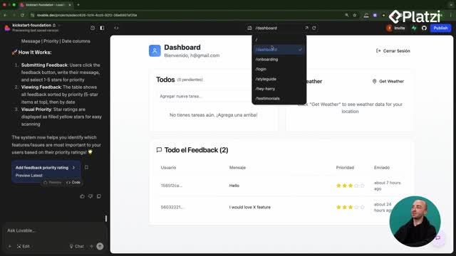
ShadCN is a UI kit that powers many modern apps. It includes tables, charts, dashboards, and more, so you can assemble interfaces quickly. In Lovable, it’s baked into every project, giving you ready-to-use building blocks.
- Open the code editor: Components > UI. You’ll see ShadCN components already in use.
- Treat them as building blocks to create a UI or application fast.
- Combine them with external libraries like 21st Dev to add polish and effects.
Where are ShadCN components in your project?
They live under the Components/UI folder. These are the default primitives your app uses, so you can compose screens rapidly and keep consistency.
Why use 21st Dev with ShadCN?
21st Dev is a directory of community-built components. You can reuse, edit, and adapt them, which speeds development because you’re not starting from zero. It’s ideal for adding unique effects and inviting interactions.
How to import 21st Dev components and keep effects?
The goal: add a more inviting upload button with a moving border effect. The key is to copy the component code precisely and guide Lovable to target the right element.
- Browse 21st Dev and preview effects by hovering: try shiny, upload, or moving border buttons.
- Pick a style that’s consistent with your theme and purpose.
- In Lovable, use the edit tool to select the existing button so the target is clear.
- Prefer manual copy over “Copy Prompt” to avoid mistakes.
What prompts help Lovable copy perfectly?
- Tell Lovable: “replace this button with this new component. Ensure you copy the component perfectly to retain its effect.”
- Copy the demo code and the two component files from 21st Dev.
- Update the Tailwind config: paste the snippet at the end, keeping line integrity.
- Run the prompt and verify the effect rendered correctly.
How do you refine the result?
- Tweak size, spacing, or tone to match your theme.
- Keep the effect intact by avoiding structural changes to the copied code.
- If needed, adjust Tailwind classes without altering the component’s core logic.
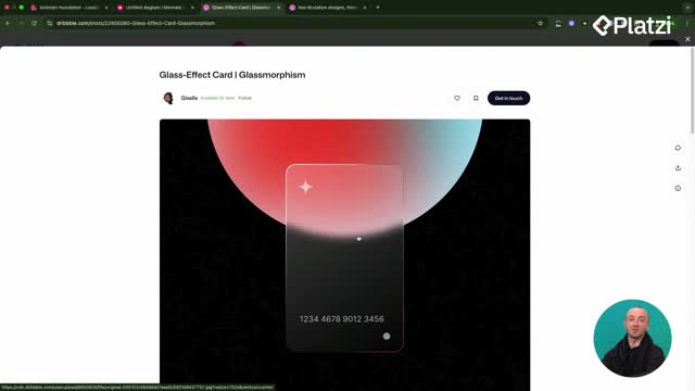
How to enhance a photo gallery with a hover glare card?
You can level up image cards with a hover glare effect so photos feel more dynamic without heavy custom code.
- Find the glare card in 21st Dev and open the component view.
- In Lovable, if you can’t select the whole card, select the container that wraps it.
- Ask Lovable to “add a new hover effect to the image using the following component” and to “retain functionality/design while adapting it to our image cards.”
What is the correct paste order?
- Paste the demo first, then the component code right after it.
- Avoid inserting code in the middle of other blocks.
- Keep related snippets together so dependencies resolve.
What skills make this process smooth?
- Precisely target elements with the edit tool.
- Copy code completely to preserve animations and styles.
- Adapt class names and containers without breaking structure.
- Keep configs like Tailwind in sync.
- Iterate quickly: test, adjust, and validate the hover effect.
Want more UI upgrades or stuck integrating a component? Share your use case or the effect you’re aiming for and let’s troubleshoot together.

