Crear proyectos es de hecho la parte más importante de tu aprendizaje, ya que al crear algo real fortaleces tu conocimiento en gran medida.
Proyecto de creación del curso
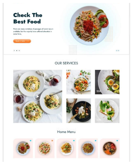
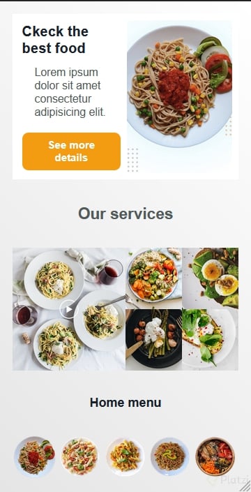
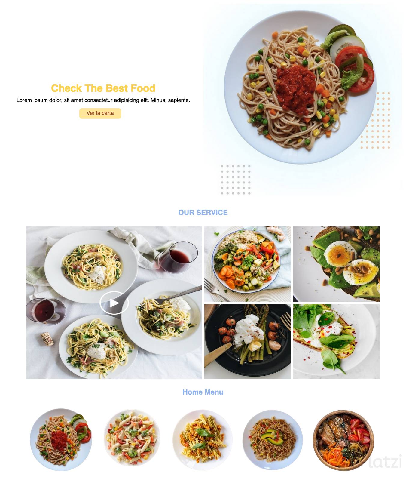
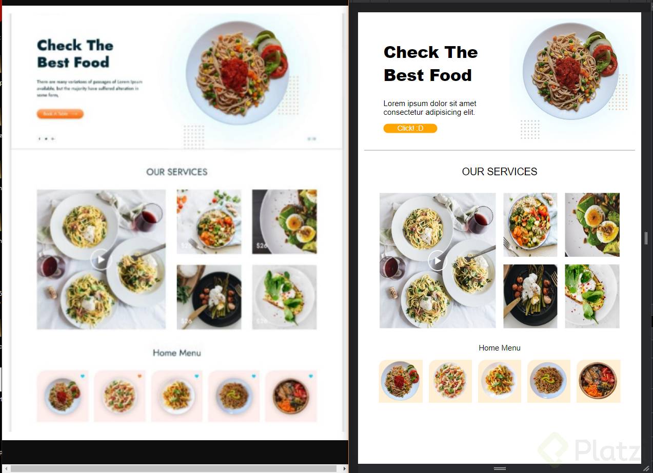
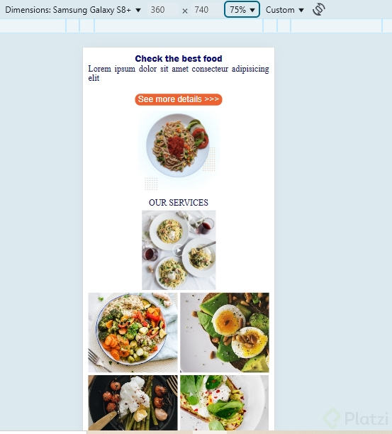
Demos un vistazo al template final que vamos a construir:
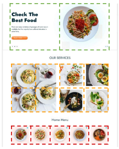
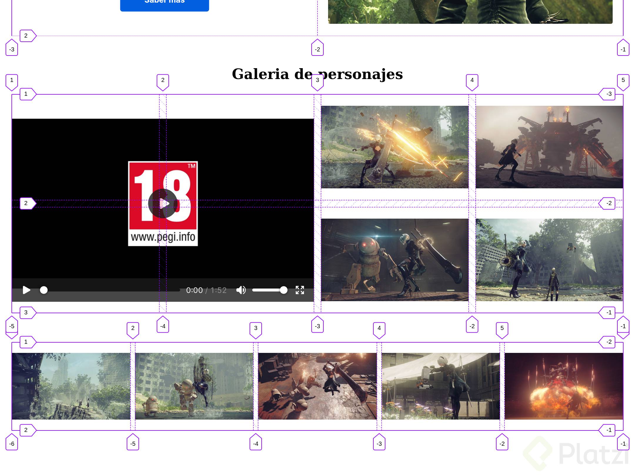
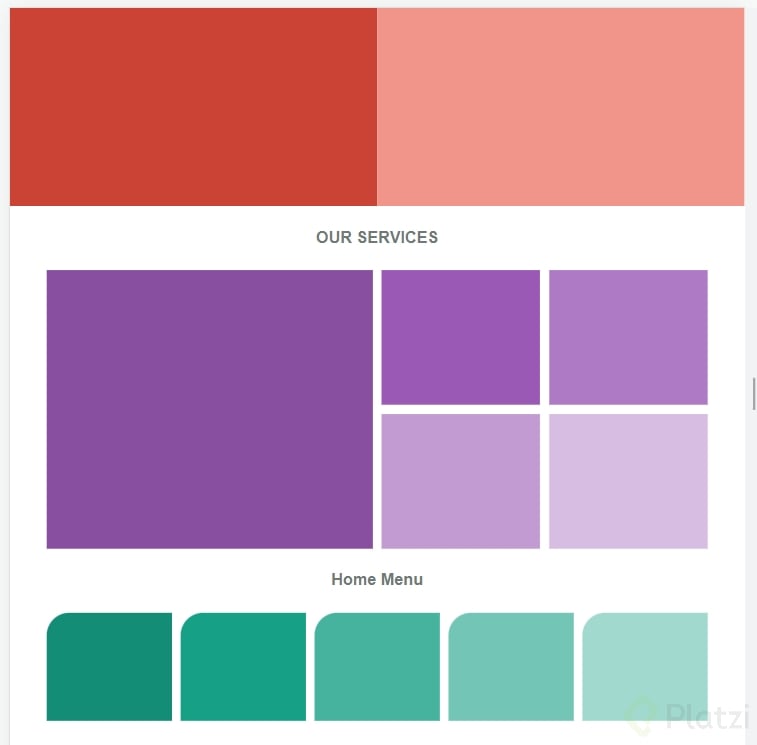
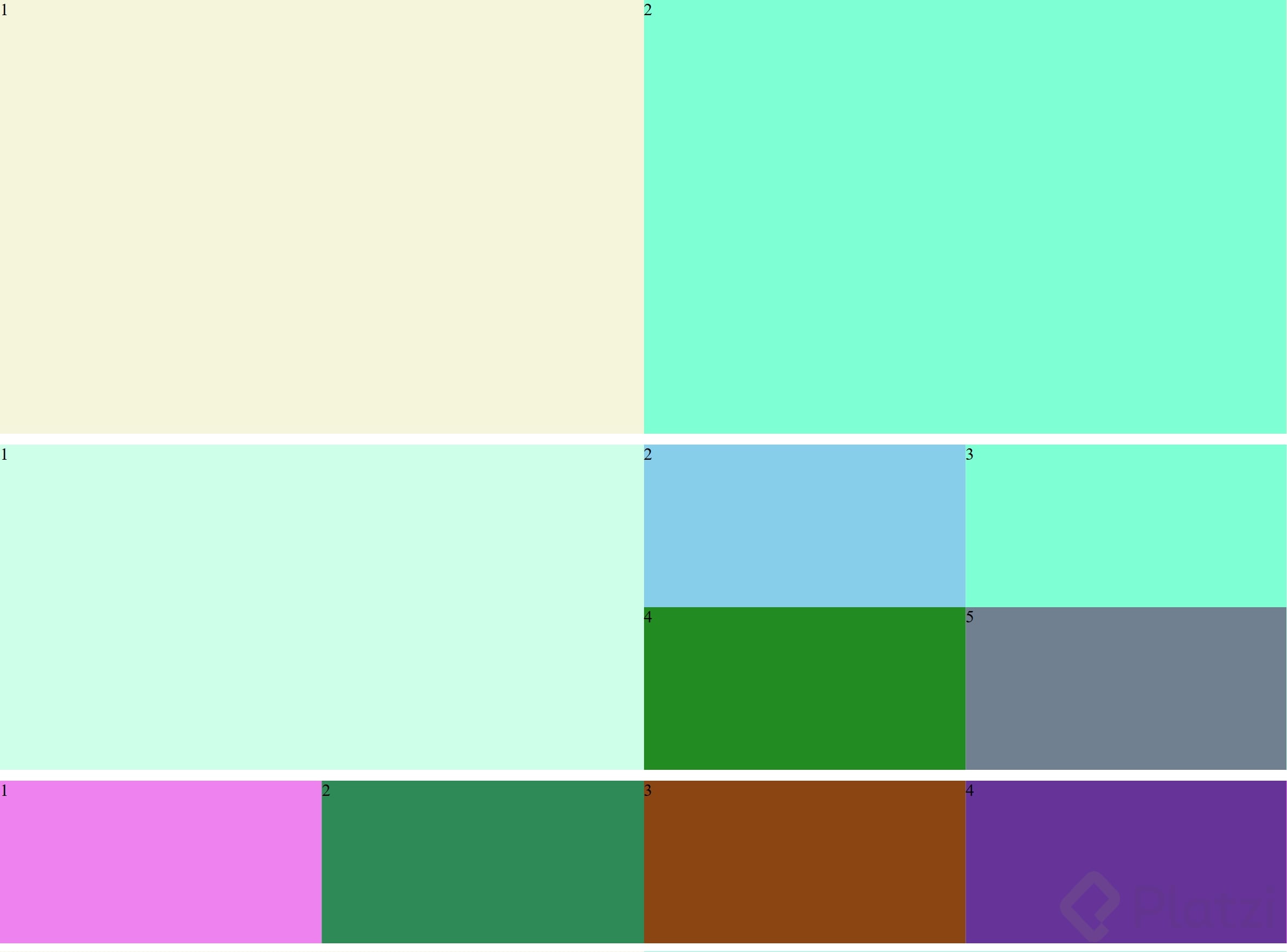
Bien, el primer paso es imaginar cómo están divididas nuestras secciones:
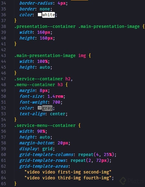
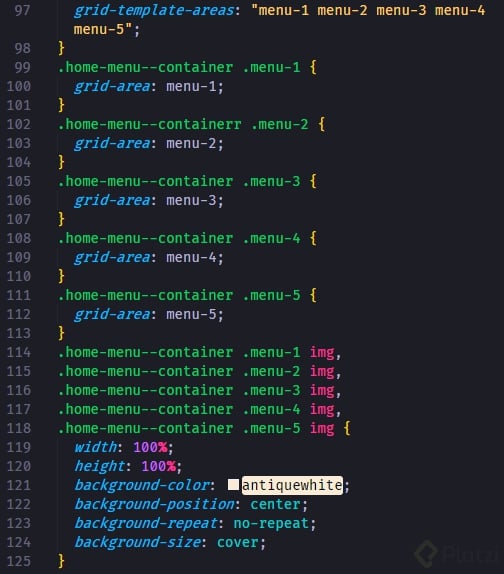
La celda es la unidad mínima de nuestra grilla, por lo que debemos prestarle mucha atención. En la sección de la mitad, observamos que las cuatro celdas pequeñas de la derecha nos indican que la sección tendrá cuatro columnas y dos filas.
Maquetación Inicial
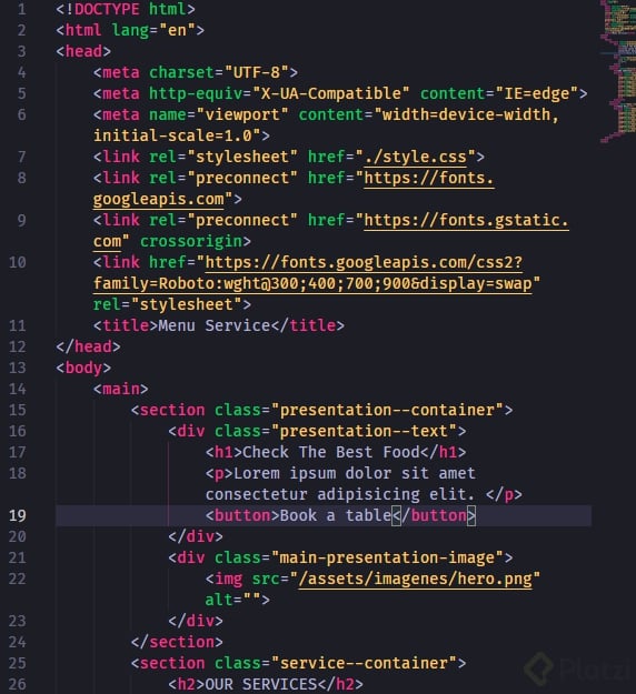
Primero, creamos una estructura simple con un main dentro.
<body><main></main></body>
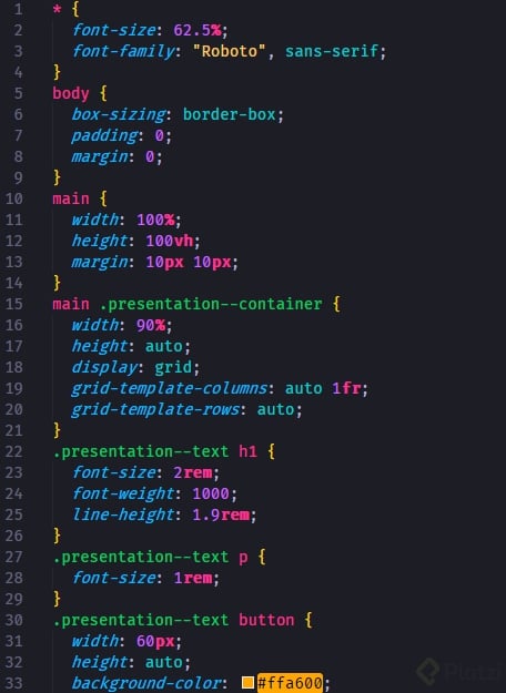
En los estilos, seteamos todo la hoja para usar la fuente Roboto.
Vamos por buen camino, has avanzado, espero no te detengas, el camino es largo pero satisfactorio y cuando lleguemos arriba, hincharemos el pecho con orgullo diciendo, SI PUDE.
Tip de maquetación con grid:
En una posible grilla ver cual es el elemento más pequeño que tiene que estar en la grilla.
A partir del elemento más pequeño determinar el número de filas y columnas a necesitar para maquetar todos los elementos de dicha sección de la web.
Muchas gracias por el tip
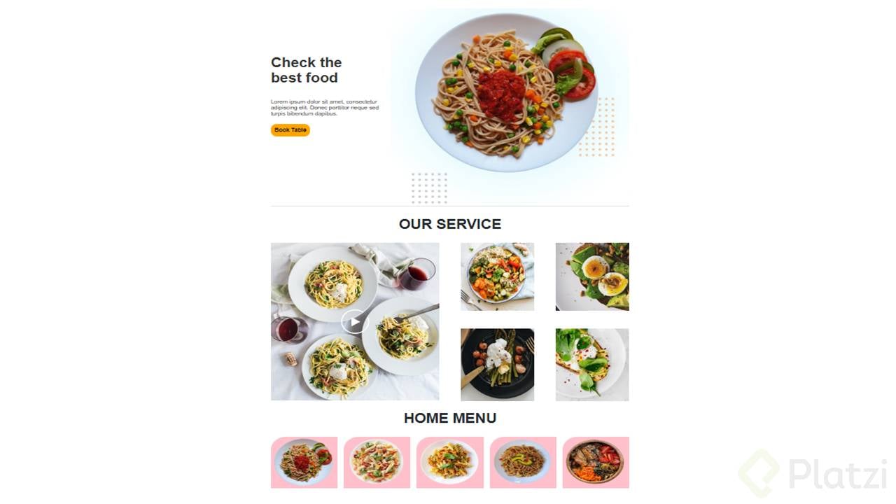
Me rete a mi misma e hice el proyecto sin ver los videos de este módulo. Lo hice a 320px ya que estoy manteniendo lo aprendido en el curso de Responsive Design: Mobile First. He aquí el resultado:
El proyecto se me muy interesante, siento que tenemos todo el conocimiento para desarrollarlo. Muchas gracias por las practicas que nos dejo en cada clase, sin duda fue el diferenciador para absorber mejor cada concepto. Vamos con todo! 😎
Me impacto verlo al inicio, después cuando puso la grilla encima se me hizo muy simple
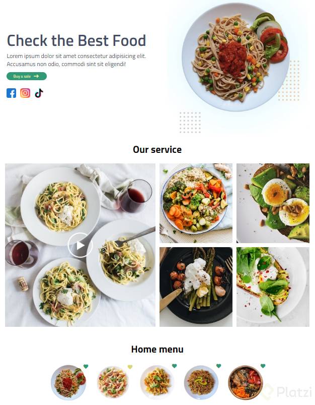
Yo lo hice sin ver el resto de clases solo para ver como me quedaba XD
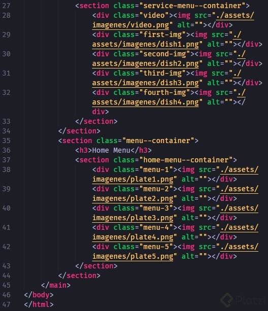
HTML
<!DOCTYPE html><html lang="en"><head><meta charset="UTF-8"><meta http-equiv="X-UA-Compatible" content="IE=edge"><meta name="viewport" content="width=device-width, initial-scale=1.0"><link rel="stylesheet" href="./estilos.css"><title>Grid layout</title></head><body><div class="container"><div class="item-1"><h2>Ckeck the best food</h2><p>Lorem ipsum dolor sit amet consectetur adipisicing elit.</p><button>See more details</button></div><figure class="item-2"><img src="https://i.postimg.cc/zD21m9fG/hero.png" alt="plato de comida"></figure></div><h1 class="services">Our services</h2><div class="container-services"><img src="https://i.postimg.cc/k5qHRc5H/video.png" alt="video de nuestros platos"class="plate-1"><img src="https://i.postimg.cc/qR0pRyfB/dish1.png" alt="plato 1"class="plate-2"><img src="https://i.postimg.cc/Wp5sNd5j/dish2.png" alt="plato 2"class="plate-3"><img src="https://i.postimg.cc/hPwgmHF5/dish3.png" alt="plato 3"class="plate-4"><img src="https://i.postimg.cc/MG08hHnC/dish4.png" alt="plato 4"class="plate-5"></div><h3 class="menu">Home menu</h4><div class="menu-container"><img src="https://i.postimg.cc/15g1yJgc/plate1.png" alt="plato 1"><img src="https://i.postimg.cc/cH1P2my3/plate2.png" alt="plato 2"><img src="https://i.postimg.cc/rs3bd2dG/plate3.png" alt="plato 3"><img src="https://i.postimg.cc/Fsk8MzqT/plate4.png" alt="plato 4"><img src="https://i.postimg.cc/rw63Mc2M/plate5.png" alt="plato 5"></div></body></html>
vamos a por este proyecto les dejo el repositorio en github al final del curso
excelente clase
Diseñando con mobile first:
en este punto les pregunto, ¿es mejor utilizar GRID o FLEXBOX?
Hola Darwin, creo que en este caso se podrian utilizar ambas. Por ej: en el contenedor central (donde estaria el video y los otros cuatro platos) sin dudas que aplicando grid hace muy facil posicionar los elementos en donde los necesitamos.
Y en la ultima section (donde esta home menu) con flex box tambien podemos posicionar muy rapido a esas imagenes.