Leyendas, etiquetas, títulos, tamaño
Clase 6 de 18 • Curso de Visualización de Datos con Matplotlib y Seaborn
Resumen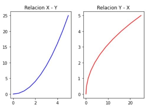
Para dar contexto a nuestros gráficos necesitamos usar títulos, leyendas, tamaño o etiquetas, para que nuestra gráfica tenga un contexto más amplio.
Cómo dar contexto a los gráficos
- Creamos nuestras gráficas comunes
fig, (ax1,ax2) = plt.subplots(1,2)
ax1.plot(x,y, 'b')
ax2.plot(y,x, 'r')
plt.show()
Contexto a los gráficos con títulos
Para crear los títulos realiza lo siguiente:
fig, (ax1,ax2) = plt.subplots(1,2)
ax1.plot(x,y, 'b')
ax1.set_title(""Relacion X - Y"")

ax2.plot(y,x, 'r')
ax2.set_title(""Relacion Y - X"")
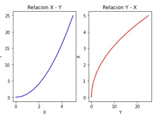
Contexto agregando etiquetas
- Agrega labels en los ejes
fig, (ax1,ax2) = plt.subplots(1,2)
ax1.plot(x,y, 'b', )
ax1.set_title(""Relacion X - Y"")
ax1.set_xlabel(""X"")
ax1.set_ylabel(""Y"")

ax2.plot(y,x, 'r')
ax2.set_title(""Relacion Y - X"")
ax2.set_xlabel(""Y"")
ax2.set_ylabel(""X"")
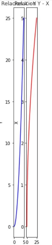
Cambiar el tamaño a las figuras
Realiza la siguiente acción:
fig, (ax1,ax2) = plt.subplots(1,2, figsize= (1,10))
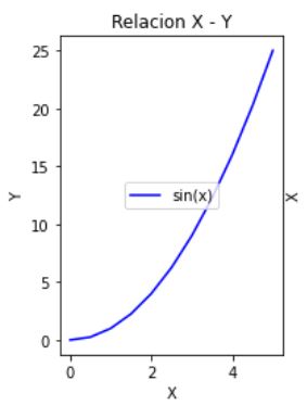
* Aplicar etiquetas (por defecto pone la mejor opción)
fig, (ax1,ax2) = plt.subplots(1,2)
ax1.plot(x,y, 'b', label = ""sin(x)"")
ax1.set_title(""Relacion X - Y"")
ax1.set_xlabel(""X"")
ax1.set_ylabel(""Y"")
ax1.legend()
* Modificar la localización de la etiqueta
ax1.legend(loc = ""upper center"")
- Otras ubicaciones
| upper right | upper left | lower left | lower right | right |
|---|