Pyplot básico
Clase 2 de 18 • Curso de Visualización de Datos con Matplotlib y Seaborn
Resumen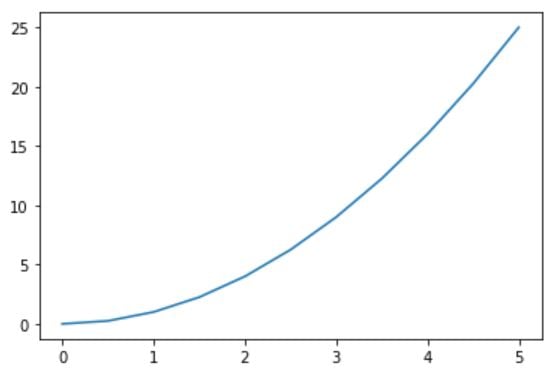
Pyplot es una herramienta que tiene Matplotlib para ejecutar gráficas de manera sencilla. Véamos cómo puedes lograrlo.
¿Cómo empezar a usar Pyplot?
- Importamos Matplotlib y Pandas
import matplotlib.pyplot as plt
import numpy as np
- Creamos nuestras variables
x = linspace(0,5,11)
-> [0. , 0.5, 1. , 1.5 ,2. , 2.5, 3.,  3.5, 4.,  4.5, 5. ]
y = x ** 2
-> [ 0.  ,  0.25,  1.  ,  2.25,  4.  ,  6.25,  9.  , 12.25, 16.  ,20.25, 25.]
- Graficar en función de y
plt.plot(x,y)
plt.show()
Modificar gráficas usando Pyplot
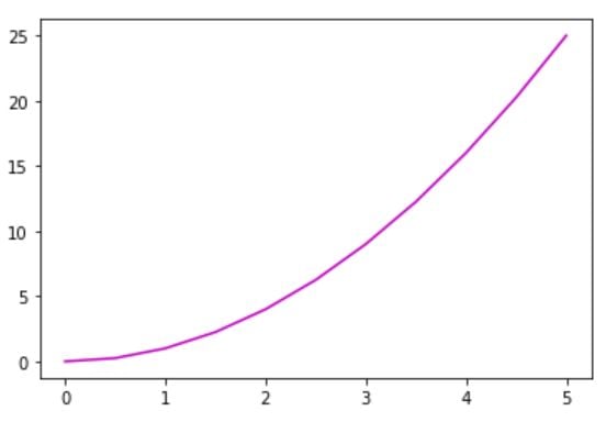
Ahora, vamos a cambiar color de la gráfica
| Character | color |
|---|---|
| ‘b’ | blue |
| ‘g’ | green |
| ‘m’ | magenta |
plt.plot(x,y, 'm')
plt.show()
Cambiar más parámetros
Format Strings
| character | description |
|---|---|
| ‘.’ | point marker |
| ‘,’ | pixel marker |
| ‘o’ | circle marker |
| ‘v’ | triangle_down marker |
| ‘^’ | triangle_up marker |
| ‘<’ | triangle_left marker |
| ‘>’ | triangle_right marker |
Line Styles
| character | description |
|---|---|
| ‘-’ | solid line style |
| ‘–’ | dashed line style |
| ‘-.’ | dash-dot line style |
| ‘:’ | dotted line style |
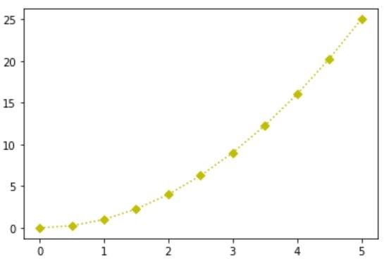
plt.plot(x,y, 'yD:') #grafica de color amarillo, con diamantes y puntos consecutivos
plt.show()
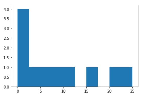
Crear histograma
plt.hist(y)  #histograma de los valores de y
plt.show()
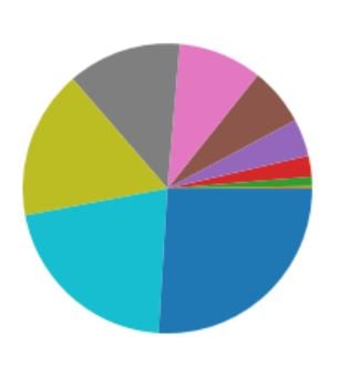
Crear gráfica de pie
plt.pie(y)
plt.show()
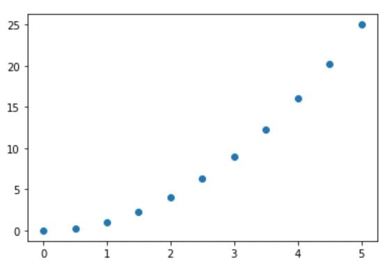
Conocer correlación entre variables
plt.scatter(x,y)  #correlacion entre la variable x e y
plt.show()
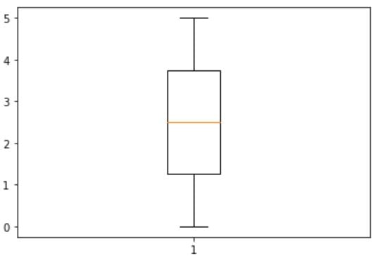
Distribución de los datos
- Distribución de los datos: Gráfico de caja
plt.boxplot(x)
plt.show()