




Quise hacer un card de algún post de red social:

Los stacks en SwiftUI son herramientas fundamentales para crear y gestionar la disposición de elementos en una interfaz de usuario. Son componentes que nos permiten agrupar múltiples vistas en una única vista más compleja, organizando elementos en un eje específico. Existen tres tipos principales de stacks en SwiftUI, y cada uno tiene un propósito único:
¿Cómo se implementa un VStack?
El VStack es utilizado para agrupar elementos de manera vertical. En un proyecto de SwiftUI, se implementa de la siguiente manera:
VStack {
    Text("Nunca")
    Text("Pares")
    Text("De")
    Text("Aprender")
}
En este ejemplo, los textos se alinean uno sobre el otro en un eje vertical. Además, existen atributos que se pueden modificar para personalizar el alineamiento y el espaciado entre los elementos del VStack.
Alineación: controla la alineación de los elementos dentro del VStack. Se puede configurar con el parámetro alignment y acepta valores como .leading, .trailing y .center.
Espaciado: define el espacio entre los elementos dentro del VStack con el parámetro spacing.
VStack(alignment: .leading, spacing: 20) { Text("Nunca") Text("Pares") Text("De") Text("Aprender") }
Además, podemos usar Spacer para distribuir el espacio, y frame para definir dimensiones específicas.
¿Cómo funciona un HStack?
El HStack organiza elementos de manera horizontal, permitiendo que estos se dispongan uno al lado del otro. La implementación de un HStack es similar a la de un VStack pero con un enfoque horizontal:
HStack {
    Text("Nunca")
    Text("Pares")
    Text("De")
    Text("Aprender")
}
Al igual que el VStack, los atributos de alineación y espaciado pueden ser modificados. Un ejemplo de cómo podemos ajustar estos atributos es el siguiente:
HStack(alignment: .center, spacing: 20) {
    Text("Nunca")
    Text("Pares")
    Text("De")
    Text("Aprender")
}
¿Qué es un ZStack y cómo se utiliza?
El ZStack permite la superposición de elementos, colocando uno delante del otro. Es ideal para composiciones donde se desea un efecto de profundidad.
ZStack {
    Color.green
    Circle()
    Rectangle()
        .frame(width: 100, height: 100)
        .foregroundColor(.yellow)
    Text("Hello World")
}
En este código, el Color.green ocupa todo el espacio disponible, seguido por un Circle y un Rectangle, uno sobre otro. Cada elemento del ZStack puede alinearse utilizando directrices como top, bottom, leading, trailing, etc.
¿Cómo combinar diferentes stacks para crear vistas avanzadas?
Combinar diferentes tipos de stacks puede ser la clave para diseñar interfaces de usuario complejas y dinámicas. Se pueden anidar stacks dentro de otros para lograr el diseño deseado:
ZStack {
    HStack(spacing: 0) {
        Rectangle()
            .frame(width: 50, height: 100)
            .foregroundColor(.red)

        Rectangle()
            .frame(width: 50, height: 100)
            .foregroundColor(.yellow)
    }

    VStack {
        Text("Hello")
        Text("World")
    }
}
En este ejemplo, se utiliza un ZStack para crear una composición donde un HStack contiene dos rectángulos lado a lado, mientras que un VStack dentro del ZStack organiza dos textos uno encima del otro.
No olvides compartir tus creaciones con la comunidad y aprovechar los recursos proporcionados para seguir creciendo en tu aprendizaje.

Curso de Desarrollo de Aplicaciones con SwiftUI
Clase 5 / 23
Curso de Desarrollo de Aplicaciones con SwiftUI
Clase 5 / 23
Los stacks en SwiftUI son herramientas fundamentales para crear y gestionar la disposición de elementos en una interfaz de usuario. Son componentes que nos permiten agrupar múltiples vistas en una única vista más compleja, organizando elementos en un eje específico. Existen tres tipos principales de stacks en SwiftUI, y cada uno tiene un propósito único:
El VStack es utilizado para agrupar elementos de manera vertical. En un proyecto de SwiftUI, se implementa de la siguiente manera:
VStack {
Text("Nunca")
Text("Pares")
Text("De")
Text("Aprender")
}
En este ejemplo, los textos se alinean uno sobre el otro en un eje vertical. Además, existen atributos que se pueden modificar para personalizar el alineamiento y el espaciado entre los elementos del VStack.
Alineación: controla la alineación de los elementos dentro del VStack. Se puede configurar con el parámetro alignment y acepta valores como .leading, .trailing y .center.
Espaciado: define el espacio entre los elementos dentro del VStack con el parámetro spacing.
VStack(alignment: .leading, spacing: 20) { Text("Nunca") Text("Pares") Text("De") Text("Aprender") }
Además, podemos usar Spacer para distribuir el espacio, y frame para definir dimensiones específicas.
El HStack organiza elementos de manera horizontal, permitiendo que estos se dispongan uno al lado del otro. La implementación de un HStack es similar a la de un VStack pero con un enfoque horizontal:
HStack {
Text("Nunca")
Text("Pares")
Text("De")
Text("Aprender")
}
Al igual que el VStack, los atributos de alineación y espaciado pueden ser modificados. Un ejemplo de cómo podemos ajustar estos atributos es el siguiente:
HStack(alignment: .center, spacing: 20) {
Text("Nunca")
Text("Pares")
Text("De")
Text("Aprender")
}
El ZStack permite la superposición de elementos, colocando uno delante del otro. Es ideal para composiciones donde se desea un efecto de profundidad.
ZStack {
Color.green
Circle()
Rectangle()
.frame(width: 100, height: 100)
.foregroundColor(.yellow)
Text("Hello World")
}
En este código, el Color.green ocupa todo el espacio disponible, seguido por un Circle y un Rectangle, uno sobre otro. Cada elemento del ZStack puede alinearse utilizando directrices como top, bottom, leading, trailing, etc.
Combinar diferentes tipos de stacks puede ser la clave para diseñar interfaces de usuario complejas y dinámicas. Se pueden anidar stacks dentro de otros para lograr el diseño deseado:
ZStack {
HStack(spacing: 0) {
Rectangle()
.frame(width: 50, height: 100)
.foregroundColor(.red)
Rectangle()
.frame(width: 50, height: 100)
.foregroundColor(.yellow)
}
VStack {
Text("Hello")
Text("World")
}
}
En este ejemplo, se utiliza un ZStack para crear una composición donde un HStack contiene dos rectángulos lado a lado, mientras que un VStack dentro del ZStack organiza dos textos uno encima del otro.
No olvides compartir tus creaciones con la comunidad y aprovechar los recursos proporcionados para seguir creciendo en tu aprendizaje.
Quise hacer un card de algún post de red social:


¿Dónde puedo encontrar la sección de recursos, no veo el botón?
ZStack {
Color.black.edgesIgnoringSafeArea(.all)
VStack {
HStack(alignment: .center,spacing: 20) {
VStack {
Text("Hello, World!").bold()
}.frame(width: 150,height: 40).padding(5).background(colorBlue).cornerRadius(10)
HStack {
Text("This is a example of a preview")
Image(systemName: "heart").foregroundStyle(.red)
}
}.frame(
width: 350,height: 50
).padding(20).background(.white).cornerRadius(20)
VStack(alignment: .center,spacing: 10) {
Image(systemName: "heart").foregroundStyle(.red).frame(maxWidth:.infinity,alignment: .trailing)
VStack {
Text("Hello, World!").bold()
}.frame(width: 150,height: 40).padding(5).background(colorBlue).cornerRadius(10)
HStack {
Text("This is a example of a preview")
}
}.frame(
width: 350,height: 150
).padding(20).background(.white).cornerRadius(20)
}
}
ZStack {
            Color.black.edgesIgnoringSafeArea(.all)
            VStack {

                HStack(alignment: .center,spacing: 20) {
                    VStack {
                        Text("Hello, World!").bold()
                    }.frame(width: 150,height: 40).padding(5).background(colorBlue).cornerRadius(10)
                    HStack {
                        Text("This is a example of a preview")
                        Image(systemName: "heart").foregroundStyle(.red)
                    }
                }.frame(
                    width: 350,height: 50
                ).padding(20).background(.white).cornerRadius(20)

                VStack(alignment: .center,spacing: 10) {
                    Image(systemName: "heart").foregroundStyle(.red).frame(maxWidth:.infinity,alignment: .trailing)
                    VStack {

                        Text("Hello, World!").bold()
                    }.frame(width: 150,height: 40).padding(5).background(colorBlue).cornerRadius(10)
                    HStack {
                        Text("This is a example of a preview")

                    }
                }.frame(
                    width: 350,height: 150
                ).padding(20).background(.white).cornerRadius(20)

            }
        }
```ZStack {

Color.black.edgesIgnoringSafeArea(.all)

VStack {


HStack(alignment: .center,spacing: 20) {

VStack {

Text("Hello, World!").bold()

}.frame(width: 150,height: 40).padding(5).background(colorBlue).cornerRadius(10)

HStack {

Text("This is a example of a preview")

Image(systemName: "heart").foregroundStyle(.red)

}

}.frame(

width: 350,height: 50

).padding(20).background(.white).cornerRadius(20)


VStack(alignment: .center,spacing: 10) {

Image(systemName: "heart").foregroundStyle(.red).frame(maxWidth:.infinity,alignment: .trailing)

VStack {


Text("Hello, World!").bold()

}.frame(width: 150,height: 40).padding(5).background(colorBlue).cornerRadius(10)

HStack {

Text("This is a example of a preview")


}

}.frame(

width: 350,height: 150

).padding(20).background(.white).cornerRadius(20)


}

}
Dejo aquí mi aporte, además de dejar el código por si alguien lo quiere replicar
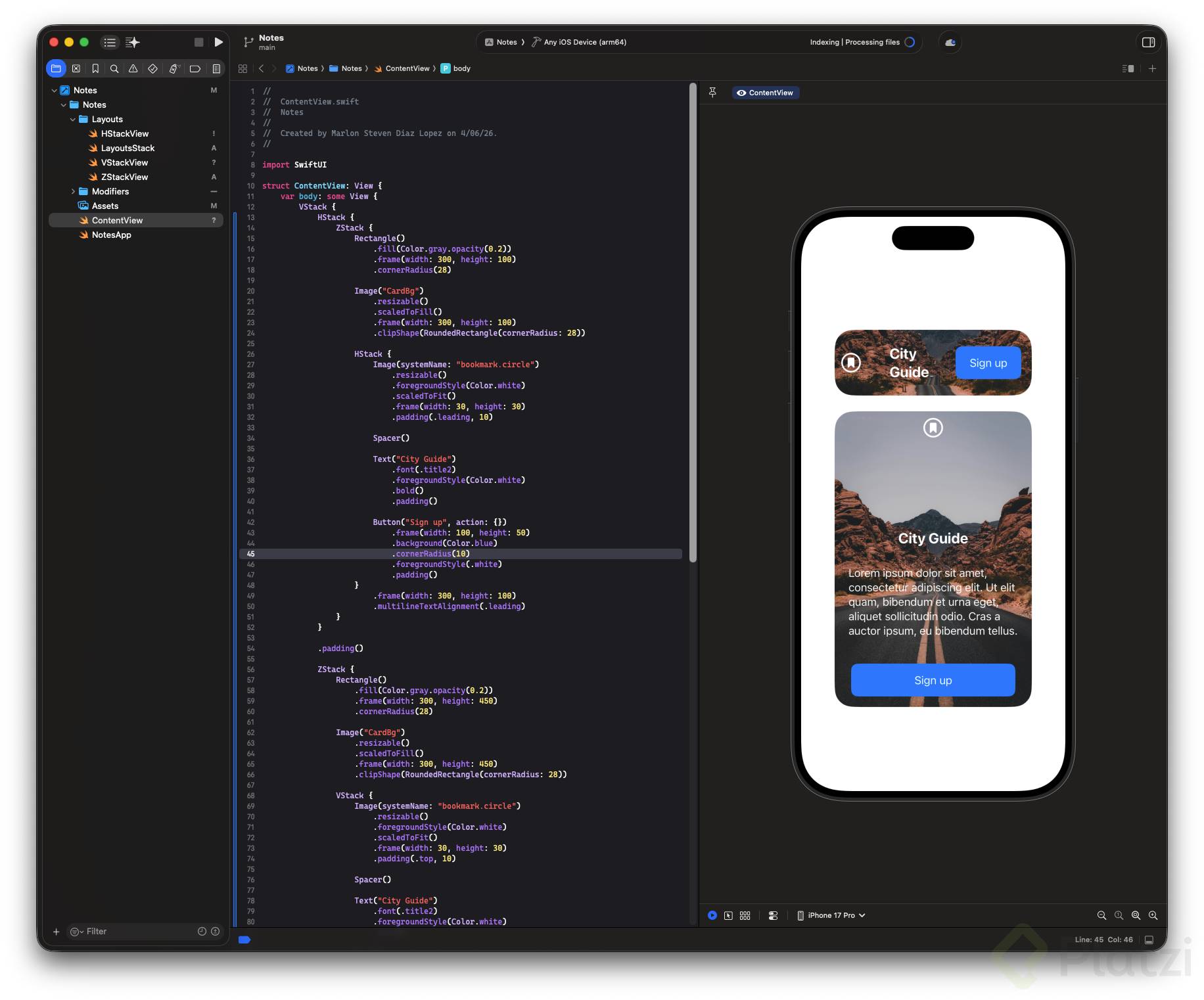
import SwiftUI

struct ContentView: View {
    var body: some View {
        VStack {
            HStack {
                ZStack {
                    Rectangle()
                        .fill(Color.gray.opacity(0.2))
                        .frame(width: 300, height: 100)
                        .cornerRadius(28)

                    Image("CardBg")
                        .resizable()
                        .scaledToFill()
                        .frame(width: 300, height: 100)
                        .clipShape(RoundedRectangle(cornerRadius: 28))

                    HStack {
                        Image(systemName: "bookmark.circle")
                            .resizable()
                            .foregroundStyle(Color.white)
                            .scaledToFit()
                            .frame(width: 30, height: 30)
                            .padding(.leading, 10)

                        Spacer()

                        Text("City Guide")
                            .font(.title2)
                            .foregroundStyle(Color.white)
                            .bold()
                            .padding()

                        Button("Sign up", action: {})
                            .frame(width: 100, height: 50)
                            .background(Color.blue)
                            .cornerRadius(10)
                            .foregroundStyle(.white)
                            .padding()
                    }
                        .frame(width: 300, height: 100)
                        .multilineTextAlignment(.leading)
                }
            }

            .padding()

            ZStack {
                Rectangle()
                    .fill(Color.gray.opacity(0.2))
                    .frame(width: 300, height: 450)
                    .cornerRadius(28)

                Image("CardBg")
                    .resizable()
                    .scaledToFill()
                    .frame(width: 300, height: 450)
                    .clipShape(RoundedRectangle(cornerRadius: 28))

                VStack {
                    Image(systemName: "bookmark.circle")
                        .resizable()
                        .foregroundStyle(Color.white)
                        .scaledToFit()
                        .frame(width: 30, height: 30)
                        .padding(.top, 10)

                    Spacer()

                    Text("City Guide")
                        .font(.title2)
                        .foregroundStyle(Color.white)
                        .bold()

                    Text("Lorem ipsum dolor sit amet, consectetur adipiscing elit. Ut elit quam, bibendum et urna eget, aliquet sollicitudin odio. Cras a auctor ipsum, eu bibendum tellus.")
                        .foregroundStyle(Color.white)
                        .padding()

                    Button("Sign up", action: {})
                        .frame(width: 250, height: 50)
                        .background(Color.blue)
                        .cornerRadius(10)
                        .foregroundStyle(.white)
                        .padding()
                }
                    .frame(width: 300, height: 450)
                    .multilineTextAlignment(.leading)
            }
        }
    }
}


//
//  ContentView.swift
//  Notes
//
//  Created by Kevin Andres Niño Guerrero on 9/04/26.
//

import SwiftUI

struct ContentView: View {
    var body: some View {

        ZStack(alignment: .leading) {
            Rectangle()
                .background(Color.secondary)
                .frame(width: 390, height: 200)
                .cornerRadius(10)
            HStack {
                Image("logo")
                    .resizable()
                    .frame(width: 150, height: 200)

                VStack(alignment: .leading, spacing: 0) {
                    Text("Absolute Batman II")
                        .foregroundStyle(.white)
                        .bold()
                    HStack(spacing: 2){
                        Image(systemName: "star.fill")
                            .resizable()
                            .frame(width: 10, height: 10)
                            .foregroundStyle(Color.yellow)
                        Image(systemName: "star.fill")
                            .resizable()
                            .frame(width: 10, height: 10)
                            .foregroundStyle(Color.yellow)
                        Image(systemName: "star.fill")
                            .resizable()
                            .frame(width: 10, height: 10)
                            .foregroundStyle(Color.yellow)
                        Image(systemName: "star.fill")
                            .resizable()
                            .frame(width: 10, height: 10)
                            .foregroundStyle(Color.yellow)
                        Image(systemName: "star.leadinghalf.filled")
                            .resizable()
                            .frame(width: 10, height: 10)
                            .foregroundStyle(Color.yellow)
                    }

                    Text("Presenta a un Bruce Wayne de clase trabajadora, no millonario, que opera como un justiciero brutal, inmenso y práctico en Gotham City, sin depender de tecnología avanzada ni recursos heredados")
                        .foregroundStyle(Color.white)
                        .font(.system(size: 10))
                        .frame(width: 220)

                    VStack(spacing: 0,){
                        Button("\(Image(systemName: "book.pages")) Ready for read?"){}
                            .frame(width: 200, height: 25)
                            .background(Color.red)
                            .cornerRadius(10)
                            .padding(10)
                            .font(.system(size: 10))
                            .foregroundStyle(Color.white)

                        Button("\(Image(systemName: "tray")) Safe for latter"){}
                            .frame(width: 180, height: 25)
                            .background(Color.secondary)
                            .cornerRadius(10)
                            .font(.system(size: 10))
                            .foregroundStyle(Color.white)
                    }

                }
            }
            Image(systemName: "suit.heart")
                .foregroundStyle(.red)
                .padding(15)
                .frame(width: 390, height: 200, alignment: .topTrailing)
        }

    }
}

#Preview {
    ContentView()
}