
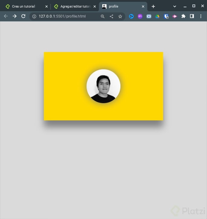
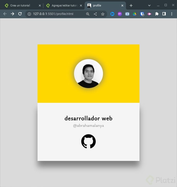
Resultado Final:
Código:
Primero comenzamos creando los archivos, profile.html y profile.css.
Ahora configuramos el archivo html
- Enlazamos el archivo css, el código debe ir dentro de la etiqueta
head
<link rel="stylesheet" href="./profile.css">
- Creamos la estructura dentro de la etiqueta
body. Usaremos un contenedor para eso usamos la etiquetamaincon la clasecontainer
<body>
  <main class="container">
  </main>
</body>
- Luego dentro del contenedor creamos 2 elementos
div, con la clasecard- en el primer
divagregamos nuestra foto - en el segundo
divcolocamos nuestra descripción
- en el primer
<body>
  <main class="container">
    <div class="card">
      <img src="./perfil.jpg" alt="AbrahamAlanya">
    </div>
    <div class="card">
      <p>desarrollador web</p>
      <p>@abrahamalanya</p>
      <a href="https://github.com/abrahamalanya" target="_blank">
        <svg>...</svg>
      </a>
    </div>
  </main>
</body>
Ahora configuramos el archivo css
- Importaremos una fuente de google fonts
@import url('https://fonts.googleapis.com/css2?family=Ysabeau+Office&display=swap');
- definimos las estilos generales
* {
  margin: 0;
  padding: 0;
  box-sizing: border-box;
}
html {
  font-size: 62.5%; // equivale a 10px
  font-family: 'Ysabeau Office', sans-serif;
}

// Con este código centramos nuestro contenedor
body {
  width: 100vw;
  height: 100vh;
  background: #dadada;
  display: flex;
  justify-content: center;
  align-items: center;
}
- Ahora configuramos nuestro contenedor, usando css grid
.container {
  display: grid;
  grid-template-columns: 350px;
  grid-template-rows: repeat(2, 200px);
}
- Declaramos reglas generales en nuestro
card
.card {
  position: relative; //nos permitirá manipular la posición
  display: flex; //con esto podremos centrar nuestros elementos
}
- Ahora configuremos el primer
divque tiene nuestrocontainer
.container div:nth-child(1) {
  background: gold;
  justify-content: center;
  align-items: center;
  z-index: 10;
}

.container div:nth-child(1) img {
  width: 100px;
  height: 100px;
  filter: grayscale(1); //blanco y negro
  border-radius: 50%;
  box-shadow: 0 0 20px 1px gray; //sombra
}
- Configuramos el segundo
divque tiene nuestrocontainer
.container div:nth-child(2) {
  background: whitesmoke;
  color: gray;
  flex-direction: column;
  justify-content: center;
  align-items: center;
  box-shadow: 0 20px 20px 0 gray;
  transition: 1s;
  top: -200px;
  z-index: 1;
}

.container div:nth-child(2) p:nth-child(1) {
  color: black;
  font-size: 2rem;
  font-weight: 900;
  letter-spacing: 1px;
}

.container div:nth-child(2) p:nth-child(2) {
  font-size: 1.5rem;
  margin-bottom: 2rem;
}

.container div:nth-child(2) svg {
  width: 50px;
}
- Le damos animación al pasar el cursor
.container:hover div:nth-child(2) {
  top: 0px;
}
Código completo
HTML
<!DOCTYPE html>
<html lang="en">
<head>
  <meta charset="UTF-8">
  <meta http-equiv="X-UA-Compatible" content="IE=edge">
  <meta name="viewport" content="width=device-width, initial-scale=1.0">
  <title>profile</title>
  <link rel="stylesheet" href="./profile.css">
  <link rel="shortcut icon" href="./img/perfil.png" type="image/x-icon">
</head>
<body>
  <main class="container">
    <div class="card">
      <img src="./img/logo.jpg" alt="AbrahamAlanya">
    </div>
    <div class="card">
      <p>desarrollador web</p>
      <p>@abrahamalanya</p>
      <a href="https://github.com/abrahamalanya" target="_blank">
        <svg role="img" viewBox="0 0 24 24" xmlns="http://www.w3.org/2000/svg">
          <path
            d="M12 .297c-6.63 0-12 5.373-12 12 0 5.303 3.438 9.8 8.205 11.385.6.113.82-.258.82-.577 0-.285-.01-1.04-.015-2.04-3.338.724-4.042-1.61-4.042-1.61C4.422 18.07 3.633 17.7 3.633 17.7c-1.087-.744.084-.729.084-.729 1.205.084 1.838 1.236 1.838 1.236 1.07 1.835 2.809 1.305 3.495.998.108-.776.417-1.305.76-1.605-2.665-.3-5.466-1.332-5.466-5.93 0-1.31.465-2.38 1.235-3.22-.135-.303-.54-1.523.105-3.176 0 0 1.005-.322 3.3 1.23.96-.267 1.98-.399 3-.405 1.02.006 2.04.138 3 .405 2.28-1.552 3.285-1.23 3.285-1.23.645 1.653.24 2.873.12 3.176.765.84 1.23 1.91 1.23 3.22 0 4.61-2.805 5.625-5.475 5.92.42.36.81 1.096.81 2.22 0 1.606-.015 2.896-.015 3.286 0 .315.21.69.825.57C20.565 22.092 24 17.592 24 12.297c0-6.627-5.373-12-12-12" />
        </svg>
      </a>
    </div>
  </main>
</body>
</html>
CSS
@import url('https://fonts.googleapis.com/css2?family=Ysabeau+Office&display=swap');

* {
  margin: 0;
  padding: 0;
  box-sizing: border-box;
}

html {
  font-size: 62.5%;
  font-family: 'Ysabeau Office', sans-serif;
}

body {
  width: 100vw;
  height: 100vh;
  background: #dadada;
  display: flex;
  justify-content: center;
  align-items: center;
}

.container {
  display: grid;
  grid-template-columns: 350px;
  grid-template-rows: repeat(2, 200px);
}

.card {
  position: relative;
  display: flex;
}

.container div:nth-child(1) {
  background: gold;
  justify-content: center;
  align-items: center;
  z-index: 10;
}

.container div:nth-child(1) img {
  width: 100px;
  height: 100px;
  filter: grayscale(1);
  border-radius: 50%;
  box-shadow: 0 0 20px 1px gray;
}

.container div:nth-child(2) {
  background: whitesmoke;
  color: gray;
  flex-direction: column;
  justify-content: center;
  align-items: center;
  box-shadow: 0 20px 20px 0 gray;
  transition: 1s;
  top: -200px;
  z-index: 1;
}

.container div:nth-child(2) p:nth-child(1) {
  color: black;
  font-size: 2rem;
  font-weight: 900;
  letter-spacing: 1px;
}

.container div:nth-child(2) p:nth-child(2) {
  font-size: 1.5rem;
  margin-bottom: 2rem;
}

.container div:nth-child(2) svg {
  width: 50px;
}

.container:hover div:nth-child(2) {
  top: 0px;
}
Curso de Frontend Developer
COMPARTE ESTE ARTÍCULO Y MUESTRA LO QUE APRENDISTE
0 Comentarios
para escribir tu comentario
