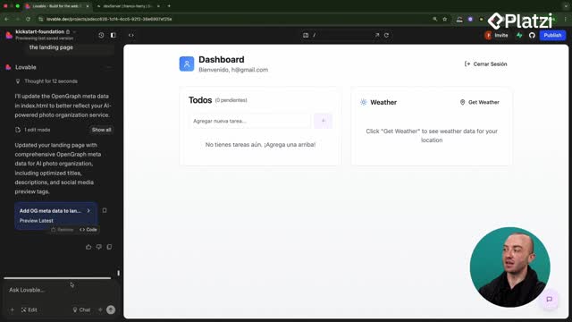
Build consistent, production-ready UIs in Lovable by leveraging a single knowledge file. With one system prompt, you capture your design system, keep buttons, colors, and layout aligned across pages, and enforce clean component structure that another developer can pick up with confidence.
How do knowledge files keep your design consistent?
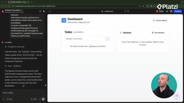
A knowledge file is attached to every prompt you run. That means you don’t repeat instructions like button styles or color choices. Instead, Lovable reads your saved guidelines first, then builds accordingly.
- Knowledge file: persistent context for every edit and generation.
- System prompt: the text you save that encodes your style and organization rules.
- Goal: maintain a unified look and feel across all new pages.
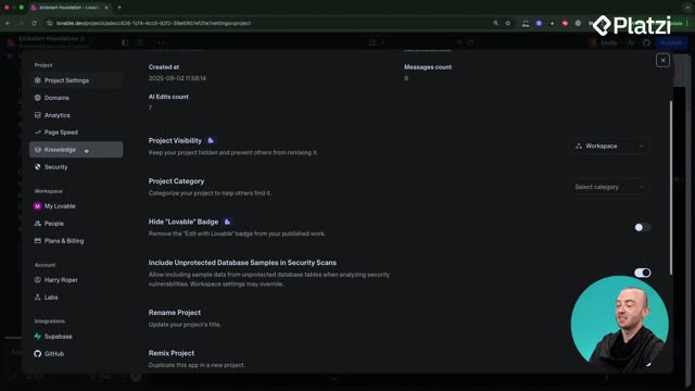
Where do you create the knowledge file?
- Open Settings, then go to Knowledge.
- Paste your style or organization prompt into the box.
- Save so Lovable reads it before future prompts.
How do you draft the style system prompt with chat mode?
- Switch to chat mode and ask: create a simple text-based system prompt for styles that match the landing page.
- Lovable audits components, colors, sizings, and outputs a “Design System and Styling Guidelines.”
- Copy only what you need, like colors and button styles, then paste into Knowledge and save.
How do you validate the style consistency quickly?
- Trigger an edit, for example: generate a login page after clicking Sign In.
- Check if the new page reuses the same background, button styles, and sizings.
- Expect a consistent look matching the landing page.
How does system knowledge ensure a production-ready structure?
Beyond styling, system knowledge can enforce organization so the app scales cleanly. The idea: reuse components first, then create new ones only when necessary, and keep them small, well-named, and in folders.
- Avoid duplication: check if a needed component already exists before creating a new one.
- Reuse over rebuild: one shared button is better than two similar buttons.
- Well-named components: clear, descriptive names that are easy to find.
- Organized into folders: group components logically to speed up navigation.
- Small components: keep them focused so Lovable works faster and changes are simpler.
- Production-ready goal: clean structure that another developer can continue without friction.
What should the organizational prompt say?
Use a concise instruction that includes these points:
- first check for existing components that can be reused.
- if a new component is needed, name it clearly and place it in an appropriate folder.
- keep components small and focused.
- aim for a production-ready app that’s clean and easy to hand off.
Which key vocabulary helps you follow the workflow?
Strengthen understanding with these terms and examples taken directly from the workflow described.
- Knowledge file: extra text attached to every prompt to keep context.
- System prompt: the rules Lovable follows for styles and organization.
- Chat mode: generates text output for your prompt without editing the app.
- Design system and styling guidelines: consolidated rules like primary color, background colors, button styles, iconography, layout, and mobile.
- Wireframe or prototype: a simple, non-functional mock to test style consistency before wiring providers.
- Production-ready: organized components, easy to find, reusable, and simple to hand off to another developer.
- Avoid duplication: reuse components across pages to prevent a messy codebase.
- Organized into folders: structure that supports growth and maintenance.
- Small components: simpler pieces that run faster and are easier to update.
Have a question or a tip on structuring your knowledge file in Lovable? Share your approach and what you include in your system prompt.

