A solid design system and a clear style guide in Lovable help you ship a consistent UI, impress users, and support monetization. Here you’ll see how to define rules, refine visuals like color schemes and buttons, and enforce those rules across pages so your photo renaming app looks cohesive from day one.
Why use a design system and style guide in Lovable?
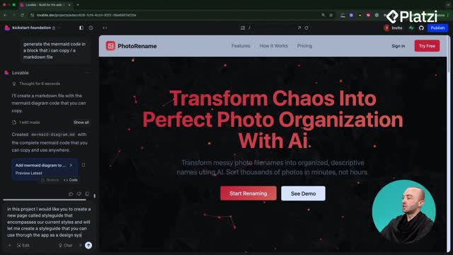
A design system and style guide is simply a page that defines rules for components: colors, typography, spacing, and patterns you’ll reuse. In Lovable, creating a Style Guide page centralizes these decisions so every new page or component follows your predefined styles instead of reinventing the UI.
- Ensures consistency: no more random colors or mismatched buttons.
- Encourages reuse: build new pages from approved components.
- Speeds up prompting: reference one source of truth.
- Improves UX and polish: light/dark mode, colors, gradients, typography, form elements, badges, shadows, animations, and dos and don’ts are all defined.
- Connects with system knowledge: Lovable can read and apply your rules before building.
How to build and refine your style guide?
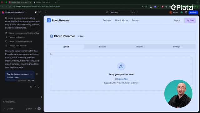
Start by asking Lovable to create a Style Guide page. It can pull in components you’ve already built, so you can see and edit everything in one place. From there, use the edit tool to make precise, low-risk changes.
How to change your color scheme?
Use the edit tool and prompt: “change the design system color scheme to use blue.” Lovable updates the palette across the Style Guide. Small, iterative edits over 1–2 hours lead to a strong, reusable stylescape that aligns with your brand.
- Define primary and accent colors.
- Review light/dark mode behavior.
- Check contrast and readability across components.
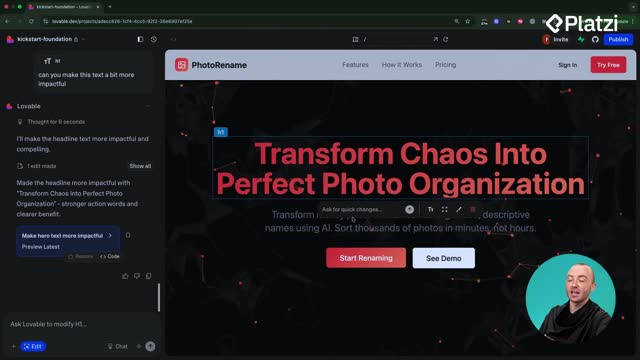
How to design distinctive buttons?
Buttons set the tone. Begin with simple defaults, then refine. If the initial result creates too many variants, simplify to two: a primary (the main call-to-action) and a ghost (secondary, low-emphasis). Ask Lovable to “stick to default and ghost” to reduce clutter.
- “Primary variant button” means the main button used across the app.
- Keep variants minimal for clarity and faster decisions.
- Aim for recognizable, on-brand shapes and states.
How to source and replicate UI inspiration?
Use sites like Dribble or 21st Dev for references. Screenshot a button you like and paste it into Lovable chat. Ask: “recreate it as the primary variant button.” Then provide specific context via the edit tool so Lovable nails the details.
- Call out the shape: less rounded corners, slightly rounded edges.
- Specify color: muted purple, no gradient if that’s what you saw.
- Define layout: thin divider line between icon and text.
- Adjust icon treatment: muted icon colors, subtle presence.
- Clarify aspect ratio: more square-ish, not overly pill-shaped.
Providing concrete attributes helps Lovable get much closer to your target style, and a few more prompts can perfect it.
How to enforce consistency across new pages and components?
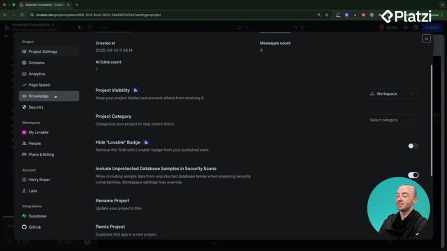
Lock in your decisions by using Settings > Knowledge. Add a simple instruction so Lovable reads your Style Guide before building anything new.
- Add: “whenever you create a new page or component, make sure that it uses our style guide and its styles. you should never create new components without first checking the style guide.”
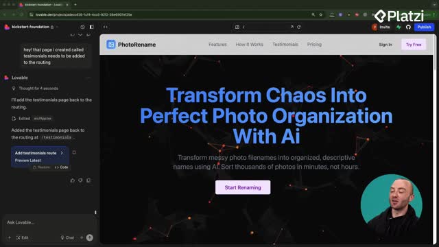
- Create a new page (for example, “Hey Harry”) and watch Lovable first read the Style Guide, then build using your colors, typography, and primary/ghost buttons.
- Proceed to expand your app with confidence: every new component aligns with the design system you set at the start.
Ready to polish your own Style Guide? Share what component you want to refine next and which inspirations you’re considering.
