Level up your UI with ready-to-use components from 21st Dev and seamless edits in Lovable. Learn how to integrate animated toggles and checkboxes, copy only the code you need, and use precise prompts to keep animations and functionality intact. Build a unique style guide that improves user experience in minutes.
Why use 21st Dev for custom UI?
21st Dev is a community-driven library of UI designs you can plug directly into your project. You can preview components, copy their base component and styles, and keep your stack clean.
- Free account and easy access to components.
- Live previews to assess animation and behavior.
- Multiple ways to import, but copying code directly is the most reliable.
- Great for elevating form elements like toggles and checkboxes.
Key idea: pick components that match your style guide for visual consistency.
How to import and integrate components in Lovable?
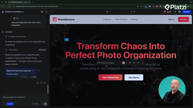
Start in Lovable with your style guide open. Replace existing elements using the select or edit tool and paste the new component code with a clear instruction.
What steps ensure clean imports?
- Open the component in 21st Dev and preview it.
- Copy the two parts: the base component and the styles (or the two code boxes like demo and custom styles).
- In Lovable, select the existing element (e.g., the switch) and add a clear prompt: “we’re replacing this with a new component,” then paste the first code block after a colon.
- Paste the second code block below the first, keeping order intact.
- Run the prompt and verify the component renders and animates on click.
How to integrate a liquid toggle?
- Choose a toggle with a “liquid” animation and open its tabs.
- Copy both code sections and paste them into Lovable as described.
- Confirm the animation works and the component responds to clicks.
What common mistakes should you avoid?
- Forgetting one of the tabs. Always copy all required files.
- Pasting out of order. Keep code blocks grouped and intact.
- Vague instructions. Be explicit about what to replace.
How to refine components and keep consistency?
Once imported, make controlled edits with precise prompts so you keep animations and functionality.
How to edit safely with prompts?
- Select the entire component first.
- Use explicit language: “reduce the size whilst retaining all animations and functionality.”
- Run edits alongside a small manual action to spot issues quickly.
- Verify the result: size changes should keep transitions smooth.
Practical tip: being over explicit helps Lovable make safe changes.
How to add and tune a custom checkbox?
- Use 21st Dev global search for “checkbox” and open a design that complements your toggle (e.g., a blue style with a pulse effect).
- Copy both code boxes: the demo and the custom checkbox.
- In Lovable, target the existing checkbox with the select tool, paste both code blocks, and run the prompt.
- If the checkbox looks too large, prompt to “halve the size” while keeping functionality and design intact.
What to do if Lovable changes the design?
- If an edit unintentionally rounds corners or alters the look, click restore to return to the previous working version.
- Re-run the edit with a clearer constraint: “retain shape, corners, animation, and interaction.”
- Iterate. Small, explicit prompts yield reliable results.
Build momentum: spend an hour exploring 21st Dev to refine toggles, checkboxes, and other form elements. Small changes can create a memorable brand feel and a smoother user experience. Next up, watch for React Router and navigation to keep your app loading fast.
Have a favorite 21st Dev component or a prompt that worked well? Share it in the comments and tell us how you styled it.


