
En el curso el profe nos pide que creemos un layout y pues bueno, este fue mi diseño
Y quiero compartirlo con ustedes por si este layout les dio algunas ideas a ustedes que quisieran implementar.
Nota: Este diseño no es responsive design, ya que si lo quieres ver en tamaño de teléfono móvil, se va a amontonar todo. Tal ves haga algunos diseños responsive a lo largo del curso.
HTML
<!DOCTYPE html>
<html lang="en">
<head>
<meta charset="UTF-8">
<meta http-equiv="X-UA-Compatible" content="IE=edge">
<meta name="viewport" content="width=device-width, initial-scale=1.0">
<title>Ad ASTRA</title>
<link rel="stylesheet" href="./style.css">
</head>
<body>
<header>
Ad ASTRA
<figure class="header__figure">
<img src="https://www.flaticon.com/svg/vstatic/svg/3594/3594083.svg?token=exp=1614448926~hmac=49d948c1d79015b5b24f4d77b45f424e" alt="logo Ad ASTRA" class="header__img">
</figure>
<nav class="header-nav">
<ul class="header-nav__unordered-list">
<li class="header-nav__item">
<a href="">Home</a>
</li>
<li class="header-nav__item">
<a href="">History</a>
</li>
<li class="header-nav__item">
<a href="">Products</a>
</li>
<li class="header-nav__item">
<a href="">Join us</a>
</li>
</ul>
</nav>
</header>
<main>
<aside class="main-aside">
<div class="main-aside__div">
<h1 class="main-aside__h1">
Rockets
</h1>
<p class="main-aside__p">
Rocket science is a primary branch of aerospace engineering.
It's not rocket science is a phrase meaning something that is
not difficult to understand. 🚀
</p>
</div>
<div class="main-aside__div">
<h1 class="main-aside__h1">
Launches
</h1>
<p class="main-aside__p">
As part of human exploration of the Moon, numerous space missions
have been undertaken to study Earth's natural satellite. 🛰️
</p>
</div>
<div class="main-aside__div">
<h1 class="main-aside__h1">
Missions
</h1>
<p class="main-aside__p">
Between 1968 and 1972, crewed missions to the Moon were conducted by
the United States as part of the Apollo program 🌑
</p>
</div>
<div class="main-aside__div">
<h1 class="main-aside__h1">
Blog
</h1>
<p class="main-aside__p">
According to a recent survey, blogs have ranked as the third most trustworthy
source of information, following only friends and family. ✒️
</p>
</div>
</aside>
<section class="main-section">
<h1 class="main-section__h1">
What we do?
</h1>
<p class="main-section__p">
Ad ASTRA Technologies Corp. is an Mexican aerospace manufacturer and space
transportation services company headquartered in Guadalajara, Mexico. It was founded
in 2020 with the goal of reducing space transportation costs to enable the
colonization of Mars and the space in general.
</p>
<h1 class="main-section__h1">
How we do it?
</h1>
<p class="main-section__p">
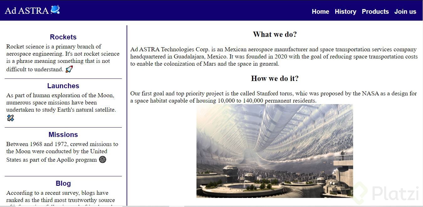
Our first goal and top priority project is the called Stanford torus, whic was proposed by the
NASA as a design for a space habitat capable of housing 10,000 to 140,000 permanent residents.
<img src="https://space.nss.org/wp-content/uploads/abalakin-space-settlement-large.jpg" alt="Standfor Torus" class="main-section__img">
</p>
</section>
</main>
<footer>
<nav class="footer-nav">
<ul class="footer-nav__unordered-list">
<li class="footer-nav__item">
<a href="#">Facebook</a>
</li>
<li class="footer-nav__item">
<a href="#">Instagram</a>
</li>
<li class="footer-nav__item">
<a href="#">YouTube</a>
</li>
<li class="footer-nav__item">
<a href="#">Reddit</a>
</li>
</ul>
</nav>
</footer>
</body>
</html>
CSS
html{
    font-size: 6.25%;
}
*{
    padding: 0;
    margin: 0;
    box-sizing: border-box;
}
header{
    background-color: #110071;
    color: white;
    font-size: 30rem;
    padding: 15rem;
}
.header-nav__item a{
    color: white;
    text-decoration: none;
}
.header-nav__item{
    font-size: 20rem;
    font-weight: bold;
    font-family: Arial, Helvetica, sans-serif;
    display: inline-block;
    padding: 0 5rem;
}
.header-nav__unordered-list{
    text-align: right;
    margin-top: -34rem;
    background-color: none;
}
.header__figure{
    width: 21rem;
    height: 21rem;
    display: inline-block;
}
.header__img{
    width: 28rem;
    height: 28rem;
    position: relative;
}
main{
    min-height: 100vh;
    width: 100%;
}
footer{
    background-color: white;
    min-height: 10vh;
    width: 100%;
    border-top: 1rem solid #110071;
}
.footer-nav{
    width: 100%;
    font-size: 20rem;
    padding: 15rem;
    margin: 15rem 0;
}
.footer-nav__item a{
    color: #110071;
    text-decoration: none;
}
.footer-nav__item{
    display: inline-block;
    padding: 0 15rem;
    font-weight: bold;
}
.footer-nav__unordered-list{
    text-align: center;
}
.main-aside, .main-section{
    min-height: 100vh;
    display: inline-block;
    margin: 15rem 0;
}
.main-aside{
    width: 30%;
    border-right: 1rem solid #110071;
    padding: 15rem;
}
.main-section{
    width: 70%;
    border-left: 1rem solid #110071;
    position: absolute;
}
.main-aside__div{
    width: 100%;
    height: 156rem;
    border-bottom: 1rem solid #110071;
}
.main-aside__h1{
    font-size: 22rem;
    text-align: center;
    width: 100%;
    height: auto;
    padding-top: 10rem;
    font-family: sans-serif;
    color: #110071;
}
.main-aside__p{
    padding: 5rem;
    font-size: 20rem;
}
.main-section__h1{
    font-size: 25rem;
    text-align: center;
    width: 100%;
    height: auto;
    padding: 15rem 0;
}
.main-section__p{
    width: 100%;
    padding: 7rem 10rem;
    font-size: 20rem;
}
.main-section__img{
    width: 500rem;
    height: 300rem;
    margin: 0 auto;
    display: block;
}
Curso Definitivo de HTML y CSS
COMPARTE ESTE ARTÍCULO Y MUESTRA LO QUE APRENDISTE
0 Comentarios
para escribir tu comentario