
Los 12 principios de animación de Disney aplicados al desarrollo web - Ejemplos con css
Antes de describir cada uno de los principios de animación, es importante tener en cuenta que Disney desarrollo estos principios para emular al mundo físico. Por lo tanto, en la web no vamos a usar todos ellos, ya que en el mundo digital, nosotros vemos todo como cajas contenedoras que tienen iconos, contenido, etc.
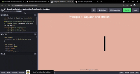
Exprimir y estirar
Nosotros podemos exprimir y estirar elementos justo como pasa en las caricaturas de Disney. Un ejemplo común de esto es cuando un personaje se estrella contra la pared.
HTML
<h1>Principle 1: Squash and stretch</h1>
<article class="principle one">
    <div class="shape"></div>
    <div class="surface"></div>
  </article>
CSS
.one .shape {
  animation: one 4s infinite ease-out;
}

.one .surface {
  background: #000;
  height: 10em;
  width: 1em;
  position: absolute;
  top: calc(50% - 4em);
  left: calc(50% + 10em);
}

@keyframes one {
  0%, 15% {
    opacity: 0;
  }
  15%, 25% {
    transform: none;
    animation-timing-function: cubic-bezier(1,-1.92,.95,.89);
    width: 4em;
    height: 4em;
    top: calc(50% - 2em);
    left: calc(50% - 2em);
    opacity: 1;
  }
  35%, 45% {
    transform: translateX(8em);
    height: 6em;
    width: 2em;
    top: calc(50% - 3em);
    animation-timing-function: linear;
    opacity: 1;
  }
  70%, 100% {
    transform: translateX(8em) translateY(5em);
    height: 6em;
    width: 2em;
    top: calc(50% - 3em);
    opacity: 0;
  }
}

body {
  margin: 0;
  background: #e9b59f;
  font-family: HelveticaNeue, Arial, Sans-serif;
  color: #fff;
}

h1 {
  position: absolute;
  top: 0;
  left: 0;
  right: 0;
  text-align: center;
  font-weight: 300;
}

h2 {
  font-size: 0.75em;
  position: absolute;
  bottom: 0;
  left: 0;
  right: 0;
  text-align: center;
}

a {
  text-decoration: none;
  color: #333;
}

.principle {
  width: 100%;
  height: 100vh;
  position: relative;
}

.shape {
  background: #2d97db;
  border: 1em solid #fff;
  width: 4em;
  height: 4em;
  position: absolute;
  top: calc(50% - 2em);
  left: calc(50% - 2em);
}
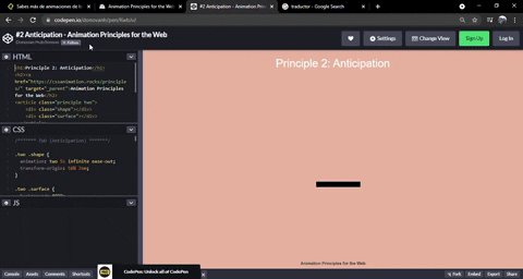
Anticipación
En la vida real, los movimientos no pasan de manera repentina. Antes de que un movimiento suceda, siempre hay una serie de movimientos que nos ayudan a entender que algo va a pasar. Por ejemplo, antes de dar un salto, lo primero que hacemos es tomar impulso y podemos inclinarnos. En el caso del desarrollo web, al momento de dar un hover a un elemento, esto puede hacerse un poco pequeño para posteriormente hacerse mas grande.
HTML
<h1>Principle 2: Anticipation</h1>
<article class="principle two">
    <div class="shape"></div>
    <div class="surface"></div>
  </article>
CSS
.two .shape {
  animation: two 5s infinite ease-out;
  transform-origin: 50% 7em;
}

.two .surface {
  background: #000;
  width: 8em;
  height: 1em;
  position: absolute;
  top: calc(50% + 4em);
  left: calc(50% - 3em);
}

@keyframes two {
  0%, 15% {
    opacity: 0;
    transform: none;
  }
  15%, 25% {
    opacity: 1;
    transform: none;
    animation-timing-function: cubic-bezier(.5,.05,.91,.47);
  }
  28%, 38% {
    transform: translateX(-2em);
  }
  40%, 45% {
    transform: translateX(-4em);
  }
  50%, 52% {
    transform: translateX(-4em) rotateZ(-20deg);
  }
  70%, 75% {
    transform: translateX(-4em) rotateZ(-10deg);
  }
  78% {
    transform: translateX(-4em) rotateZ(-24deg);
    opacity: 1;
  }
  86%, 100% {
    transform: translateX(-6em) translateY(4em) rotateZ(-90deg);
    opacity: 0;
  }
}

/* General styling */
body {
  margin: 0;
  background: #e9b59f;
  font-family: HelveticaNeue, Arial, Sans-serif;
  color: #fff;
}

h1 {
  position: absolute;
  top: 0;
  left: 0;
  right: 0;
  text-align: center;
  font-weight: 300;
}

h2 {
  font-size: 0.75em;
  position: absolute;
  bottom: 0;
  left: 0;
  right: 0;
  text-align: center;
}

a {
  text-decoration: none;
  color: #333;
}

.principle {
  width: 100%;
  height: 100vh;
  position: relative;
}

.shape {
  background: #2d97db;
  border: 1em solid #fff;
  width: 4em;
  height: 4em;
  position: absolute;
  top: calc(50% - 2em);
  left: calc(50% - 2em);
}
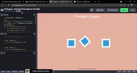
Puesta en escena
En algunas ocasiones, hay un personaje al que queremos que sea el protagonista en alguna escena en particular. Para que esto suceda, una buena forma es escondiendo o quitando del foco de atención a cualquier otro personaje alrededor. En el desarrollo web, podemos hacer esto con una sombra negra en los elementos que no queremos que tengan una protagonización, o incluso darle movimiento al elemento que queremos resaltar. Por ejemplo, a un botón de “Save” le podemos dar movimiento frecuentemente para que el usuario sepa que necesita guardar algún archivo.
HTML
<h1>Principle 3: Staging</h1>
<article class="principle three">
    <div class="shape a"></div>
    <div class="shape b"></div>
    <div class="shape c"></div>
  </article>
CSS
.three .shape.a {
  transform: translateX(-12em);
}

.three .shape.c {
  transform: translateX(12em);
}

.three .shape.b {
  animation: three 5s infinite ease-out;
  transform-origin: 0 6em;
}

.three .shape.a, .three .shape.c {
  animation: threeb 5s infinite linear;
}

@keyframes three {
  0%, 10% {
    transform: none;
    animation-timing-function: cubic-bezier(.57,-0.5,.43,1.53);
  }
  26%, 30% {
    transform: rotateZ(-40deg);
  }
  32.5% {
    transform: rotateZ(-38deg);
  }
  35% {
    transform: rotateZ(-42deg);
  }
  37.5% {
    transform: rotateZ(-38deg);
  }
  40% {
    transform: rotateZ(-40deg);
  }
  42.5% {
    transform: rotateZ(-38deg);
  }
  45% {
    transform: rotateZ(-42deg);
  }
  47.5% {
    transform: rotateZ(-38deg);
    animation-timing-function: cubic-bezier(.57,-0.5,.43,1.53);
  }
  58%, 100% {
    transform: none;
  }
}

@keyframes threeb {
  0%, 20% {
    filter: none;
  }
  40%, 50% {
    filter: blur(5px);
  }
  65%, 100% {
    filter: none;
  }
}

/* General styling */
body {
  margin: 0;
  background: #e9b59f;
  font-family: HelveticaNeue, Arial, Sans-serif;
  color: #fff;
}

h1 {
  position: absolute;
  top: 0;
  left: 0;
  right: 0;
  text-align: center;
  font-weight: 300;
}

h2 {
  font-size: 0.75em;
  position: absolute;
  bottom: 0;
  left: 0;
  right: 0;
  text-align: center;
}

a {
  text-decoration: none;
  color: #333;
}

.principle {
  width: 100%;
  height: 100vh;
  position: relative;
}

.shape {
  background: #2d97db;
  border: 1em solid #fff;
  width: 4em;
  height: 4em;
  position: absolute;
  top: calc(50% - 2em);
  left: calc(50% - 2em);
}
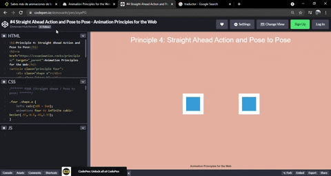
Acción directa y pose a pose
El objetivo es hacer que la animación se vea tan suave como sea posible. Como se menciono anteriormente, hacer que los movimientos en la web luzcan tan similares como en la vida real. Para hacer esto hay dos formas de hacerlo.
- Manualmente (Acción directa)
- Pose a pose (Nos ayuda el navegador)
En la acción directa nosotros tenemos que determinar cada frame. En cambio, en el pose a pose, la transición entre los keyframes es manejada por el navegador.
En el link de abajo podemos ver un elemento moviéndose suavemente y otro de manera brusca.
HTML
<h1>Principle 4: Straight Ahead Action and Pose to Pose</h1>
<article class="principle four">
    <div class="shape a"></div>
    <div class="shape b"></div>
  </article>
CSS
.four .shape.a {
    left: calc(50% - 8em);
    animation: four 6s infinite cubic-bezier(.57,-0.5,.43,1.53);
}

.four .shape.b {
  left: calc(50% + 8em);
  animation: four 6s infinite steps(1);
}

@keyframes four {
  0%, 10% {
    transform: none;
  }
  26%, 30% {
    transform: rotateZ(-45deg) scale(1.25);
  }
  40% {
    transform: rotateZ(-45deg) translate(2em, -2em) scale(1.8);
  }
  50%, 75% {
    transform: rotateZ(-45deg) scale(1.1);
  }
  90%, 100% {
    transform: none;
  }
}

/* General styling */
body {
  margin: 0;
  background: #e9b59f;
  font-family: HelveticaNeue, Arial, Sans-serif;
  color: #fff;
}

h1 {
  position: absolute;
  top: 0;
  left: 0;
  right: 0;
  text-align: center;
  font-weight: 300;
}

h2 {
  font-size: 0.75em;
  position: absolute;
  bottom: 0;
  left: 0;
  right: 0;
  text-align: center;
}

a {
  text-decoration: none;
  color: #333;
}

.principle {
  width: 100%;
  height: 100vh;
  position: relative;
}

.shape {
  background: #2d97db;
  border: 1em solid #fff;
  width: 4em;
  height: 4em;
  position: absolute;
  top: calc(50% - 2em);
  left: calc(50% - 2em);
}
Acción de seguimiento y superposición
En la vida real NO todo se mueve a la misma velocidad y dirección. Por ejemplo, cuando vamos conduciendo muy rápido y frenamos de manera repentina, el auto todavía se sigue moviendo hacia adelante unos segundos para después regresar a la posición en la que debería detenerse. Además de esto, los pasajeros dentro del auto podrían salir volando si no llevan el cinturón de seguridad.

HTML
<h1>Principle 5: Follow Through and Overlapping Action</h1>
 <article class="principle five">
    <div class="shape-container">
      <div class="shape"></div>
    </div>
  </article>
CSS
.five .shape {
  animation: five 4s infinite cubic-bezier(.64,-0.36,.1,1);
  position: relative;
  left: auto;
  top: auto;
}

.five .shape-container {
  animation: five-container 4s infinite cubic-bezier(.64,-0.36,.1,2);
  position: absolute;
  left: calc(50% - 4em);
  top: calc(50% - 4em);
}

@keyframes five {
  0%, 15% {
    opacity: 0;
    transform: translateX(-12em);
  }
  15%, 25% {
    transform: translateX(-12em);
    opacity: 1;
  }
  85%, 90% {
    transform: translateX(12em);
    opacity: 1;
  }
  100% {
    transform: translateX(12em);
    opacity: 0;
  }
}

@keyframes five-container {
  0%, 35% {
    transform: none;
  }
  50%, 60% {
    transform: skewX(20deg);
  }
  90%, 100% {
    transform: none;
  }
}

/* General styling */
body {
  margin: 0;
  background: #e9b59f;
  font-family: HelveticaNeue, Arial, Sans-serif;
  color: #fff;
}

h1 {
  position: absolute;
  top: 0;
  left: 0;
  right: 0;
  text-align: center;
  font-weight: 300;
}

h2 {
  font-size: 0.75em;
  position: absolute;
  bottom: 0;
  left: 0;
  right: 0;
  text-align: center;
}

a {
  text-decoration: none;
  color: #333;
}

.principle {
  width: 100%;
  height: 100vh;
  position: relative;
}

.shape {
  background: #2d97db;
  border: 1em solid #fff;
  width: 4em;
  height: 4em;
  position: absolute;
  top: calc(50% - 2em);
  left: calc(50% - 2em);
}
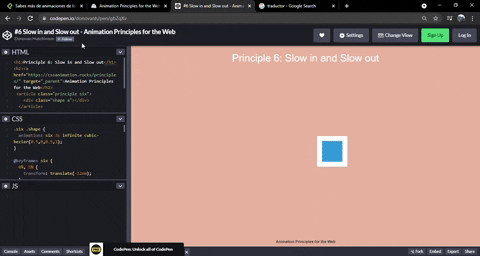
Acelerar y desacelerar
En la vida real rara vez las cosas van de 0 a 100 km/h en menos de un segundo. Normalmente, a las cosas les lleva unos segundos acelerar y desacelerar. En el mundo web, esto se logra con las transiciones, donde ease-in significa acelerar y ease-out es lo contrario, desacelerar.
HTML
<h1>Principle 6: Slow in and Slow out</h1>
 <article class="principle six">
    <div class="shape a"></div>
  </article>
CSS
.six .shape {
  animation: six 3s infinite cubic-bezier(0.5,0,0.5,1);
}

@keyframes six {
  0%, 5% {
    transform: translate(-12em);
  }
  45%, 55% {
    transform: translate(12em);
  }
  95%, 100% {
    transform: translate(-12em);
  }
}

/* General styling */
body {
  margin: 0;
  background: #e9b59f;
  font-family: HelveticaNeue, Arial, Sans-serif;
  color: #fff;
}

h1 {
  position: absolute;
  top: 0;
  left: 0;
  right: 0;
  text-align: center;
  font-weight: 300;
}

h2 {
  font-size: 0.75em;
  position: absolute;
  bottom: 0;
  left: 0;
  right: 0;
  text-align: center;
}

a {
  text-decoration: none;
  color: #333;
}

.principle {
  width: 100%;
  height: 100vh;
  position: relative;
}

.shape {
  background: #2d97db;
  border: 1em solid #fff;
  width: 4em;
  height: 4em;
  position: absolute;
  top: calc(50% - 2em);
  left: calc(50% - 2em);
}
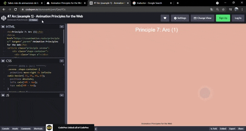
Curvas
En la vida real las cosas no se mueven de manera lineal. Las lineas rectas no es algo que a la madre naturaleza le gusta hacer. En el mundo web, nosotros podemos hacer lucir a los elementos de una manera mas “natural” con el movimiento de ease-in & ease-out. Sin embargo, cuando queremos que un elemento simule una curva, tendremos que usar mas de una animación o movimientos. Por ejemplo, cuando una pelota esta cayendo, podemos simular una curva con 2 movimientos:
- El primero seria la pelota moviéndose de arriba a abajo
- El segundo movimiento seria la pelota moviéndose de izquierda a derecha.
HTML
<h1>Principle 7: Arc (1)</h1>
<article class="principle sevena">
    <div class="shape-container">
      <div class="shape a"></div>
    </div>
  </article>
CSS
.sevena .shape-container {
  animation: move-right 6s infinite cubic-bezier(.37,.55,.49,.67);
  position: absolute;
  left: calc(50% - 4em);
  top: calc(50% - 4em);
}
.sevena .shape {
  animation: bounce 6s infinite linear;
  border-radius: 50%;
  position: relative;
  left: auto;
  top: auto;
}

@keyframes move-right {
  0% {
    transform: translateX(-20em);
    opacity: 1;
  }
  80% {
    opacity: 1;
  }
  90%, 100% {
    transform: translateX(20em);
    opacity: 0;
  }
}

@keyframes bounce {
  0% {
    transform: translateY(-8em);
    animation-timing-function: cubic-bezier(.51,.01,.79,.02);
  }
  15% {
    transform: translateY(8em);
    animation-timing-function: cubic-bezier(.19,1,.7,1);
  }
  25% {
    transform: translateY(-4em);
    animation-timing-function: cubic-bezier(.51,.01,.79,.02);
  }
  32.5% {
    transform: translateY(8em);
    animation-timing-function: cubic-bezier(.19,1,.7,1);
  }
  40% {
    transform: translateY(0em);
    animation-timing-function: cubic-bezier(.51,.01,.79,.02);
  }
  45% {
    transform: translateY(8em);
    animation-timing-function: cubic-bezier(.19,1,.7,1);
  }
  50% {
    transform: translateY(3em);
    animation-timing-function: cubic-bezier(.51,.01,.79,.02);
  }
  56% {
    transform: translateY(8em);
    animation-timing-function: cubic-bezier(.19,1,.7,1);
  }
  60% {
    transform: translateY(6em);
    animation-timing-function: cubic-bezier(.51,.01,.79,.02);
  }
  64% {
    transform: translateY(8em);
    animation-timing-function: cubic-bezier(.19,1,.7,1);
  }
  66% {
    transform: translateY(7.5em);
    animation-timing-function: cubic-bezier(.51,.01,.79,.02);
  }
  70%, 100% {
    transform: translateY(8em);
    animation-timing-function: cubic-bezier(.19,1,.7,1);
  }
}

/* General styling */
body {
  margin: 0;
  background: #e9b59f;
  font-family: HelveticaNeue, Arial, Sans-serif;
  color: #fff;
}

h1 {
  position: absolute;
  top: 0;
  left: 0;
  right: 0;
  text-align: center;
  font-weight: 300;
}

h2 {
  font-size: 0.75em;
  position: absolute;
  bottom: 0;
  left: 0;
  right: 0;
  text-align: center;
}

a {
  text-decoration: none;
  color: #333;
}

.principle {
  width: 100%;
  height: 100vh;
  position: relative;
}

.shape {
  background: #2d97db;
  border: 1em solid #fff;
  width: 4em;
  height: 4em;
  position: absolute;
  top: calc(50% - 2em);
  left: calc(50% - 2em);
}
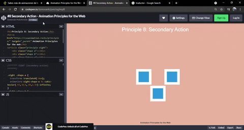
Acción desencadenada
En el mundo real, cuando una acción sucede, hay otras acciones que nos ayudan a entender que la primera acción realmente paso. Por ejemplo, cuando un balón rebota en el césped, puede levantar pasto, o algún animales pueden salir asustados por el ruido del balón, etc.
En el caso del desarrollo web, nosotros podemos hacer que una acción desencadene a otra acción. Esto lo podemos hacer con timing donde ambas acciones están encadenadas y cuando no suceda la primera, no puede suceder la segunda.
HTML
<h1>Principle 8: Secondary Action</h1>
<article class="principle eight">
    <div class="shape a"></div>
    <div class="shape b"></div>
    <div class="shape c"></div>
  </article>
CSS
.eight .shape.a {
  transform: translateX(-6em);
  animation: eight-shape-a 4s cubic-bezier(.57,-0.5,.43,1.53) infinite;
}
.eight .shape.b {
  top: calc(50% + 6em);
  opacity: 0;
  animation: eight-shape-b 4s linear infinite;
}
.eight .shape.c {
  transform: translateX(6em);
  animation: eight-shape-c 4s cubic-bezier(.57,-0.5,.43,1.53) infinite;
}

@keyframes eight-shape-a {
  0%, 50% {
    transform: translateX(-5.5em);
  }
  70%, 100% {
    transform: translateX(-10em);
  }
}

@keyframes eight-shape-b {
  0% {
    transform: none;
  }
  20%, 30% {
    transform: translateY(-1.5em);
    opacity: 1;
    animation-timing-function: cubic-bezier(.57,-0.5,.43,1.53);
  }
  32% {
    transform: translateY(-1.25em);
    opacity: 1;
  }
  34% {
    transform: translateY(-1.75em);
    opacity: 1;
  }
  36%, 38% {
    transform: translateY(-1.25em);
    opacity: 1;
  }
  42%, 60% {
    transform: translateY(-1.5em);
    opacity: 1;
  }
  75%, 100% {
    transform: translateY(-8em);
    opacity: 1;
  }
}

@keyframes eight-shape-c {
  0%, 50% {
    transform: translateX(5.5em);
  }
  70%, 100% {
    transform: translateX(10em);
  }
}

/* General styling */
body {
  margin: 0;
  background: #e9b59f;
  font-family: HelveticaNeue, Arial, Sans-serif;
  color: #fff;
}

h1 {
  position: absolute;
  top: 0;
  left: 0;
  right: 0;
  text-align: center;
  font-weight: 300;
}

h2 {
  font-size: 0.75em;
  position: absolute;
  bottom: 0;
  left: 0;
  right: 0;
  text-align: center;
}

a {
  text-decoration: none;
  color: #333;
}

.principle {
  width: 100%;
  height: 100vh;
  position: relative;
}

.shape {
  background: #2d97db;
  border: 1em solid #fff;
  width: 4em;
  height: 4em;
  position: absolute;
  top: calc(50% - 2em);
  left: calc(50% - 2em);
}
Timing
El timing es simplemente cuanto tiempo le tomara a un elemento completar un movimiento. El timing nos ayuda a que un cierto elemento parezca mas pesado que otro cuando le agregamos mas timing. Podemos ajustar este tiempo que tarda un elemento en moverse con las propiedades de animation-duration o transition-duration.

HTML
<h1>Principle 9: Timing</h1>
<article class="principle nine">
    <div class="shape a"></div>
    <div class="shape b"></div>
  </article>
CSS
.nine .shape.a {
  animation: nine 4s infinite cubic-bezier(.93,0,.67,1.21);
  left: calc(50% - 12em);
  transform-origin: 100% 6em;
}
.nine .shape.b {
  animation: nine 2s infinite cubic-bezier(1,-0.97,.23,1.84);
  left: calc(50% + 2em);
  transform-origin: 100% 100%;
}

@keyframes nine {
  0%, 10% {
    transform: translateX(0);
  }
  40%, 60% {
    transform: rotateZ(90deg);
  }
  90%, 100% {
    transform: translateX(0);
  }
}

/* General styling */
body {
  margin: 0;
  background: #e9b59f;
  font-family: HelveticaNeue, Arial, Sans-serif;
  color: #fff;
}

h1 {
  position: absolute;
  top: 0;
  left: 0;
  right: 0;
  text-align: center;
  font-weight: 300;
}

h2 {
  font-size: 0.75em;
  position: absolute;
  bottom: 0;
  left: 0;
  right: 0;
  text-align: center;
}

a {
  text-decoration: none;
  color: #333;
}

.principle {
  width: 100%;
  height: 100vh;
  position: relative;
}

.shape {
  background: #2d97db;
  border: 1em solid #fff;
  width: 4em;
  height: 4em;
  position: absolute;
  top: calc(50% - 2em);
  left: calc(50% - 2em);
}
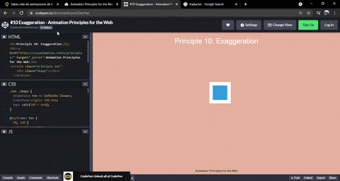
Exageración
La exageración es utilizada en Disney muy comúnmente para enfatizar una acción, tal como un golpe, una caída, etc. En el mundo web, nosotros podemos exagerar una acción cuando damos clic a un elemento o cuando una acción es completada, como la carga de un archivo. Con esto enfatizamos que la acción ya se realizo. Además de esto, la exageración puede ir acompañada de colores distintos en el elemento que esta siendo enfatizado.
HTML
<h1>Principle 10: Exaggeration</h1>
<article class="principle ten">
    <div class="shape"></div>
  </article>
CSS
.ten .shape {
  animation: ten 4s infinite linear;
  transform-origin: 50% 8em;
  top: calc(50% - 6em);
}

@keyframes ten {
  0%, 10% {
    transform: none;
    animation-timing-function: cubic-bezier(.87,-1.05,.66,1.31);
  }
  40% {
    transform: rotateZ(-45deg) scale(2);
    animation-timing-function: cubic-bezier(.16,.54,0,1.38);
  }
  70%, 100% {
    transform: rotateZ(360deg) scale(1);
  }
}

/* General styling */
body {
  margin: 0;
  background: #e9b59f;
  font-family: HelveticaNeue, Arial, Sans-serif;
  color: #fff;
}

h1 {
  position: absolute;
  top: 0;
  left: 0;
  right: 0;
  text-align: center;
  font-weight: 300;
}

h2 {
  font-size: 0.75em;
  position: absolute;
  bottom: 0;
  left: 0;
  right: 0;
  text-align: center;
}

a {
  text-decoration: none;
  color: #333;
}

.principle {
  width: 100%;
  height: 100vh;
  position: relative;
}

.shape {
  background: #2d97db;
  border: 1em solid #fff;
  width: 4em;
  height: 4em;
  position: absolute;
  top: calc(50% - 2em);
  left: calc(50% - 2em);
}
3D renderization
Cuando estamos trabajando con elemento 3D, tenemos que tener cuidado en que estos elementos cumplan con las reglas de perspectiva que rigen al mundo físico. De otra forma, estas formas en 3D lucen erróneas. La buena noticia es que la mayoría de los navegadores ya cumplen y pueden manejar renderizaciones en 3D.

HTML
<h1>Principle 11: Solid drawing</h1>
<article class="principle eleven">
    <div class="shape">
      <div class="container">
        <span class="front"></span>
        <span class="back"></span>
        <span class="left"></span>
        <span class="right"></span>
        <span class="top"></span>
        <span class="bottom"></span>
      </div>
    </div>
  </article>
CSS
.eleven .shape {
  background: none;
  border: none;
  perspective: 400px;
  perspective-origin: center;
}
.eleven .shape .container {
  animation: eleven 4s infinite cubic-bezier(.6,-0.44,.37,1.44);
  transform-style: preserve-3d;
}
.eleven .shape span {
    display: block;
    position: absolute;
    opacity: 1;
    width: 4em;
    height: 4em;
    border: 1em solid #fff;
    background: #2d97db;
}
.eleven .shape span.front {
  transform: translateZ(3em);
}
.eleven .shape span.back {
  transform: translateZ(-3em);
}
.eleven .shape span.left {
  transform: rotateY(-90deg) translateZ(-3em);
}
.eleven .shape span.right {
  transform: rotateY(-90deg) translateZ(3em);
}
.eleven .shape span.top {
  transform: rotateX(-90deg) translateZ(-3em);
}
.eleven .shape span.bottom {
  transform: rotateX(-90deg) translateZ(3em);
}


@keyframes eleven {
  0% {
    opacity: 0;
  }
  10%, 40% {
    transform: none;
    opacity: 1;
  }
  60%, 75% {
    transform: rotateX(-20deg) rotateY(-45deg) translateY(4em);
    animation-timing-function: cubic-bezier(1,-0.05,.43,-0.16);
    opacity: 1;
  }
  100% {
    transform: translateZ(-180em) translateX(20em);
    opacity: 0;
  }
}

/* General styling */
body {
  margin: 0;
  background: #e9b59f;
  font-family: HelveticaNeue, Arial, Sans-serif;
  color: #fff;
}

h1 {
  position: absolute;
  top: 0;
  left: 0;
  right: 0;
  text-align: center;
  font-weight: 300;
}

h2 {
  font-size: 0.75em;
  position: absolute;
  bottom: 0;
  left: 0;
  right: 0;
  text-align: center;
}

a {
  text-decoration: none;
  color: #333;
}

.principle {
  width: 100%;
  height: 100vh;
  position: relative;
}

.shape {
  background: #2d97db;
  border: 1em solid #fff;
  width: 4em;
  height: 4em;
  position: absolute;
  top: calc(50% - 2em);
  left: calc(50% - 2em);
}
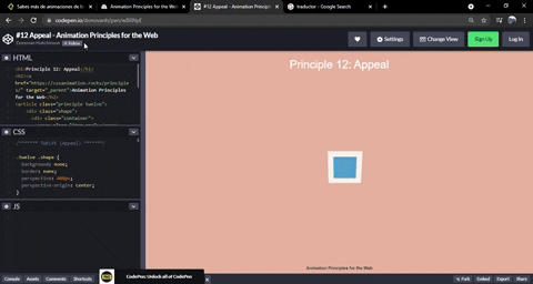
Atracción
Cuando usamos animaciones o transiciones, tenemos que estar seguros de que estas lucen amigables para el usuario. De otra forma pueden estresar al usuario.si las animaciones van muy rápido o aburrirlo si van muy lentas. La idea es encontrar el punto medio.
HTML
<h1>Principle 12: Appeal</h1>
<article class="principle twelve">
    <div class="shape">
      <div class="container">
        <span class="item one"></span>
        <span class="item two"></span>
        <span class="item three"></span>
        <span class="item four"></span>
      </div>
    </div>
  </article>
CSS
.twelve .shape {
  background: none;
  border: none;
  perspective: 400px;
  perspective-origin: center;
}

.twelve .shape .container {
  animation: show-container 8s infinite cubic-bezier(.6,-0.44,.37,1.44);
  transform-style: preserve-3d;
  width: 4em;
  height: 4em;
  border: 1em solid #fff;
  background: #2d97db;
  position: relative;
}

.twelve .item {
  background-color: #1f7bb6;
  position: absolute;
}

.twelve .item.one {
  animation: show-text 8s 0.1s infinite ease-out;
  height: 6%;
  width: 30%;
  top: 15%;
  left: 25%;
}

.twelve .item.two {
  animation: show-text 8s 0.2s infinite ease-out;
  height: 6%;
  width: 20%;
  top: 30%;
  left: 25%;
}

.twelve .item.three {
  animation: show-text 8s 0.3s infinite ease-out;
  height: 6%;
  width: 50%;
  top: 45%;
  left: 25%;
}

.twelve .item.four {
  animation: show-button 8s infinite cubic-bezier(.64,-0.36,.1,1.43);
  height: 20%;
  width: 40%;
  top: 65%;
  left: 30%;
}

@keyframes show-container {
  0% {
    opacity: 0;
    transform: rotateX(-90deg);
  }
  10% {
    opacity: 1;
    transform: none;
    width: 4em;
    height: 4em;
  }
  15%, 90% {
    width: 12em;
    height: 12em;
    transform: translate(-4em, -4em);
    opacity: 1;
  }
  100% {
    opacity: 0;
    transform: rotateX(-90deg);
    width: 4em;
    height: 4em;
  }
}

@keyframes show-text {
  0%, 15% {
    transform: translateY(1em);
    opacity: 0;
  }
  20%, 85% {
    opacity: 1;
    transform: none;
  }
  88%, 100% {
    opacity: 0;
    transform: translateY(-1em);
    animation-timing-function: cubic-bezier(.64,-0.36,.1,1.43);
  }
}

@keyframes show-button {
  0%, 25% {
    transform: scale(0);
    opacity: 0;
  }
  35%, 80% {
    transform: none;
    opacity: 1;
  }
  90%, 100% {
    opacity: 0;
    transform: scale(0);
  }
}


/* General styling */
body {
  margin: 0;
  background: #e9b59f;
  font-family: HelveticaNeue, Arial, Sans-serif;
  color: #fff;
}

h1 {
  position: absolute;
  top: 0;
  left: 0;
  right: 0;
  text-align: center;
  font-weight: 300;
}

h2 {
  font-size: 0.75em;
  position: absolute;
  bottom: 0;
  left: 0;
  right: 0;
  text-align: center;
}

a {
  text-decoration: none;
  color: #333;
}

.principle {
  width: 100%;
  height: 100vh;
  position: relative;
}

.shape {
  background: #2d97db;
  border: 1em solid #fff;
  width: 4em;
  height: 4em;
  position: absolute;
  top: calc(50% - 2em);
  left: calc(50% - 2em);
}
Curso de Animaciones con CSS
COMPARTE ESTE ARTÍCULO Y MUESTRA LO QUE APRENDISTE

