
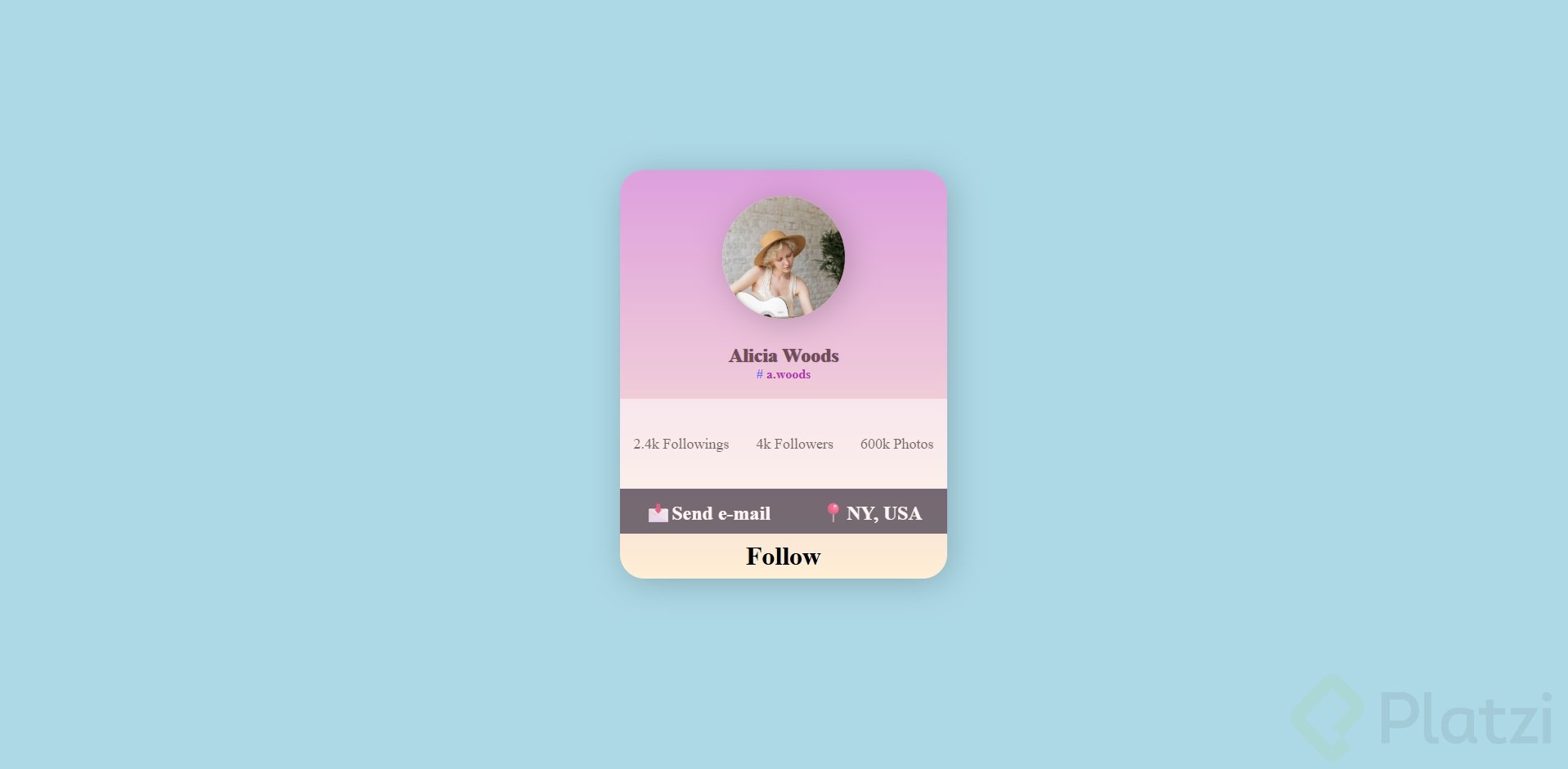
Modelo final:
Crear un proyecto con etiquetas HTML:
<body>
    <section>
        <div class="container">
            <div class="img-circle">
                <img src="https://images.pexels.com/photos/5331154/pexels-photo-5331154.jpeg?auto=compress&cs=tinysrgb&w=1260&h=750&dpr=1" alt=""> -->
            </div>
            <h1>Alicia Woods</h1>
            <h4><span> # </span>a.woods</h4>
            <div class="card-2">
                <p>2.4k Followings</p>
                <p>4k Followers</p>
                <p>600k Photos</p>
            </div>
            <div class="card-3">
                <h2>Send e-mail</h2>
                <h2>NY, USA</h2>
            </div>
            <div class="card-4">
                <h3>Follow</h3>
            </div>
        </div>
    </section>
</body>
Aquí está como darle estilos con CSS
 <style>
        body{
            background-color: lightblue;
        }
        section{
            width: 100%;
            display: flex;
            justify-content:center; /*Centrar contenido*/
            align-items: center;/*Centrar items*/
            padding-top:200px;
            padding-bottom:200px ;
        }
        .container{
            background: linear-gradient(plum, papayawhip);/*Degradando el color de fondo*/
            width: 400px;
            height: 500px;
            border-radius: 30px;/*Agregar un borde circular*/
            box-shadow:4px 5px 40px rgba(0, 0, 0, 0.2); /*Agregar sombra al contenedor*/
        }
        h1{
            color: rgb(112, 78, 78);
            text-align: center; /*Centrar textos*/
            font-weight: bold ;
            text-shadow: 1px 0px 1px darkslateblue;
            margin-bottom: 0;
        }
         h4{
            color: rgb(179, 49, 179);
            text-align: center;
            margin-top: 0;

        }
        .img-circle{
            background-color: papayawhip;
            width: 150px;
            height: 150px;
            border-radius: 50%;
            overflow: hidden;
            display: block;
            margin: 2rem auto;
            box-shadow:5px 5px 40px rgba(0, 0, 0, 0.2); /*Agregar sombra al fondo de la imagen*/
        }
        .container img{
            width: 100%; /*que tome todo el tamaño del elemento padre .img-circle*/
        }
        span{
            color: rgb(116, 107, 248);
        }
        .card-2{
            width: 100%;
            height: 22%;
            background-color: white;
            opacity: 50%;
            display: flex;
            justify-content: space-around;
            align-items: center;
        }
        .card-2 p{
            text-align: center;
            color: black;
            font-size: large;
        }
         .card-3{
            width: 100%;
            height: 11%;
            background-color: rgb(62, 54, 71);
            opacity: 70%;
            display: flex;
            justify-content: space-around;
            align-items: center;

        }
        h2::before{
            content: "📩"; /*Incluir emoji*/
        }
        div h2:nth-child(2)::before {
            content: "📍"; /*Incluir emoji*/
        }
        h2{
            color: white;
        }
        .card-4{
            width: 100%;
            height: 11%;
            display: flex;
            justify-content: space-around;
            align-items: center;
        }
        h3{
            font-size: xx-large;

        }
    </style>
Código contiene comentarios que pueden ayudar a guiarse para las propiedades de CSS usadas y destacadas de este proyecto.
Curso de Frontend Developer
COMPARTE ESTE ARTÍCULO Y MUESTRA LO QUE APRENDISTE
0 Comentarios
para escribir tu comentario

