Presentation Design Tips for Non-Designers
Contenido del curso
Desbloqueos creativos
Convergencia: Técnicas de generación de ideas
- 8

Técnicas de generación de ideas para resolver problemas creativos
00:40 min - 9

Cubing: Six Angles to Better Ideas
07:21 min - 10

Técnica Crazy 8s
03:35 min - 11
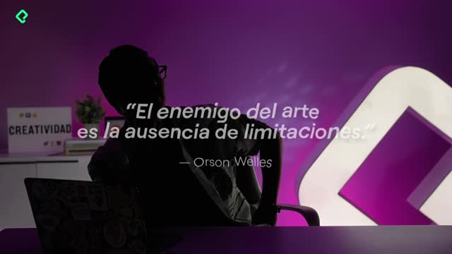
How Creative Limits Spark Better Ideas
02:31 min - 12

Reverse Thinking to Solve Any Problem
03:01 min - 13

5 AI Prompts for Solo Creative Feedback
07:57 min - 14

Six Thinking Hats for Stuck Teams
02:22 min
Incubación
Storytelling: cómo presentar tu idea
Sostenibilidad Creativa: Mantener el Hábito
Presentation Design Tips for Non-Designers
Resumen
A well designed presentation can be the difference between your idea landing or getting lost. Bad design, more than looking ugly, tends to confuse. So whether you plan to design your slides yourself or hire someone, these presentation design tips for non designers will help you build decks that communicate clearly and look professional.
What fonts work best for pitch decks?
For digital and pitch presentations, sans serif typefaces are your safest bet. They are the ones without the little feet at the end of each letter, like Helvetica, and you can find plenty of free options on Google Fonts.
When you mix typefaces, keep it minimal. Two is the sweet spot, three is the maximum. A strong, prominent font works great for titles, while a cleaner one carries the body copy across the rest of the deck.
What is a sans serif font? It is a typeface without decorative strokes (or feet) at the end of letters. Examples include Helvetica, Arial and most fonts you will find recommended for digital screens.
How much text should I put on a slide?
Less than you think. The rule shared in the lesson is simple: never go over six lines of text per idea, and if you are using a list, keep it to three items maximum.
The reason is practical. Slides are not documents. If your audience is reading a wall of text, they are not listening to you. Trim until only the essential message remains.
- Maximum six lines per idea.
- Maximum three items per list.
- Maximum two typefaces (three if absolutely necessary).
That discipline forces you to choose what really matters in each slide.
How do I choose colors with good contrast?
Contrast is what makes your slides readable from the back of a room or on a small screen. The principle is straightforward: dark text on light backgrounds, or light text on dark backgrounds.
Dark does not have to mean black. It can be a deep blue or a dark brown, as long as it sits against a white or beige background. The reverse also works, think yellow on black or white on black for maximum legibility.
What color combinations should I avoid in a presentation? Bright colors on top of other bright colors. They vibrate, hurt the eyes and make text nearly impossible to read.
Why visuals beat text
Whenever you can replace text with an image, a chart or a diagram, do it. Text alone rarely communicates an idea as fast as a visual does. And when you use a visual, show only one per slide so the audience focuses on a single message at a time.
Why does less is more matter in slide design?
If a slide feels like too much is happening, it probably is. The fix is almost always subtraction: remove an element, shorten a sentence, drop a decoration. Clean slides let your idea breathe and your audience follow.
A quick exercise to train your eye is to study real pitch decks from successful startups, like Airbnb's early deck. Notice how they used type, contrast and white space. The pattern repeats: clear, simple, minimal.
- Pick a pitch deck you admire.
- Identify the typefaces and contrast choices.
- Compare them with your current slides.
- Cut anything that does not serve the message.
Try the exercise with your own deck and share in the comments how it went.