If you feel stuck with only the basics, learning how to master Excel for business analysis can transform the way you work with data. This course shows you how to turn messy files into structured tables, build interactive dashboards, and automate reports so you spend less time fixing spreadsheets and more time making decisions.
What will you learn to do with Excel in this course?
The focus is practical: take real business problems and solve them with tools that go far beyond simple formulas. You will move from cleaning raw data to presenting insights that actually drive decisions.
Here is what you will build along the way:
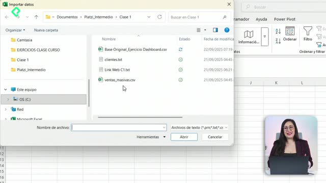
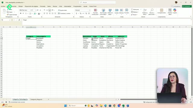
- Structured tables created from disorganized files, ready to analyze.
- Pivot tables (tablas dinámicas) that answer real business questions, like which products are growing or where the company is losing money.
- Rankings that combine margins and growth to compare performance.
- An interactive dashboard with slicers (segmentadores) and timelines (escalas de tiempo).
- Simulations using Solver to test business scenarios.
- Automations with Power Query to refresh dashboards in seconds.
Each skill connects with the next, so by the end you have a complete workflow instead of isolated tricks [0:15].
What is a pivot table used for in business? It is a tool that summarizes large amounts of data so you can answer questions like which products grow fastest or which areas lose money, without writing complex formulas.
Why does going beyond basic Excel matter for your career?
Basic Excel gets you through daily tasks, but professional Excel lets you analyze, automate, and communicate insights. That difference is what separates someone who fills cells from someone who guides business decisions.
Think about the typical pain points: files that arrive in chaos, reports that take hours to update, and dashboards that break every time new data comes in. With the right tools, those problems disappear.
What is Power Query? It is an Excel feature that lets you connect, clean, and transform data automatically, so your dashboards update in seconds instead of being rebuilt by hand.
How does this course turn messy data into interactive dashboards?
The path follows a clear logic. First, you clean and structure your data. Then you analyze it with pivot tables and rankings. Finally, you visualize everything in a dashboard that other people can actually use.
The interactive layer is key. Slicers let users filter information with one click, timelines make date ranges easy to explore, and Solver opens the door to what if simulations where you test different business assumptions.
And here is where automation closes the loop: with Power Query, the entire pipeline refreshes on its own. You stop being the bottleneck of your own reports.
Key concepts and skills you will develop
The course is taught by Dany Téllez and is designed for anyone ready to move from a basic Excel level to a professional one [0:42]. These are the core ideas worth keeping in mind:
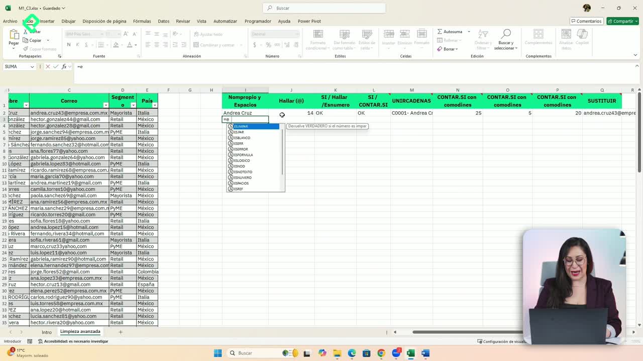
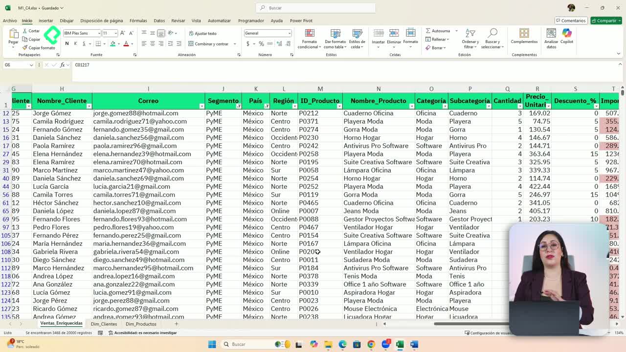
- Structured tables: the foundation for any reliable analysis.
- Pivot tables: the fastest way to summarize and explore data.
- Rankings with margins and growth: useful to compare products, clients, or regions.
- Interactive dashboards: with slicers and timelines for self service analysis.
- Solver: for optimization and scenario simulation.
- Power Query: for automating data cleaning and updates.
If you have ever wondered how analysts deliver clean reports so quickly, this is the toolkit behind it. Share in the comments which of these tools you want to apply first in your work.