Connecting multiple Excel files into one report can turn into a nightmare of VLOOKUPs, manual crosses and heavy spreadsheets. With Power Pivot in Excel you relate different sources with a single click and build interactive dashboards from them. This walkthrough is for anyone who already works with pivot tables and wants to scale into multi source reporting.
How do I enable Power Pivot in Excel?
Power Pivot lives in the top ribbon of Excel, but it does not always show up by default. If you cannot see it, you need to activate it as a COM add-in before doing anything else.
The path is short and you only do it once:
- Open the File menu and go to Options.
- Enter Add-ins and, in the Manage dropdown, choose COM Add-ins and click Go.
- Check Microsoft Power Pivot for Excel and accept.
If the tab still does not appear, close Excel, reopen it, and as a last resort restart your computer. Once it shows up, click Manage to open the Power Pivot window.
What is Power Pivot used for? It is an Excel tool that lets you import, relate and analyze data from multiple sources, like several Excel files, SAP or Oracle, inside a single optimized model.
How do I import multiple Excel files into Power Pivot?
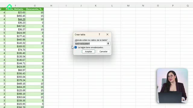
Inside the Power Pivot window you will find the option From Other Sources, which is the gateway to load data from systems like SAP, Oracle or, in this case, Excel files.
The loading flow is straightforward:
- Click From Other Sources and scroll down to Excel File.
- Browse to your file and, very important, enable Use first row as column headers.
- Confirm the table preview and click Finish.
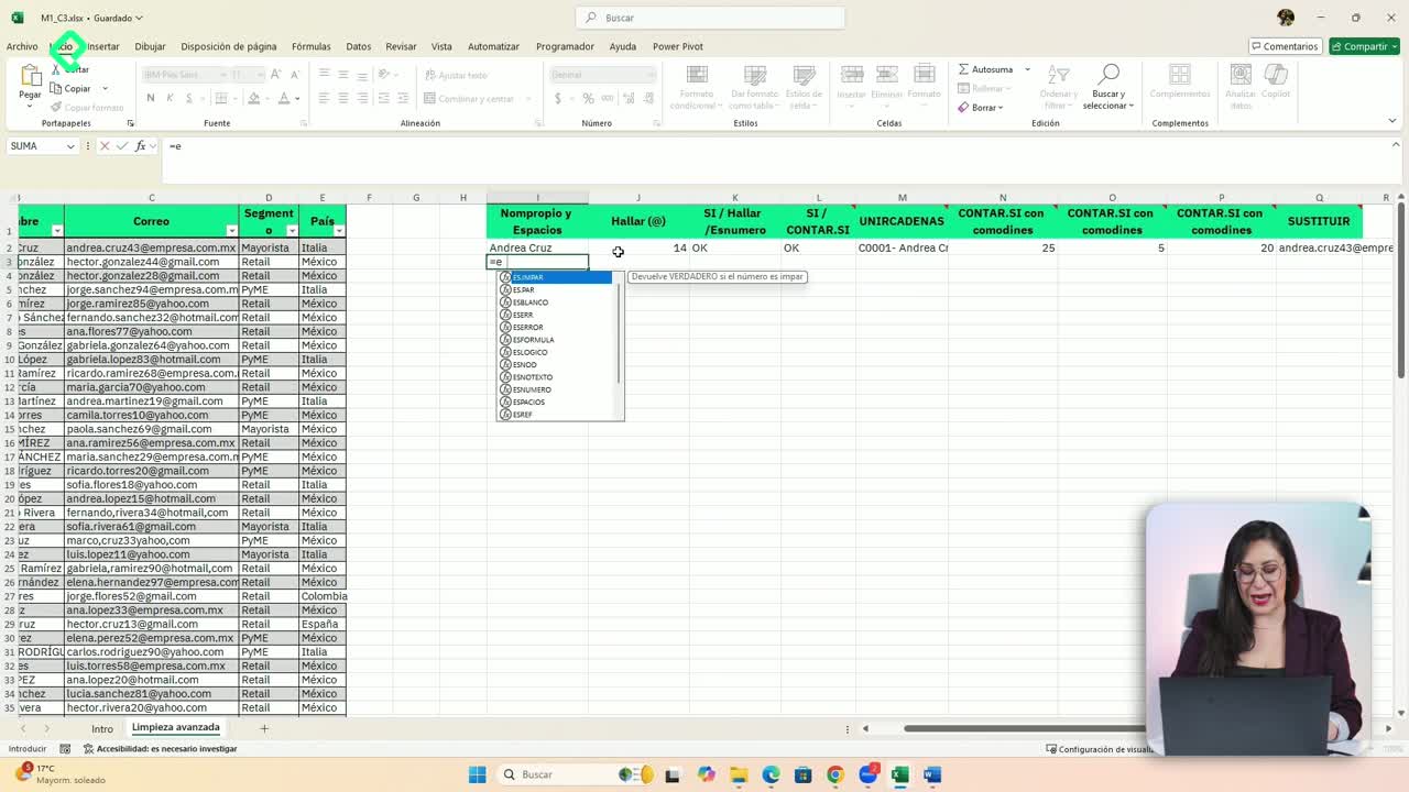
Each file you import becomes a tab at the bottom of the Power Pivot window. If you ever see headers like Column F or Column H, it means you forgot to mark the first row as header. The fix is simple: right click the tab, delete it and load the file again with the option enabled. This screen is the data view, where you check how your raw information looks before relating it.
What is the difference between data view and diagram view?
The data view shows your tables row by row, like a regular spreadsheet. The diagram view shows each table as a box with all its column headers inside, ready to be connected. To switch, click Diagram View in the Power Pivot ribbon and arrange the boxes however feels visual to you.
How do I create relationships between tables in Power Pivot?
In the diagram view you connect tables through a key field, a column that repeats across files and links them together. The classic example is ID Cliente, but it can also be ID País or ID Transacción, depending on your model.
To relate two tables, drag the key column from one box and drop it on the matching column in the other. Power Pivot will draw a line with a 1 on one side and an asterisk on the other, marking a one to many relationship: one client can appear many times in your sales table, and Power Pivot will keep that link consistent.
What is a one to many relationship? It is a link where one record in a table, like a single client, can match multiple records in another table, like dozens of sales rows tied to that same client.
You are not limited to one key. Different pairs of tables can be joined by different fields, as long as every table ends up connected to the model through some shared column.
How do I build a dashboard from related tables?
Once the relationships are in place, the payoff shows up in Excel. From the Power Pivot window, click PivotTable and pick the Four Charts layout, then send it to a new worksheet.
Excel will create four buckets ready for dynamic charts, and the field list on the right will show every table you imported. That is the magic moment: you can drag Segmento from one file and Cantidad de ventas from another into the same chart, and Power Pivot resolves the join in the background.
From there you apply everything you already know about dashboards:
- Change chart types, like switching to a pie or doughnut chart.
- Add new charts for metrics like Compras using Sum of Compras.
- Insert slicers from Chart Design, Analyze, and connect them through Report Connections so a single filter controls every chart at once.
Slicers in Power Pivot show tabs like Active and All, which means you can filter across every related file from one place. That is what turns a static report into a real interactive control panel.
Why is Power Pivot better for heavy Excel files?
When you work with very large files, regular Excel slows down because it loads every cell into memory. Power Pivot does not do that. It keeps a compressed model and shows you only the mirror of the data you need for your pivot tables and charts.
The practical effect is that your files become lighter, your dashboards run faster, and you can combine sources that would otherwise be impossible to merge by hand. If you usually juggle several Excel files for a single report, this is the tool that scales with you.
Drop a screenshot of your dashboard in the comments so I can see how your model turned out.