Conditional Styles With StyleSheet in React Native
Contenido del curso
Módulo 2: Construcción de la Interfaz de Usuario
- 5
Using const, let, and Conditionals in JSX
10:35 min - 6
Reusable Components with Props in React Native
14:49 min - 7
Conditional Styles With StyleSheet in React Native
Viendo ahora - 8
Dark Mode Theming in React Native Apps
13:07 min - 9
Making React Native Dynamic with useState
12:12 min - 10
Adding Habits and Streaks With React Native State
13:24 min - 11
Pressable vs TouchableOpacity in React Native
09:36 min
Módulo 3: Interactividad y Manejo de Datos
- 12
ScrollView vs FlatList in a Habits Carousel
10:50 min - 13
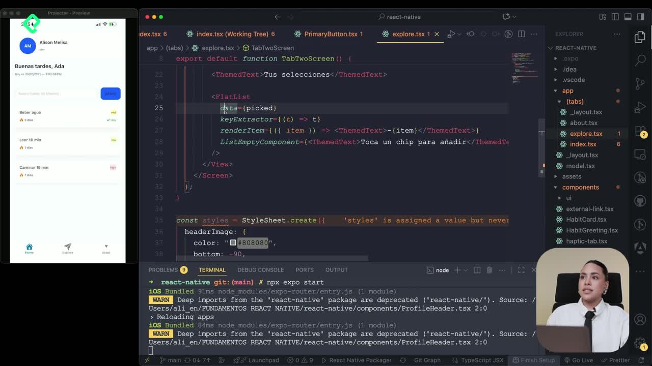
Diferencias entre ScrollView y FlatList para listas grandes
09:47 min - 14
Instalación de Async Storage para persistencia de datos en React Native
14:54 min - 15
Persisting Habits with AsyncStorage Context
12:07 min - 16
Persisting Habits with AsyncStorage and Context
13:19 min - 17
Confetti Animation With a Fake API Service
11:58 min - 18
Cómo crear una ExploreCard específica para iOS y Android
09:47 min - 19
Explore Tab Carousel With FlatList
12:49 min - 20
AI Avatar Generator with AsyncStorage
12:32 min - 21
Camera and Gallery Access in React Native
16:01 min
Módulo 4: Visualización de Listas y Contenido
Conditional Styles With StyleSheet in React Native
Resumen
Styling a React Native app feels familiar if you already know CSS, but it has its own rules. You'll learn how StyleSheet works, how to organize layouts with Flexbox, and how to apply conditional styles based on a prop like priority, all inside a habit tracker card.
What is StyleSheet in React Native and how does it relate to CSS?
Think of StyleSheet as a cascading style sheet, almost like a CSS file living inside your component. It holds an identifier for each style block and a set of keys that look exactly like CSS properties, with one twist: they use camelCase instead of hyphens. So background-color becomes backgroundColor, and padding-horizontal becomes paddingHorizontal.
You can apply a single style object or pass an array of them using brackets. That array trick is powerful because you can mix a base style with an inline override on the fly, which gives your project both structure and personality.
What is StyleSheet in React Native? It's an API that lets you define style objects similar to CSS, using camelCase keys, and reference them by name inside your components.
How does Flexbox work in React Native layouts?
React Native uses Flexbox by default, but with a key difference from the web: every container starts with a column direction instead of a row. If you want your items side by side, you change it explicitly with flexDirection: 'row' [02:00].
From there, the alignment properties behave just like in CSS:
justifyContentcontrols the main axis with values likeflex-start,flex-end,center,space-betweenandspace-around.alignItemscontrols the cross axis using the same vocabulary.flexDirectionswitches between column and row when you need a different flow.
Because these are the same values you already know from CSS, the learning curve is gentle. You're really just translating syntax, not concepts.
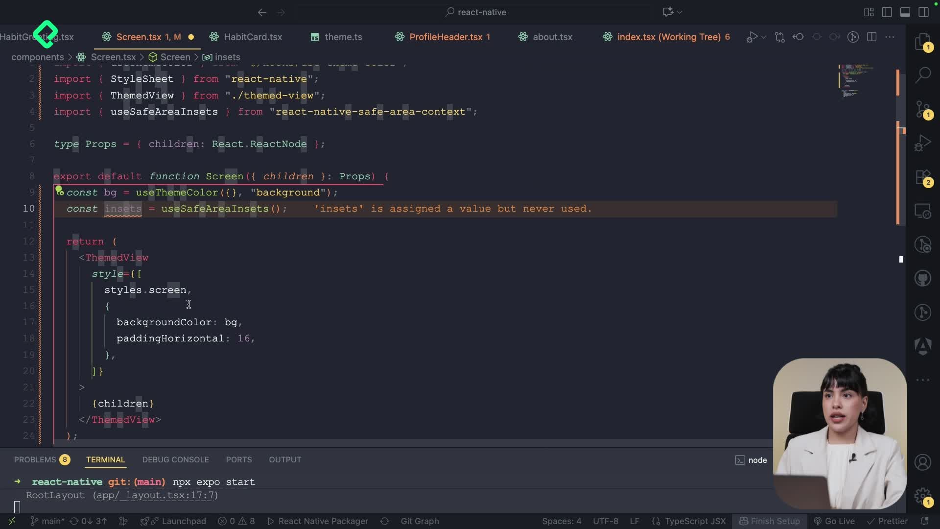
How do I create a reusable Screen component with shared styles?
One of the cleanest patterns in React Native is wrapping every screen in a custom component that standardizes the background, padding and direction. You build a component called Screen that receives a children prop typed as React.Node, and returns a View with your shared styles applied [03:30].
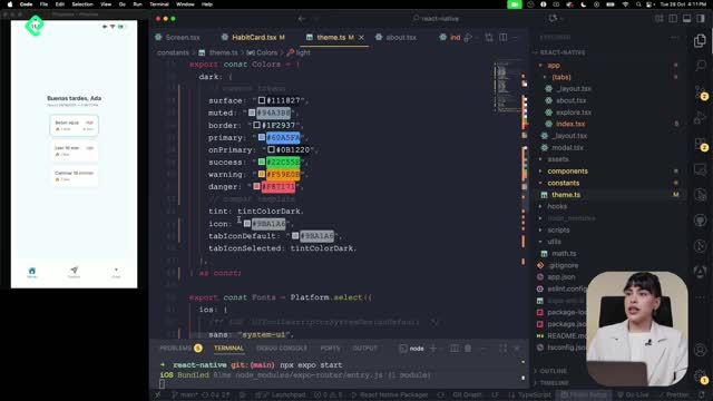
Inside that component, you define your styles with StyleSheet.create, giving the object a key like screen and adding properties such as:
flexDirection: 'column'to keep the natural vertical flow.backgroundColorwith the brand color of your choice.paddingHorizontalfor spacing on the X axis.paddingVerticalfor spacing on the Y axis.
Then, in your index, explore or about screens, you import Screen and wrap the existing View inside it. The background updates instantly while the rest of your content stays untouched. That's the value of reusable styles: change one file, update every screen.
Why use a Screen wrapper component? It centralizes layout decisions like padding and background, so every page in your app stays visually consistent without repeating code.
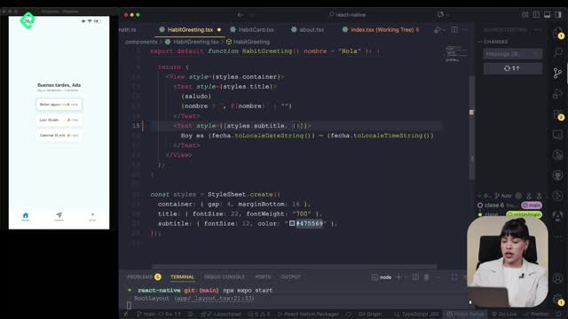
How do I apply conditional styles based on a priority prop?
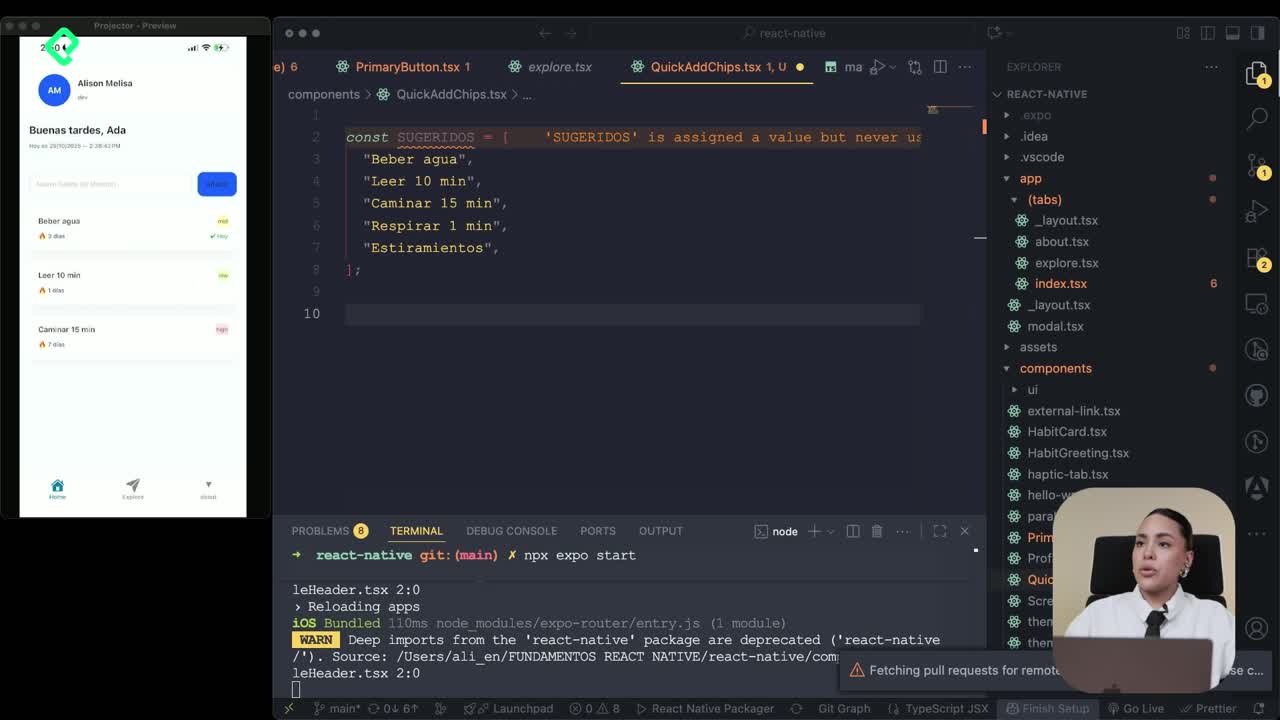
Now let's bring this into a real use case: a habit card that changes color depending on its priority. You define three style variants in your StyleSheet, one for each level:
- High in red.
- Mid in orange.
- Low in green.
In the card component, you add a priority prop and type it so it accepts values like low, mid or high [05:45]. Then you create a constant that matches the incoming priority value with the corresponding entry in your priority styles object. If there's a match, that style applies; if not, it falls back to a default.
You use that matched style to set both the backgroundColor of the badge and the text color. Save the file, change the prop from low to mid to high, and watch the card swap colors in real time. This pattern works for any visual state: status, severity, category, or tier.
How can I organize the card layout with two rows?
Once the colors work, the card still looks cramped. The fix is purely structural: split the content into two rows using two View containers with flexDirection: 'row'. Move the priority badge into the second row so the title and the badge don't fight for space [07:30].
The result is a card that breathes, communicates priority at a glance, and reuses the same StyleSheet patterns you already wrote. Try it on your own habit tracker and tell me in the comments which color palette you picked for high, mid and low priorities.