Dark Mode Theming in React Native Apps
Contenido del curso
Módulo 2: Construcción de la Interfaz de Usuario
- 5
Using const, let, and Conditionals in JSX
10:35 min - 6
Reusable Components with Props in React Native
14:49 min - 7
Conditional Styles With StyleSheet in React Native
11:24 min - 8
Dark Mode Theming in React Native Apps
Viendo ahora - 9
Making React Native Dynamic with useState
12:12 min - 10
Adding Habits and Streaks With React Native State
13:24 min - 11
Pressable vs TouchableOpacity in React Native
09:36 min
Módulo 3: Interactividad y Manejo de Datos
- 12
ScrollView vs FlatList in a Habits Carousel
10:50 min - 13
Diferencias entre ScrollView y FlatList para listas grandes
09:47 min - 14
Instalación de Async Storage para persistencia de datos en React Native
14:54 min - 15
Persisting Habits with AsyncStorage Context
12:07 min - 16
Persisting Habits with AsyncStorage and Context
13:19 min - 17
Confetti Animation With a Fake API Service
11:58 min - 18
Cómo crear una ExploreCard específica para iOS y Android
09:47 min - 19
Explore Tab Carousel With FlatList
12:49 min - 20
AI Avatar Generator with AsyncStorage
12:32 min - 21
Camera and Gallery Access in React Native
16:01 min
Módulo 4: Visualización de Listas y Contenido
Dark Mode Theming in React Native Apps
Resumen
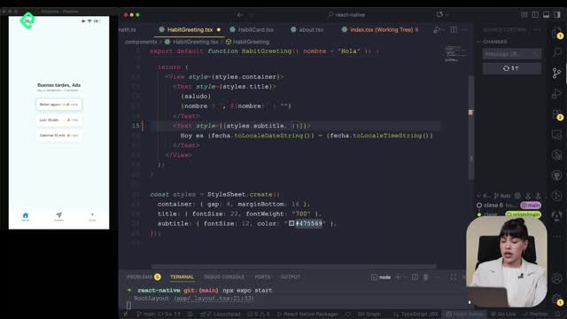
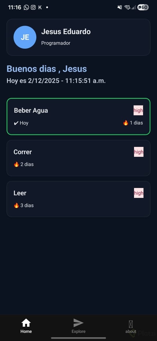
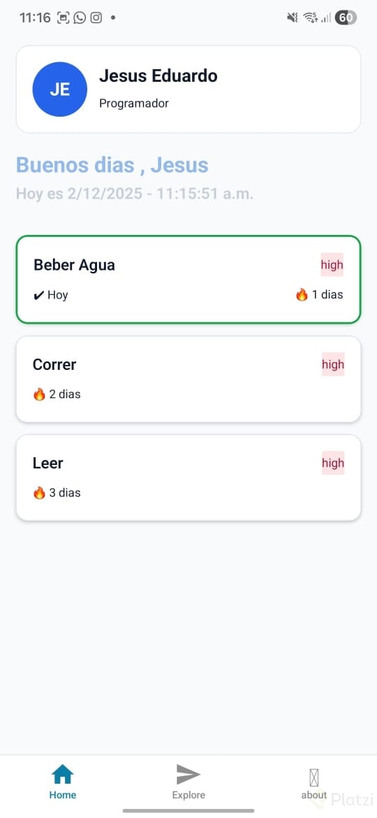
Adapting your React Native app to light and dark mode is easier than it looks, and you can also inject your own color palette without breaking the system. The key lies in theme hooks and themed components that React Native ships by default, ready to react to the operating system appearance.
How does the theme system work in React Native?
React Native already includes a full scheme for handling the color palette of your app depending on the device mode. When you switch your phone from light to dark, the tabs, the Explore screen and any themed component update automatically.
That magic happens thanks to a hook called useTheme, which reads the operating system color scheme and applies the matching tokens. You will find it inside the template, fully automated, so you don't need to wire the listener yourself.
What is useTheme in React Native? It is a hook that detects whether the device is in light or dark mode and returns the right color tokens for your components, so the UI updates without manual logic.
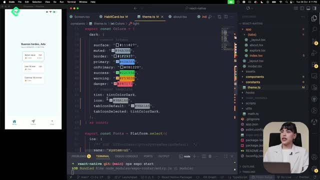
Where do you customize the color palette?
The palette lives in the constants folder, inside the theme file. There you will see the default colors the app uses and you can replace them with your own brand tokens.
In the example, the defaults stay in place and a few extra colors are added to make buttons and warnings more dynamic. The same file also stores typography rules, with specific fonts for iOS, Android and web, so the text system stays consistent across platforms.
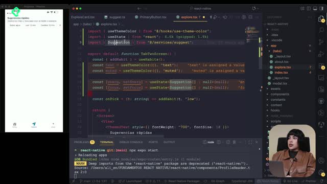
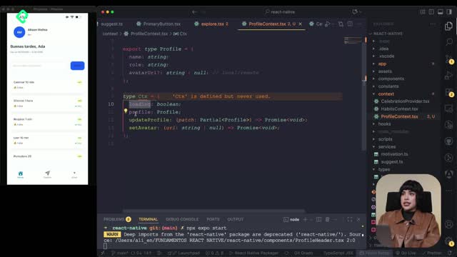
How to build a ProfileHeader with useThemeColor?
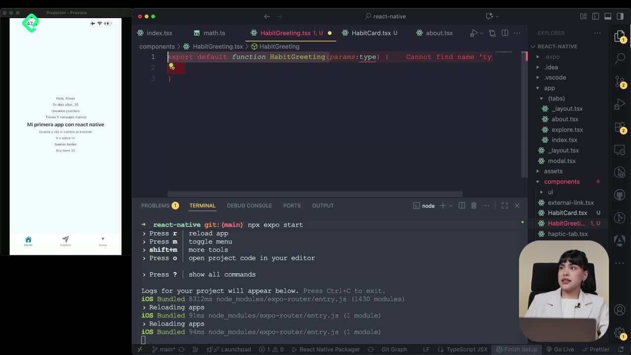
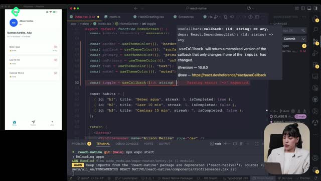
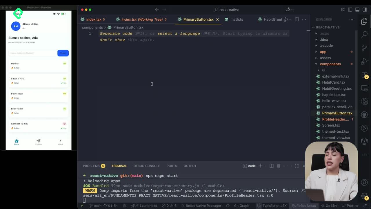
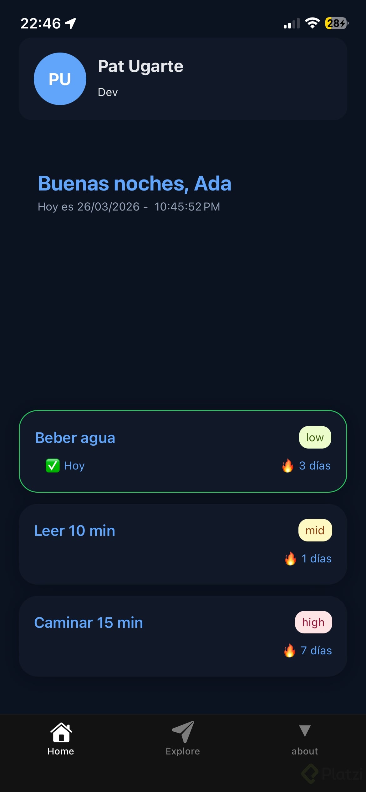
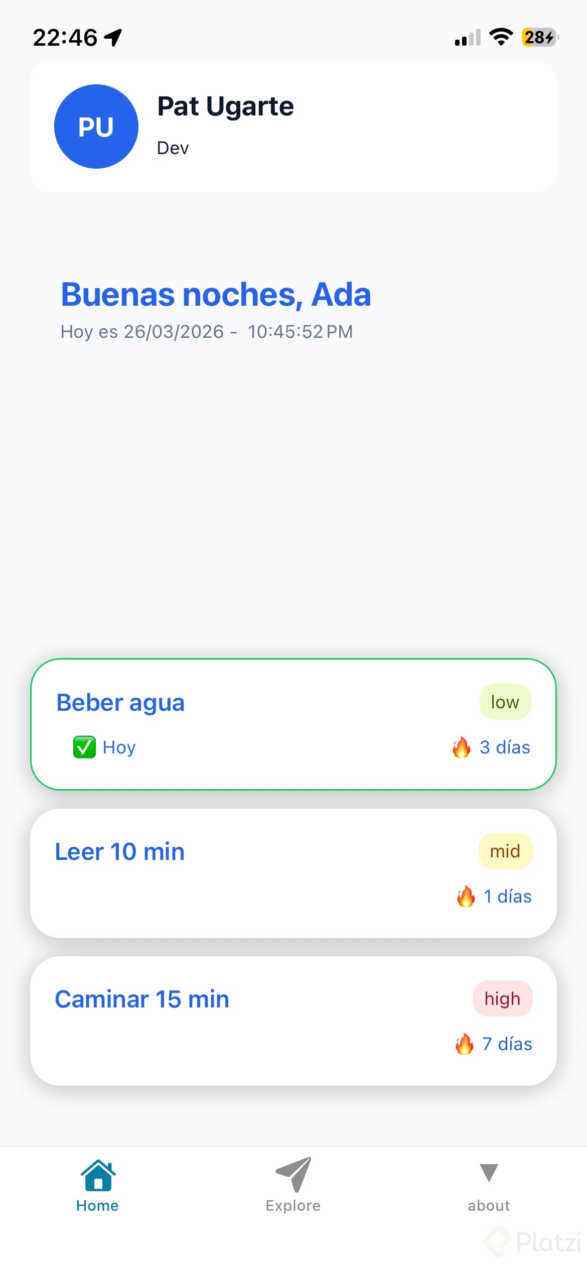
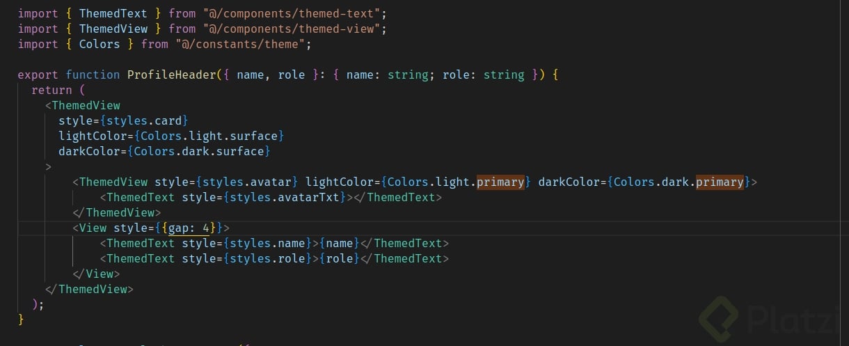
Once the palette is defined, the next step is consuming it from a real component. The exercise creates a new file called ProfileHeader.tsx inside the components folder, designed to display the user's name, role and initials.
Inside the component you call useThemeColor to pull each token into a constant:
- card, for the background of the profile card.
- primary, for the circular avatar container.
- onPrimary, for the text placed over the primary color.
- initial, reserved for accent details.
With those constants ready, you combine local StyleSheet rules with theme colors directly in the JSX. The trick is passing an array to the style prop: first the static style from StyleSheet, then an inline object that injects the dynamic backgroundColor coming from the theme hook.
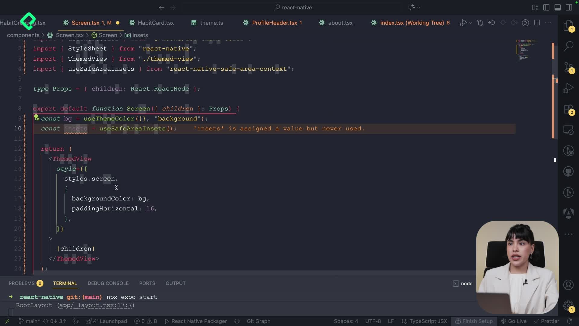
How do you mix StyleSheet with theme colors?
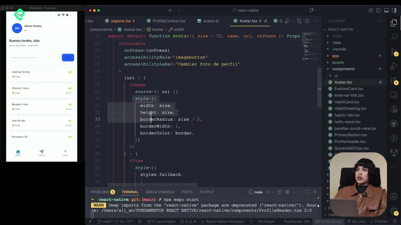
The pattern looks like this in plain words: the outer View uses styles.card for layout (flexbox, borders, spacing) and an inline backgroundColor tied to the card constant. Inside, a second View holds the avatar circle, with equal width and height, a rounded border and the primary color as background.
For the initials, the component reuses ThemeText, which already exists in the template and ships with variants like default, title and semibold. You feed it the avatarText style and the computed initials.
How do I get initials from a name in React Native? Split the name by spaces, map each word to its first character, join them and convert the result to uppercase. Store it in a constant called initials and render it inside ThemeText.
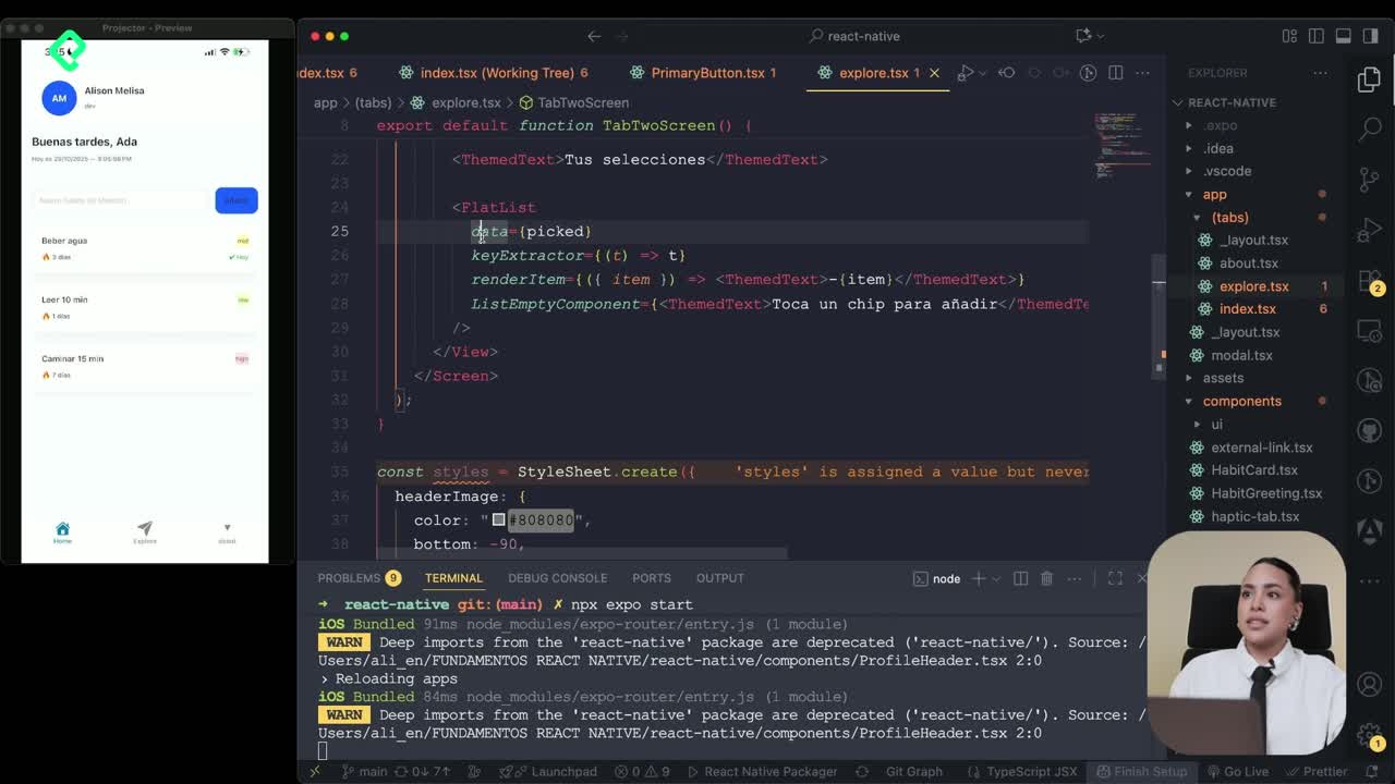
How to apply ThemeText and ThemeView across the app?
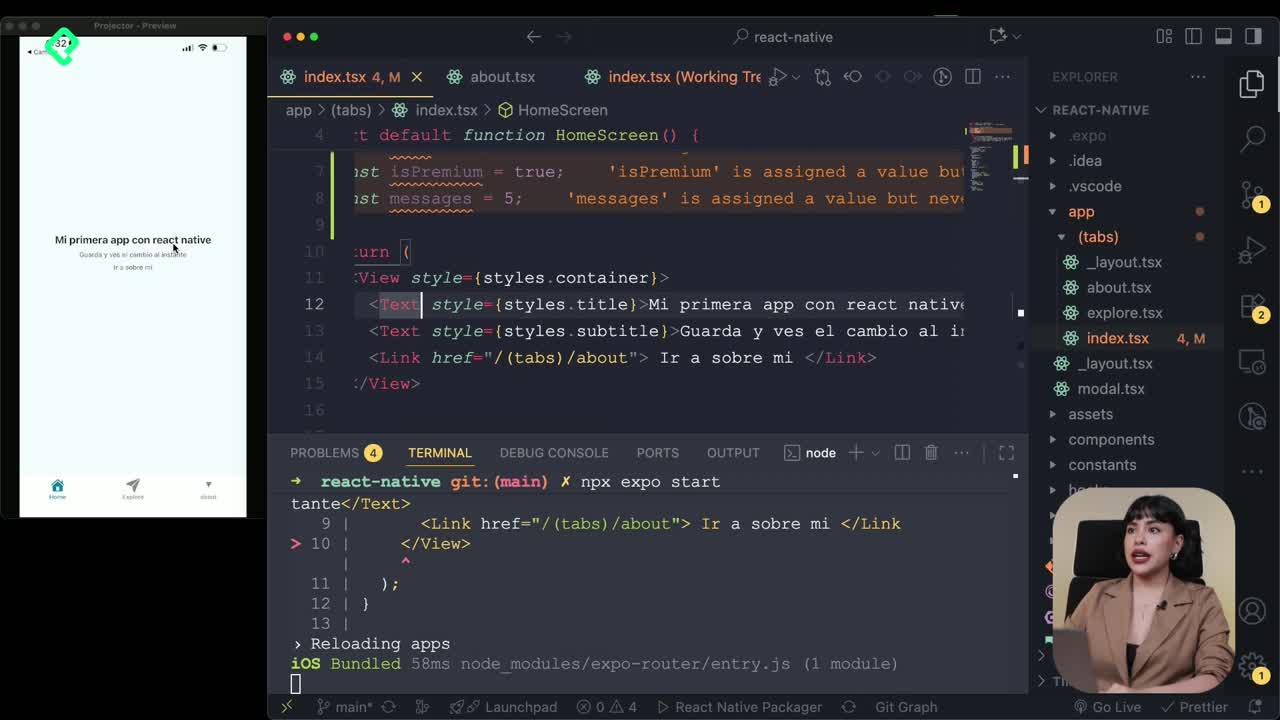
After the ProfileHeader works, the same logic scales to the rest of the screens. In the index file you import the component, pass the name and role props, and the profile card renders with the active theme.
The recommendation is to replace every plain Text with ThemeText so the typography reacts to dark mode automatically. When you toggle the device to dark, the welcome message, the greeting and the profile copy all switch tone without extra code.
For backgrounds, the equivalent component is ThemeView. It exposes lightColor and darkColor props, which means you can define both variants in one place and let the hook pick the right one.
What is the challenge for this lesson?
The pending task is swapping the outer View of the home screen for a ThemeView, picking the color you prefer and layering extra styles on top. That single change finishes the dark mode coverage and leaves the layout fully reusable.
What is the difference between ThemeText and ThemeView? ThemeText handles typography variants and adapts text color to the active theme, while ThemeView wraps containers and switches background colors between light and dark mode.
Try your own palette, share which colors you picked for buttons and warnings, and tell me in the comments how the ThemeView refactor looked on your home screen.