Pressable vs TouchableOpacity in React Native
Contenido del curso
Módulo 2: Construcción de la Interfaz de Usuario
- 5
Using const, let, and Conditionals in JSX
10:35 min - 6
Reusable Components with Props in React Native
14:49 min - 7
Conditional Styles With StyleSheet in React Native
11:24 min - 8
Dark Mode Theming in React Native Apps
13:07 min - 9
Making React Native Dynamic with useState
12:12 min - 10
Adding Habits and Streaks With React Native State
13:24 min - 11
Pressable vs TouchableOpacity in React Native
Viendo ahora
Módulo 3: Interactividad y Manejo de Datos
- 12
ScrollView vs FlatList in a Habits Carousel
10:50 min - 13
Diferencias entre ScrollView y FlatList para listas grandes
09:47 min - 14
Instalación de Async Storage para persistencia de datos en React Native
14:54 min - 15
Persisting Habits with AsyncStorage Context
12:07 min - 16
Persisting Habits with AsyncStorage and Context
13:19 min - 17
Confetti Animation With a Fake API Service
11:58 min - 18
Cómo crear una ExploreCard específica para iOS y Android
09:47 min - 19
Explore Tab Carousel With FlatList
12:49 min - 20
AI Avatar Generator with AsyncStorage
12:32 min - 21
Camera and Gallery Access in React Native
16:01 min
Módulo 4: Visualización de Listas y Contenido
Pressable vs TouchableOpacity in React Native
Resumen
Adding habits to your app is just the start. Understanding what happens when you press a button and how to make a list scrollable is what turns a basic screen into a usable interface. Here you will learn how to build a reusable PrimaryButton in React Native, why Pressable beats TouchableOpacity, and how to wrap your content in a ScrollView to display every habit you add.
Why should you use Pressable instead of TouchableOpacity?
Both components react to taps, but they behave differently under the hood. Pressable gives you full control over the press lifecycle, while TouchableOpacity only animates opacity when tapped.
When you log a Pressable interaction, you can see two distinct states: press in when the finger touches the screen, and press out when it lifts. TouchableOpacity skips that granularity and limits you to a visual fade.
What is Pressable in React Native? It is a core component that detects press states (in, out, long press) and lets you customize styles and feedback for each one, giving you more control than TouchableOpacity.
That is why a reusable button in a habit tracker app should rely on Pressable: you get richer feedback and cleaner state handling [02:10].
How do you create a reusable PrimaryButton component?
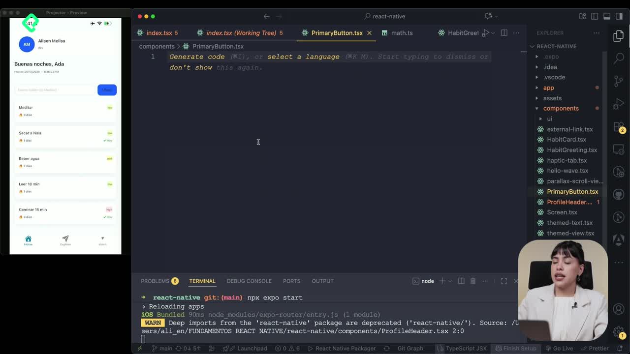
The goal is a single button you can drop into any screen, with props that adapt its behavior. Create a file called PrimaryButton.tsx and define the props it needs.
The component receives four props:
- title as a
stringfor the button label. - onPress as a function that runs when the user taps it.
- disabled as a
booleanto deactivate the button when needed. - style to extend the visual appearance from outside.
Inside the component, return a Pressable and assign:
- role set to
buttonfor accessibility. - aria-label mapped to the title prop.
- disabled connected to the prop of the same name.
- onPress wired to the function passed in.
For styling, import StyleSheet from React Native at the top of the file. Set a minimum height, minimum width, padding for breathing room, and center the content so the label sits in the middle of the button [04:20].
How do you replace a Pressable with your PrimaryButton in the home screen?
Once the component is ready, head to your index file and find the existing Pressable you used to add habits. Swap it for your new PrimaryButton.
Pass the props it expects:
- title equal to
"Añadir"or whatever label fits your UI. - onPress connected to your addHabit function.
Save the file and the button now triggers the same logic as before, but with the cleaner API of a reusable component. From here, any screen that needs a primary action can import the same button and stay visually consistent.
When should I build a reusable button? As soon as you repeat the same button style or behavior in two screens. A single component keeps styles, accessibility, and logic in one place.
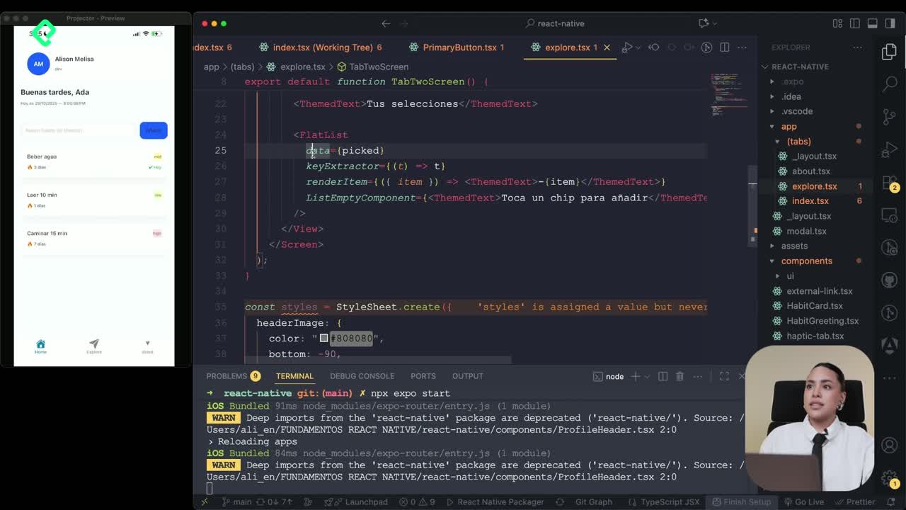
How do you make a habit list scrollable with ScrollView?
As you add more habits, some of them disappear below the fold. The fix is to replace the outer View with a ScrollView imported directly from React Native, not from the gesture handler library [07:15].
A ScrollView gives you a few useful props worth tuning:
- showsVerticalScrollIndicator set to
falsehides the side bar while scrolling. - contentContainerStyle lets you apply layout styles to the inner content, replacing the styles you had on the old View.
Inside contentContainerStyle, two values make a clear difference:
- paddingBottom of
32to leave space at the end of the list. - gap of
16to separate each habit card vertically.
What is the difference between style and contentContainerStyle in ScrollView? style applies to the scroll container itself, while contentContainerStyle applies to the wrapper around the children. Use the second one for padding and gaps between items.
With this setup, you can keep adding habit cards and scroll through every one of them without losing access to the bottom of the list.
What did you build in this lesson?
You now have a PrimaryButton powered by Pressable, with props for title, onPress, disabled, and custom styles. You also wrapped your habit list in a ScrollView with hidden indicator, bottom padding, and consistent spacing between cards.
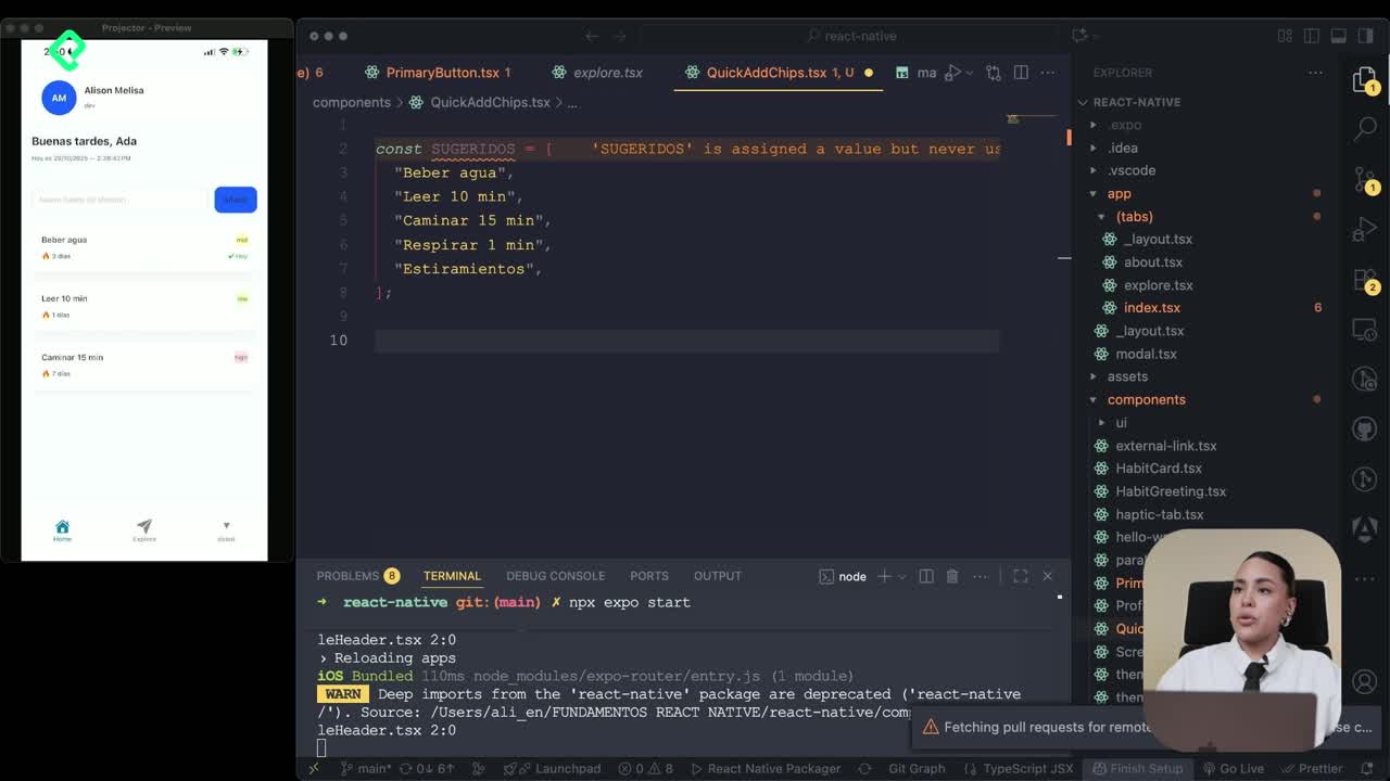
The next step is creating a suggested habits component to give users ideas when they open the app. Have you tried building your own reusable button yet? Share in the comments which props you would add to make it fit your project.